2 BHK Flat Colour Combination Ideas for a Stylish, Cohesive Home
By Usha Balasubramanyan- September 22, 2026
Summary
A well-planned 2 BHK flat colour combination creates visual flow, makes compact spaces feel larger, and ensures every room complements the next. Choosing one neutral base colour with carefully selected accent shades helps achieve a timeless look that’s easy to update over time. The result is a home that feels cohesive, welcoming, and beautifully balanced.
Expert Tip
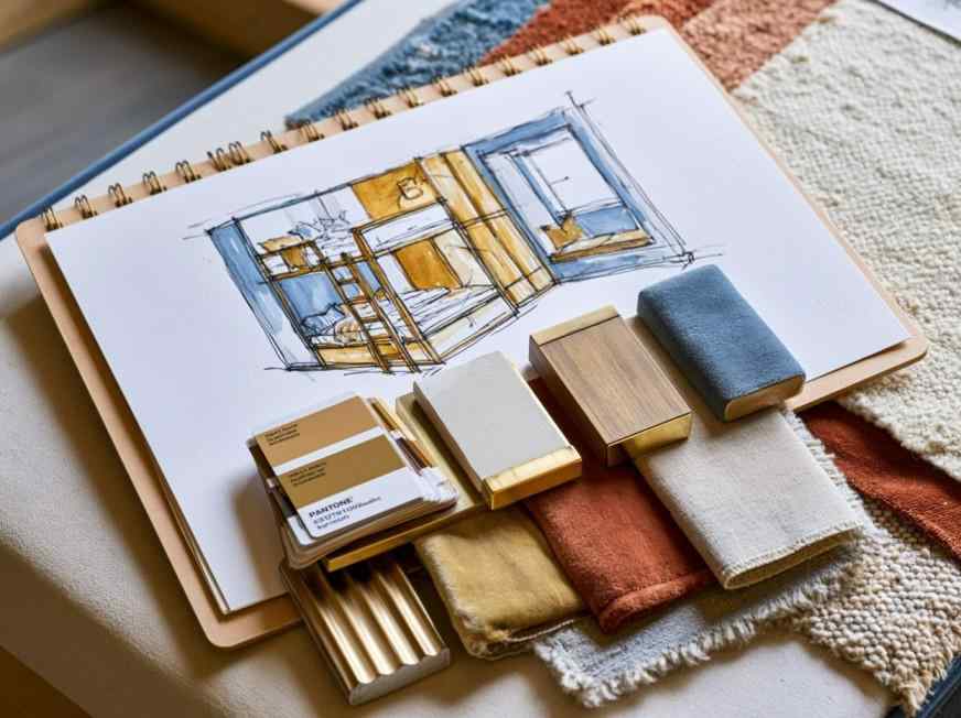
Before choosing paint, place your flooring sample, wardrobe laminate, kitchen finish, and curtain fabric together. Seeing all the materials side by side makes it much easier to create a colour palette that feels cohesive throughout the home.
Best For
2 BHK apartments, both first-time interiors and makeovers
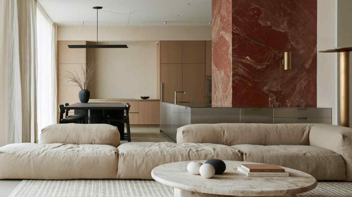
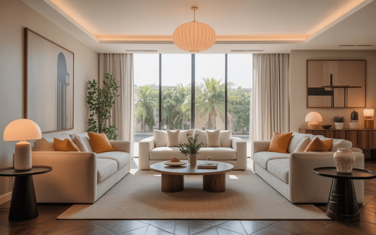
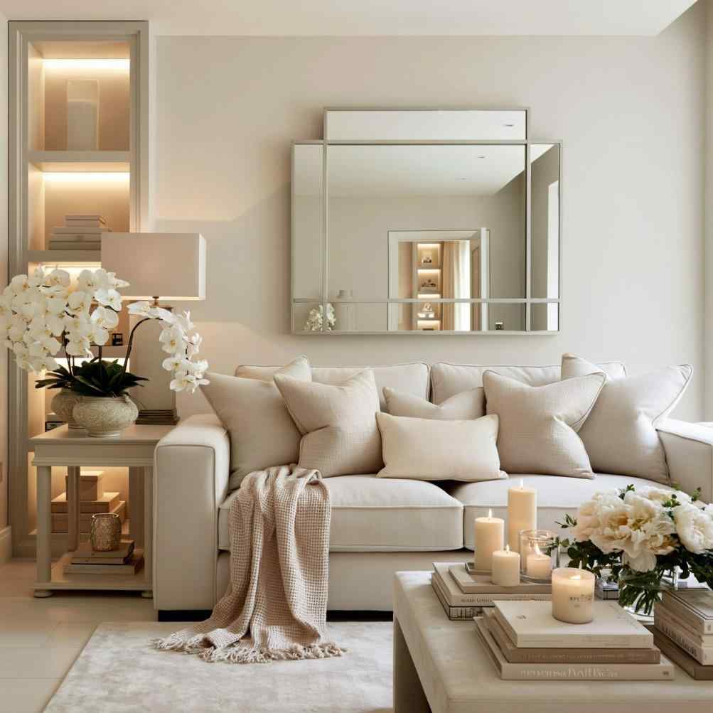
A neutral colour combination for 2 BHK flats creates a warm, spacious living room feel.
Choosing colours for a 2 BHK flat isn’t just about selecting attractive paint shades for individual rooms. Since the living room, dining area, kitchen, and bedrooms are often visually connected, every colour choice influences how spacious, bright, and cohesive the entire home feels. A well-planned palette can make even a compact apartment appear larger while creating a smooth flow from one room to the next.
The best 2 BHK flat colour combination balances personal style with practicality. By using a consistent base palette and introducing complementary accent colours, you can create a home that’s elegant, comfortable, and timeless without making every room look identical.
With thoughtful planning, colour becomes one of the simplest ways to transform your entire home.
Why Colour Planning Matters More in a 2 BHK
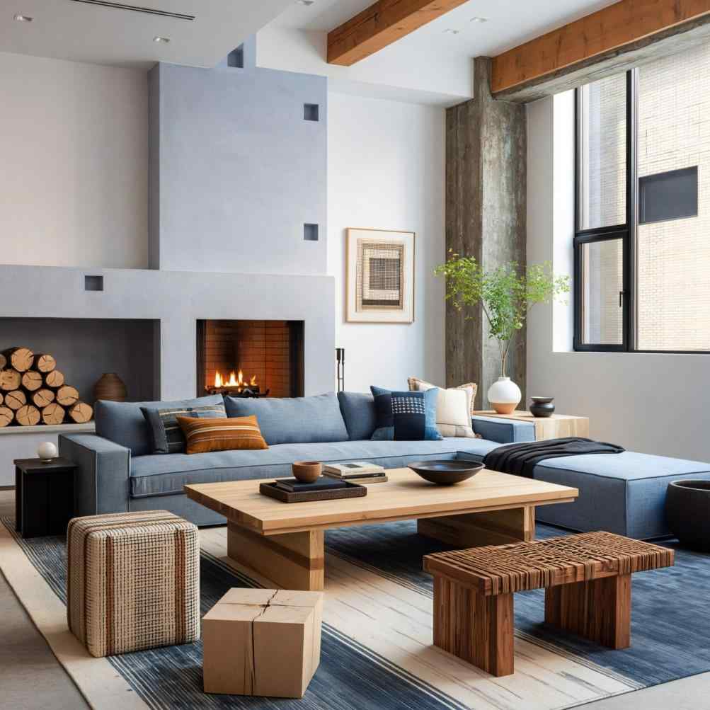
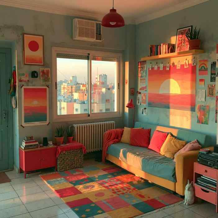
Soft grey walls and dusty blue accents bring a cohesive feel to this 2 BHK living room.
Unlike larger homes where every room can have a distinct identity, a 2 BHK works best when spaces feel visually connected. Using too many unrelated wall colour combinations can make the flat feel smaller and fragmented.
Instead, choose one neutral base colour for the entire home and introduce different accent shades in each room through feature walls, furnishings, and décor. Repeating similar wood finishes, flooring, and fabrics also helps maintain continuity.
A consistent palette makes the apartment feel calmer, brighter, and more spacious.
Living Room Colour Combinations for a 2 BHK
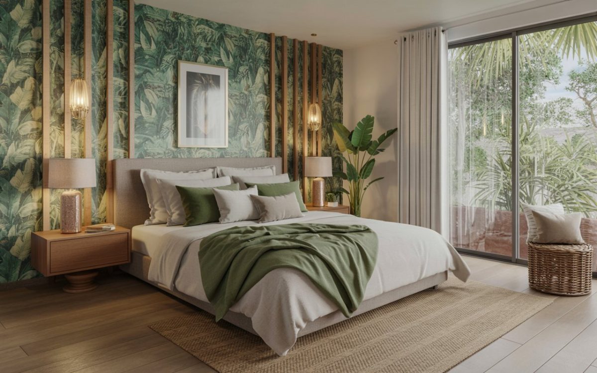
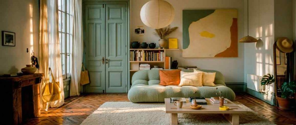
Warm white and sage green create a timeless 2 BHK living room colour combination.
The living room usually sets the tone for the rest of the home.
These combinations create welcoming spaces while providing flexibility for different furniture styles. Natural wood finishes, indoor plants, and warm lighting complete the look beautifully.
Bedroom Colour Combinations for a 2 BHK
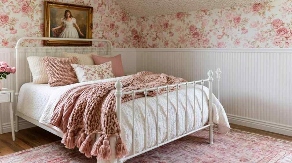
Blush pink and ivory tones create a soft, relaxing 2 BHK bedroom colour combination.
Bedrooms should feel relaxing while still complementing the rest of the apartment.
One bedroom can remain light and airy, while the second bedroom may incorporate slightly deeper colours without disrupting the home’s overall palette.
Kitchen and Hall Colour Pairings That Tie the Home Together
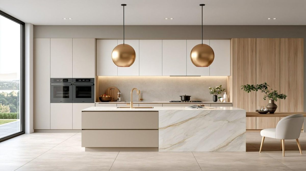
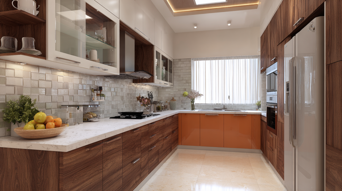
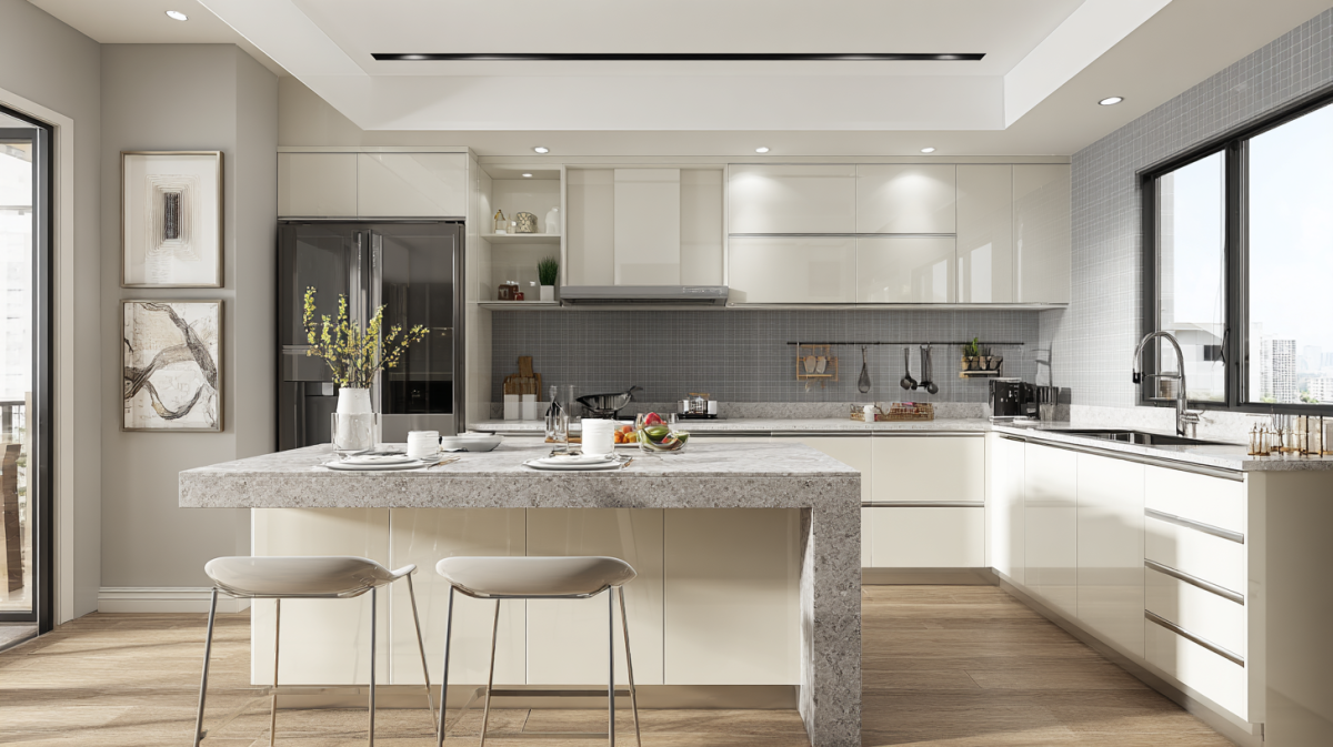
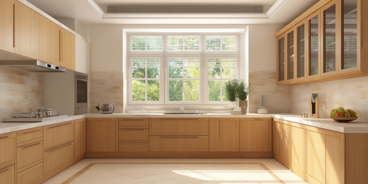
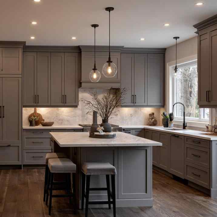
Warm grey cabinetry pairs beautifully with light countertops in this 2 BHK kitchen.
The kitchen and hall often share visual connections, making colour coordination especially important.
White cabinets paired with light wood finishes remain a timeless favourite.
Warm grey kitchens blend beautifully with beige or greige living rooms.
Sage green cabinetry complements cream walls throughout adjoining spaces.
Matte finishes generally create a softer, more contemporary appearance than glossy surfaces.
Repeating one accent colour in both the kitchen and living room helps create continuity without making the spaces feel repetitive. Small decorative details, such as cushions, artwork, or bar stools, can reinforce the chosen palette throughout the home.
Choosing One Colour Palette Across a 2 BHK (Dos and Don’ts)
Pairing fabric swatches and paint samples helps plan a cohesive 2 BHK colour palette.
A consistent palette creates a more elegant home, but balance is important.
Do
Choose one neutral base colour.
Limit the palette to three or four main colours.
Repeat similar wood finishes.
Coordinate flooring throughout the flat.
Use accent colours through furnishings and décor.
Mixing too many bold colours can make a 2 BHK flat feel cluttered, not cohesive.
Don’t
Paint every room in completely different colours.
Introduce too many bold feature walls.
Mix multiple wood finishes without a plan.
Ignore natural lighting in each room.
Follow short-lived colour trends without considering long-term appeal.
The best colour combination for 2 BHK flat creates visual continuity while still allowing each room to have its own personality.
Create a Beautifully Connected Home
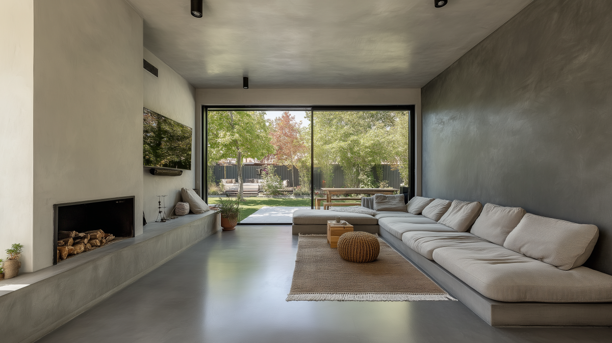
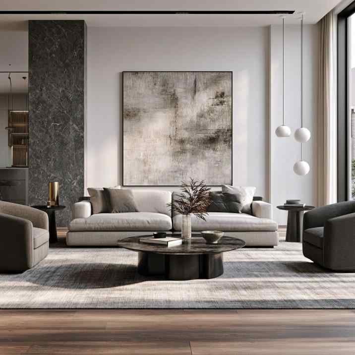
A soft grey and charcoal palette ties this 2 BHK living room together beautifully.
The right colour combination for 2 BHK flat brings every room together while making the entire apartment feel larger, brighter, and more welcoming. Whether you prefer soft neutrals, earthy greens, calming blues, or timeless beige palettes, consistency is the secret to achieving a professionally designed look.
At HomeLane, our designers create personalised colour palettes that work seamlessly with your furniture, lighting, and interior finishes. Book a free HomeLane consultation and transform your 2 BHK into a stylish home that’s thoughtfully coordinated from room to room.
When every room speaks the same design language, your home feels effortlessly elegant.
FAQs
1. What is the best colour combination for a 2 BHK flat?
Warm white paired with sage green, beige, greige, dusty blue, taupe, or soft grey creates a timeless and versatile palette. The ideal combination depends on your furniture, lighting, and personal style. Neutral bases also make it easier to refresh your décor in the future without repainting the entire home.
2. Should all rooms in a 2 BHK have the same colour theme?
No, but they should feel connected through a consistent base palette. Using complementary accent colours allows each room to have its own personality while maintaining visual harmony. This approach creates a smooth visual flow that makes the entire apartment feel larger and more cohesive.
3. Which colours make a small 2 BHK flat look bigger?
White, ivory, cream, beige, light grey, and soft pastel shades reflect more light and make compact spaces appear larger. Keeping ceilings and adjoining walls in similar light tones also enhances the sense of openness. Adding mirrors and maximising natural light further amplifies this spacious effect.
4. What are good colour combinations for a 2 BHK living room and bedroom together?
A living room in warm white and sage green pairs beautifully with bedrooms in dusty blue and grey or olive green and beige. Coordinating wood finishes and fabrics helps maintain a cohesive look.
5. How many colours should be used in a 2 BHK flat interior?
Limiting your home to one neutral base colour, one or two accent shades, and a consistent wood finish usually creates the most balanced result. Too many unrelated colours can make the apartment feel visually cluttered.
6. What colour combination works well for a 2 BHK flat on a budget?
Warm white walls combined with beige, light grey, or sage green accents offer an elegant look without requiring expensive finishes. Simple paint updates, coordinated furnishings, and matching soft furnishings can completely transform the space.









 EXPLORE MORE