Colourful Interior Design: How to Use Colour Without Overdoing It
By Usha Balasubramanyan- September 24, 2026
Summary
Colourful interior design creates warm, welcoming homes when colour is layered thoughtfully with neutral tones, natural materials, and balanced layouts. By choosing a consistent palette and introducing colour strategically, you can design rooms that feel lively, stylish, and timeless. The best colourful interiors aren’t the brightest—they’re the ones where every colour has a purpose!
Expert Tip
Follow the 60-30-10 rule when planning colourful interiors. Use 60% of one dominant colour, 30% of a secondary shade, and 10% as a bold accent to create a balanced, cohesive space.
Best For
Creative home interiors in maximalist and minimalist styles
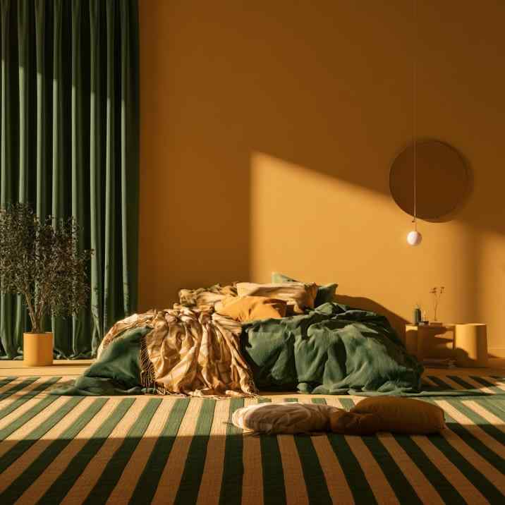
Mustard walls and deep green bedding create a cozy, colourful bedroom.
A colourful home has a personality all its own. It feels welcoming, cheerful, and full of life, reflecting the people who live in it rather than simply following the latest trends. But creating a vibrant interior doesn’t mean painting every wall a different shade or filling every corner with bright décor.
The secret to successful colourful interior design is balance. Carefully chosen colours, layered thoughtfully with neutral tones, natural textures, and good lighting, create spaces that feel lively without becoming overwhelming. Whether you prefer soft earthy hues, bold jewel tones, or playful accents, there’s a colourful style that suits every home.
When colour is used intentionally, it becomes the easiest way to make your interiors feel unique.
What Are the Best Colour Combinations for a Colourful Interior?
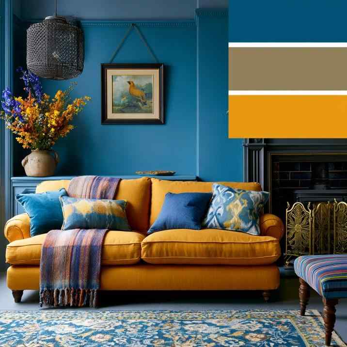
Navy blue walls paired with a mustard sofa show bold colour balance.
The most successful colourful homes start with a balanced palette. Rather than introducing many unrelated shades, choose two or three dominant colours and repeat them throughout the home using walls, furniture, artwork, textiles, and accessories.
Popular combinations include navy and mustard, sage green and terracotta, blush pink with olive green, teal and warm wood, or rust paired with cream.
Jewel tones such as emerald, sapphire, and burgundy create rich, sophisticated interiors, while pastel palettes feel lighter and more relaxed.
Colour also becomes easier to manage when balanced with white, beige, greige, or timber finishes.
Modern Colourful vs Maximalist Colourful Interior Design: What’s the Difference?
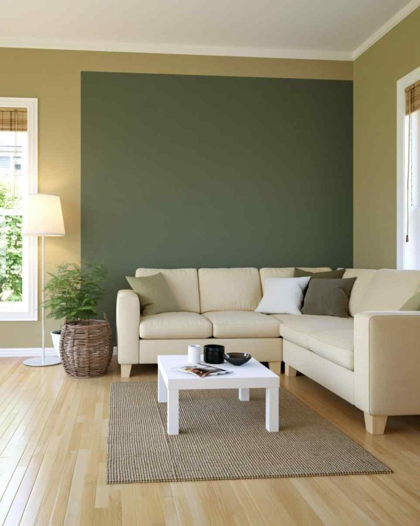
An olive green accent wall adds colour to a neutral, minimalist living room.
Both styles embrace colour, but they do so very differently.
Modern colourful interior design uses bold colours selectively, pairing them with clean lines, simple furniture, and uncluttered layouts. One statement sofa, colourful artwork, or painted feature wall often provides enough visual interest. This approach creates vibrant spaces that still feel calm, sophisticated, and easy to live in.
Maximalist colourful interior design, on the other hand, celebrates abundance. Rich colours, layered patterns, vintage pieces, statement lighting, decorative objects, and mixed textures all work together to create an expressive, collected look. It feels like a beautifully woven tapestry, where every colour, texture, and treasured piece tells part of your home’s story.
The key to successful maximalism is intention rather than randomness. Even busy rooms benefit from a consistent colour palette that ties everything together.
How Do You Bring Colour into Each Room Without It Feeling Overwhelming?
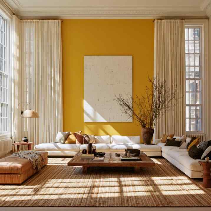
A mustard yellow accent wall brings warmth to a modern white living room.
Not every room needs the same level of colour intensity. In fact, too much of colour can quickly become too much!
Living rooms work beautifully with colourful sofas, rugs, cushions, artwork, or feature walls.
Bedrooms usually benefit from softer palettes paired with colourful bedding or upholstered headboards.
Kitchens can introduce colour through cabinetry, splashbacks, bar stools, or lighting, while bathrooms often rely on colourful tiles or accessories.
Instead of painting every surface, spread colour throughout the room using furniture, fabrics, lighting, and décor.
Our blog on Living Room Colour Combinations showcases several balanced palettes that feel vibrant without becoming overpowering. And if you’re looking for fresh wall colour inspiration, these wall painting colour ideas give you plenty of ideas for introducing colour in creative ways in every room!
What Colourful Interior Design Mistakes Should You Avoid?
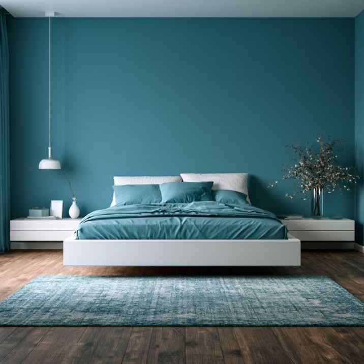
Teal walls and bedding create a calm, colourful modern bedroom.
The biggest mistake is using too many competing colours. Without a clear palette, rooms can quickly feel chaotic rather than vibrant.
Another common error is forgetting about undertones. Warm and cool colours don’t always complement each other, even if they’re individually attractive.
Poor lighting can also change how colours appear throughout the day, making some shades look dull or harsh.
Many homeowners overlook the importance of neutral space. White walls, timber furniture, or natural textures give bright colours room to breathe and prevent visual overload.
Finally, avoid following every colour trend. Choosing shades you genuinely enjoy usually leads to interiors that remain appealing for much longer.
Let Colour Tell Your Story!
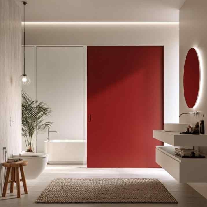
A bold red accent wall gives this modern bathroom colourful personality.
A successful colourful home interior design doesn’t rely on using more colours…it relies on using the right colours thoughtfully. Whether you prefer subtle earthy tones, playful contrasts, or bold statement shades, careful planning helps every room feel vibrant without becoming overwhelming.
At HomeLane, our designers create personalised interiors that combine colour, texture, lighting, and layout into spaces that feel both beautiful and practical. Book a free HomeLane consultation and discover how colour can completely transform your home.
Sometimes, the happiest homes are simply the most colourful ones!
FAQs
1. How do I choose colours for my home interior?
Start with a neutral base and select two or three complementary colours that can be repeated throughout the home. Testing paint samples in natural and artificial light helps ensure the colours work well all day.
2. What are some colourful interior colour combinations for your home?
Popular combinations include sage and terracotta, navy and mustard, blush and olive, teal and warm wood, or emerald with cream. Choose combinations that complement your home’s lighting and overall style.
3. How many colours should I use in one room?
Most professionally designed rooms use three main colours following the 60-30-10 rule. This creates visual balance while still allowing personality to shine through.
4. Is colourful interior design suitable for a small home?
Absolutely. Lighter colourful palettes, strategic accent colours, and plenty of natural light can make smaller spaces feel energetic without looking crowded. Avoid using too many dark colours in compact rooms.
5. Which rooms work best for bold colour choices?
Living rooms, dining rooms, powder rooms, and children’s bedrooms are excellent spaces for experimenting with stronger colours. Bedrooms usually benefit from softer palettes that promote relaxation.
6. Why does my colourful accent wall look too overwhelming?
The surrounding décor may not provide enough visual balance, or the chosen colour may be too saturated for the room’s size and lighting. Pairing bold walls with neutral furniture and accessories often creates a more harmonious look.
7. Why does colourful paint fade or look dull after a few months?
Poor-quality paint, excessive sunlight, moisture, or improper surface preparation can all affect colour longevity. Choosing high-quality paints and suitable finishes helps colours stay richer for much longer.










 EXPLORE MORE