10 POP Design Colour Combinations You’ll Love in 2026
By Usha Balasubramanyan- April 21, 2026
Summary
Ceilings are usually the last thing we think about. Most people paint them white and just move on to the more exciting parts of the room. But in 2026, POP ceilings are no longer an afterthought. The right POP colour combination can make a small room feel taller, a dark hall feel brighter, and your bedroom feel more layered. The trick is not just picking a pretty shade. It is all about getting the feel for light, finish, and how your ceiling works with your walls. This guide walks you through ten combinations that actually work in Indian homes, along with practical tips to avoid common colour mistakes!
Best for:
Homeowners updating POP ceilings in 2026 who want balanced, light-enhancing colour combinations.
Expert Tip:
HomeLane designers suggest finalising the overall colour palette for your room, before selecting your ceiling POP colour combination. A complementary palette always feels put-together and visually cohesive.
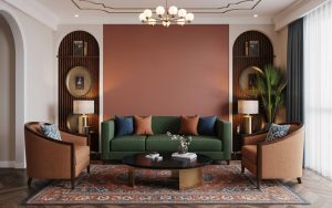
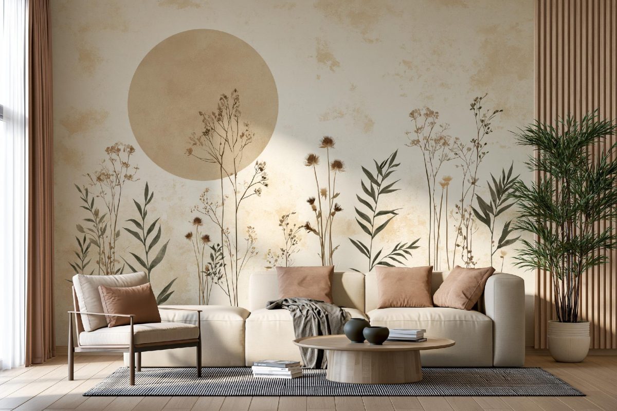
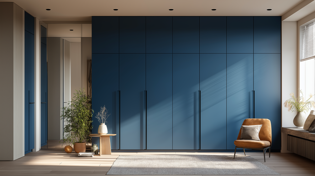
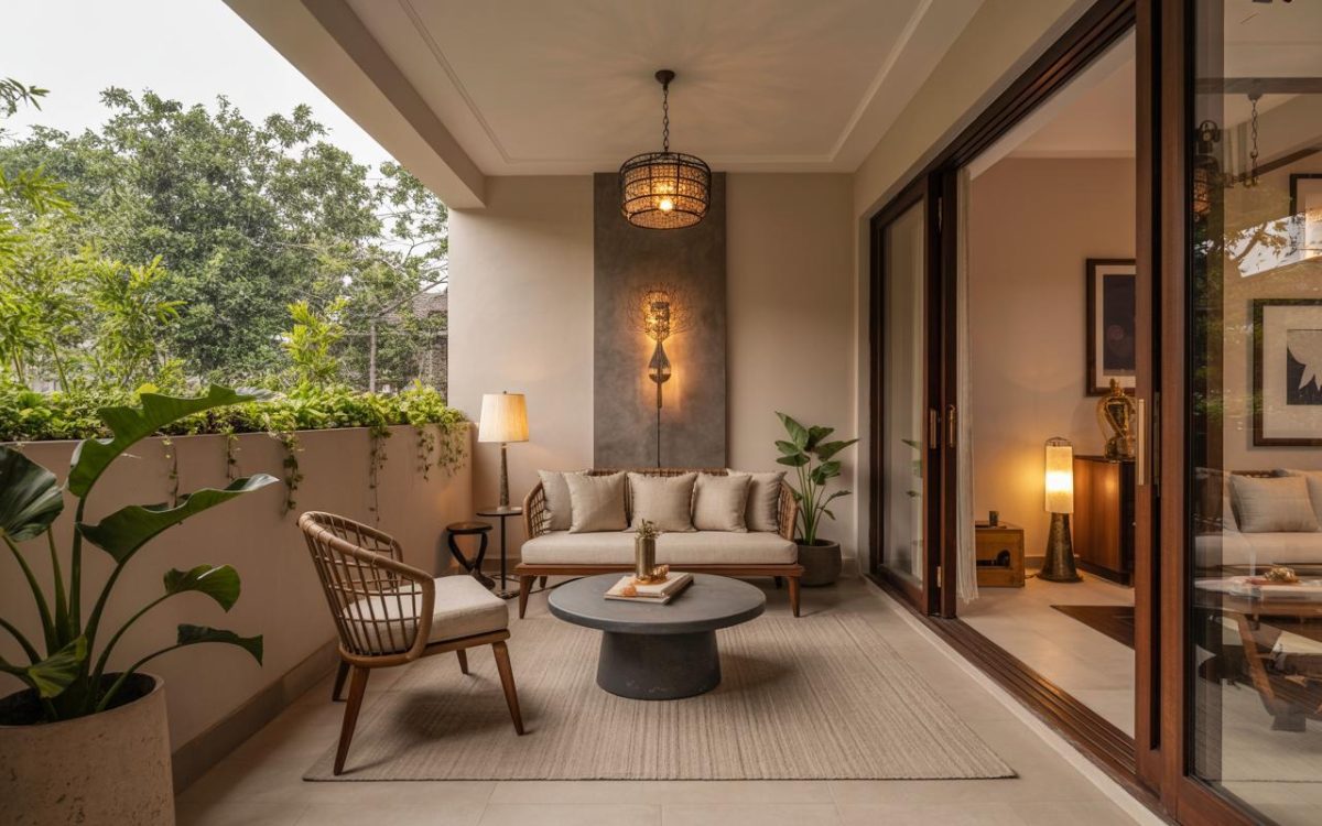
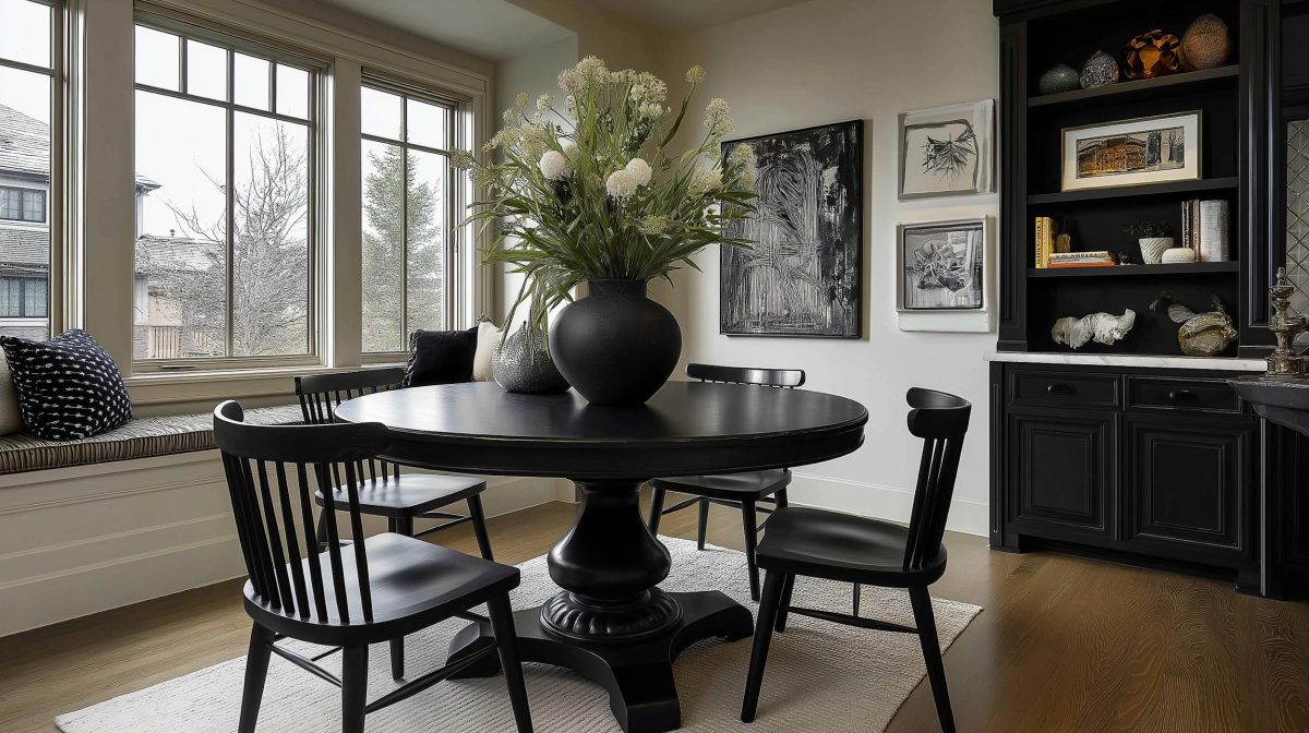
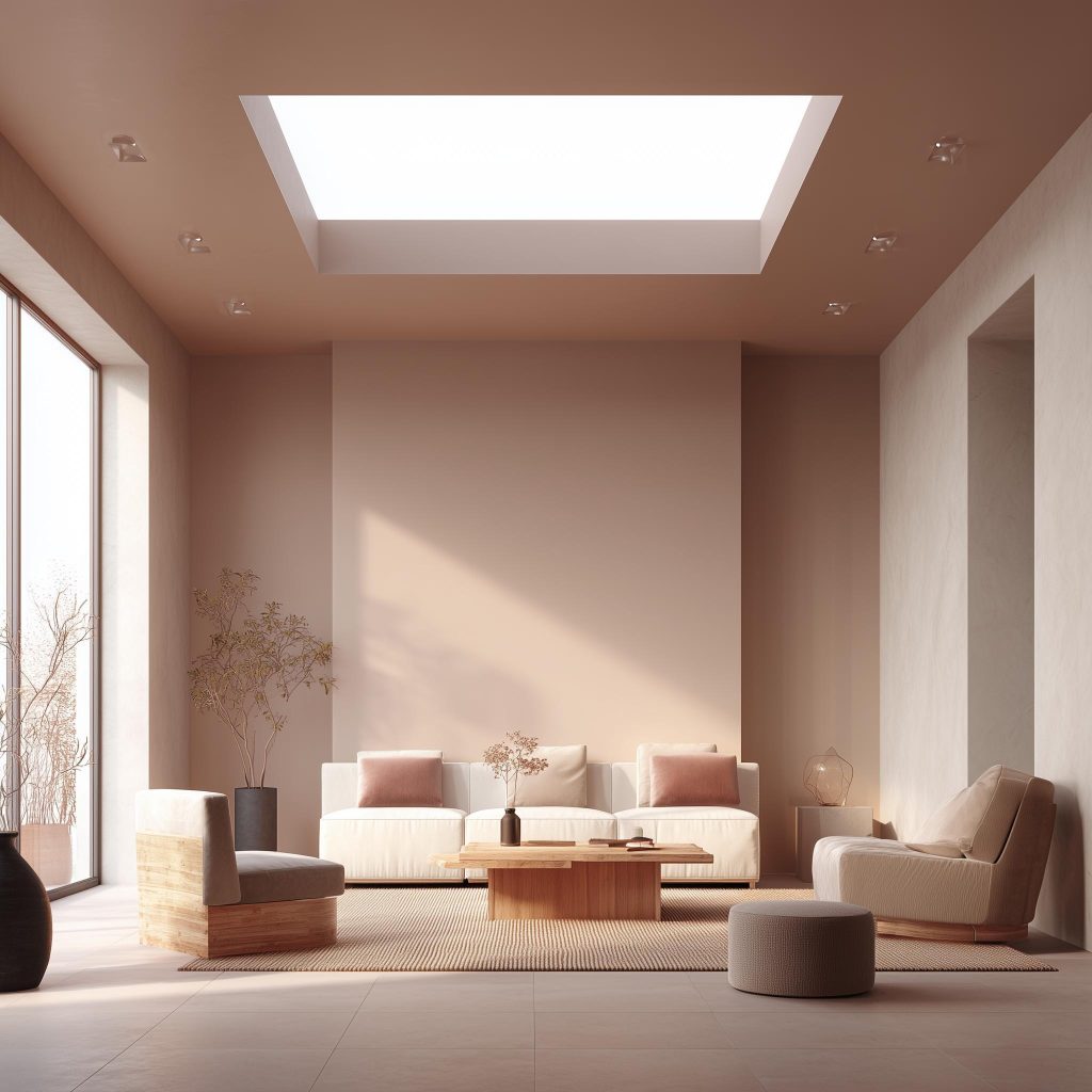
Stylish sage green and white pop and wall colour combination.
When was the last time you really looked at your ceiling?
Most homes default to plain white. It’s safe, it’s oh-so-predictable. Done! But a thoughtful POP design colour combination can completely transform the vibe of any space. It can soften harsh lighting, balance bold walls, or effortlessly add extra dimension to your rooms.
If you are planning a renovation this year, let us rethink that fifth wall!
Ten POP Colour Combinations That Actually Work
1. White and Soft Beige for Calm Living Spaces
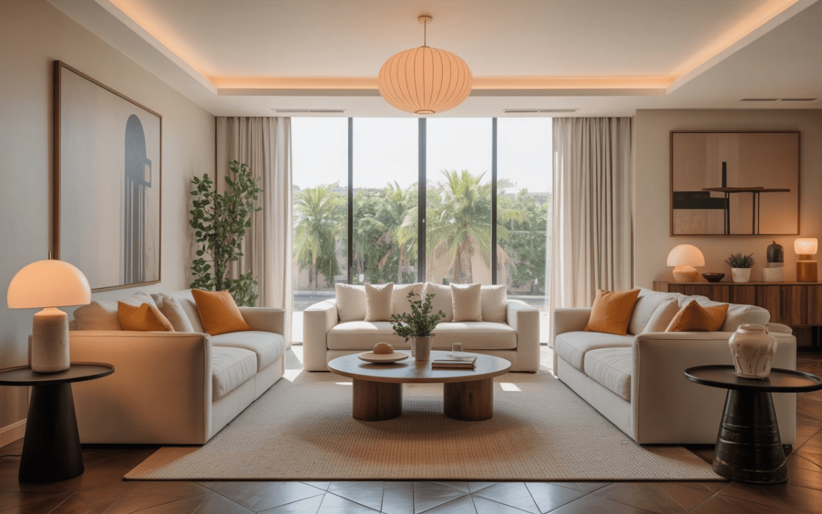
Modern pop colour combination for living room with warm lighting.
A classic POP colour combination with white paired with warm beige works beautifully in living rooms. It reflects light gently without feeling boring.
For a hall POP colour combination, this duo keeps your space open while adding subtle warmth.
2. White and Light Grey for Modern Homes
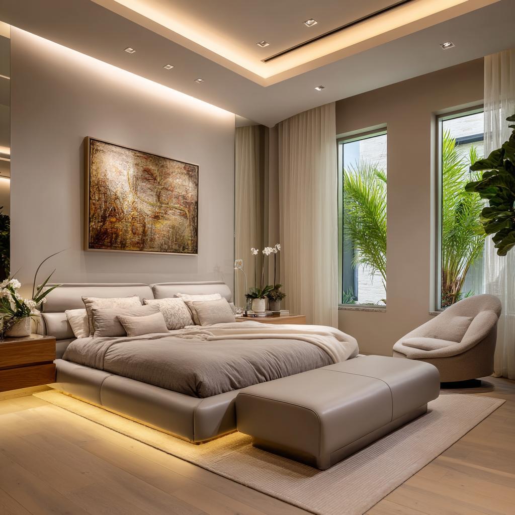
Sophisticated bedroom pop colour combination in grey and gold.
If you prefer a low-key look, white with pale grey, or even just all-grey, is a lovely POP ceiling colour combination.
This is also a safe ceiling POP colour combination when you want sophistication without too much of unnecessary drama.
3. Cream and Warm Taupe for Bedrooms
Elegant pop color combination for bedroom with layered lighting.
For a soothing bedroom POP colour combination, cream with taupe creates depth without darkening the room.
It pairs beautifully with wooden furniture and layered bedding.
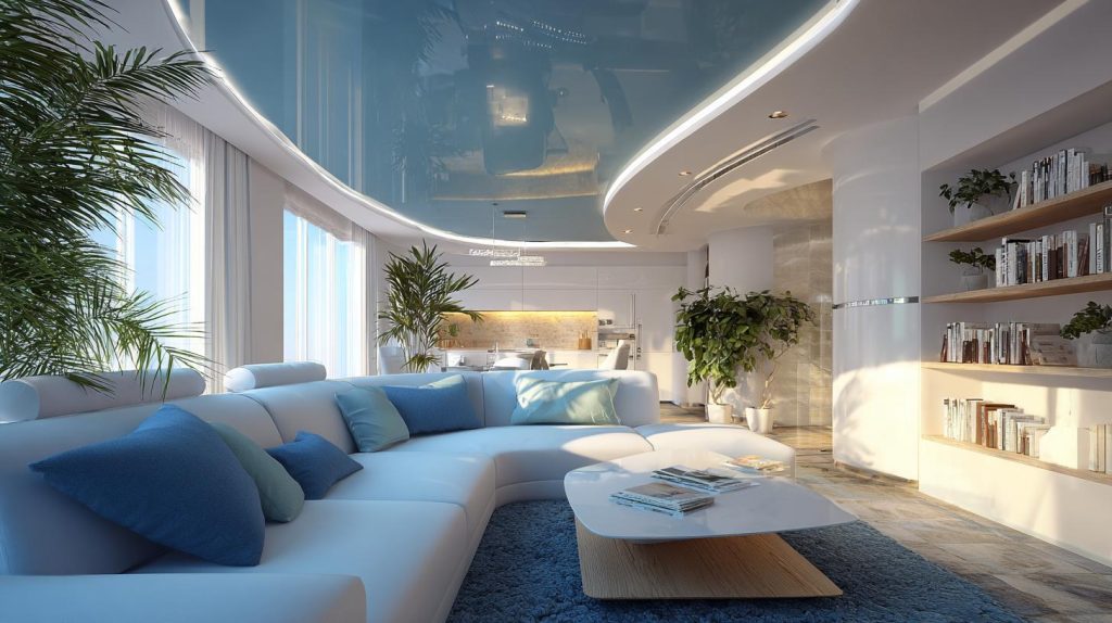
4. White and Pastel Blue for Airy Halls
Reflective and bright hall pop colour combination for open areas.
A soft blue inset within a white POP frame creates a refreshing POP colour combination for hall areas.
It is especially useful in spaces that receive strong afternoon light.
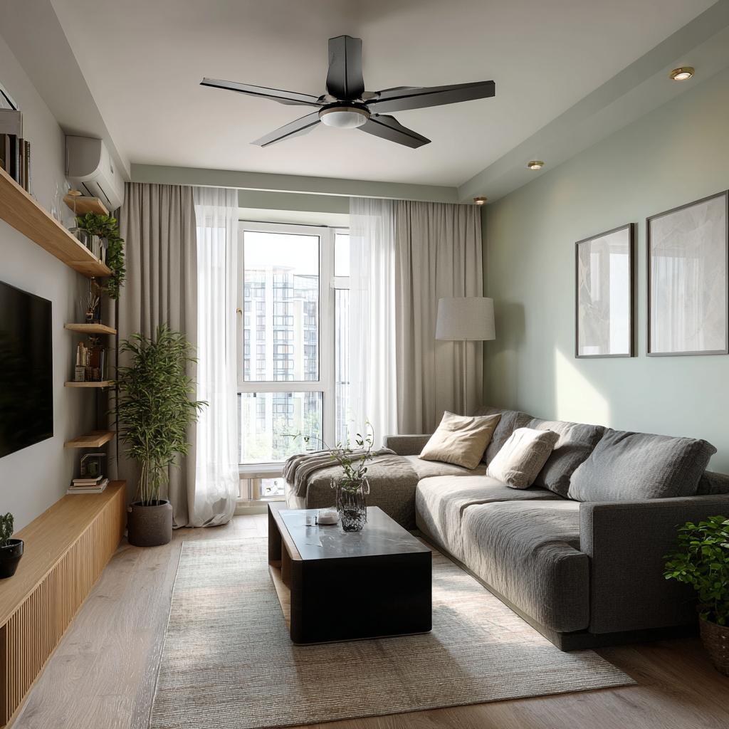
5. Off-White and Sage Green for Subtle Accent
Fresh and trendy pop design colour combination for small halls.
Sage green borders within a white ceiling create a gentle POP and wall colour combination when matched with similar tones on the walls.
It works well in living rooms that need softness rather than bold contrast.
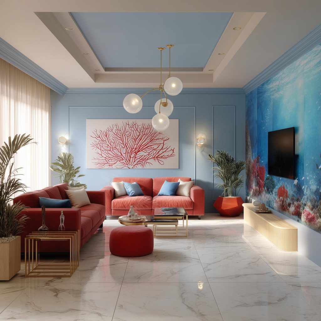
6. Ivory and Mustard for Statement Ceilings
Premium pop color combination for hall in a luxury villa space.
Use this carefully in larger spaces. Smaller rooms may feel compressed if the shade is too strong.
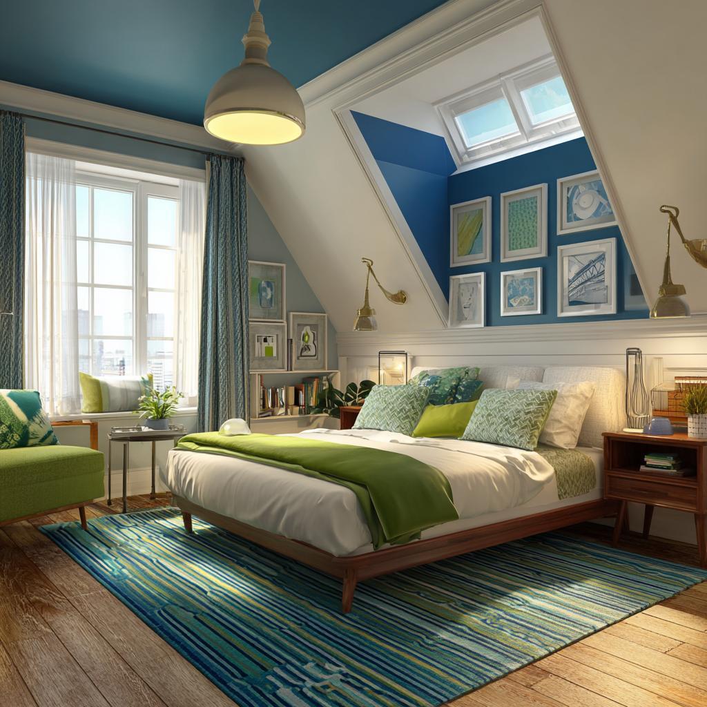
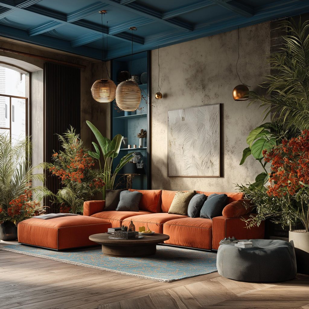
7. White and Dark Blue for Dramatic Contrast
Bold pop color combination for bedroom with unique attic layout.
If your space has plenty of natural light, a white base with blue accents can serve as a bold roof POP colour combination.
Avoid this combo in low-light rooms, as darker hues will reduce perceived height.
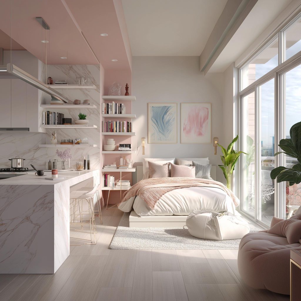
8. White and Blush for Soft Bedrooms
Chic pink and white pop colour combination with white accents.
Blush works beautifully as a POP colour combination for bedroom spaces. It feels warm and inviting without overpowering the décor.
Pair with soft lighting for best results.
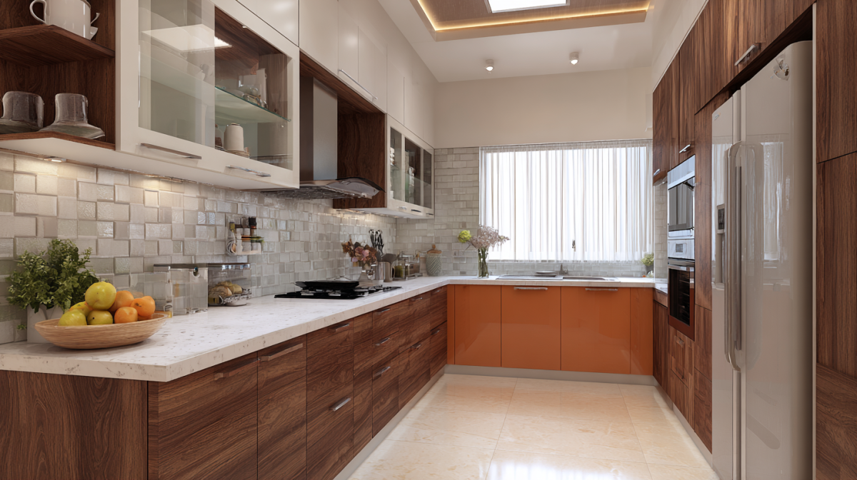
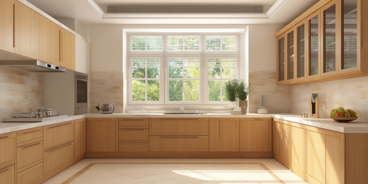
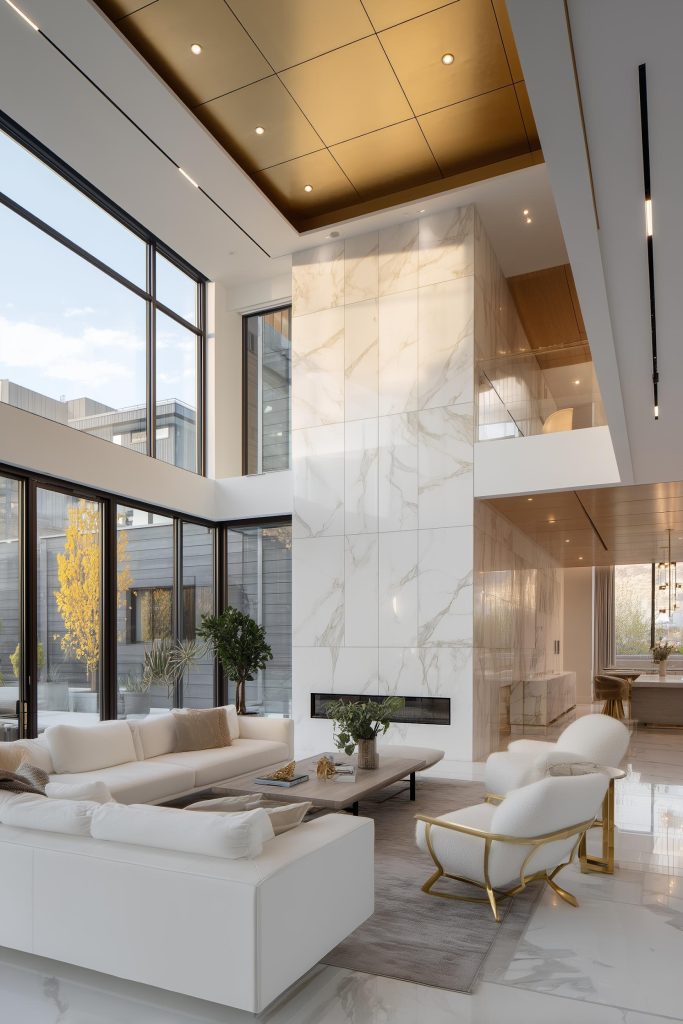
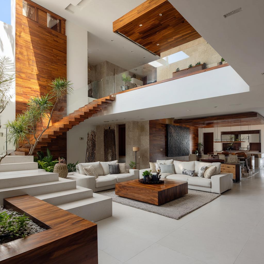
9. Neutral White and Wood Tones
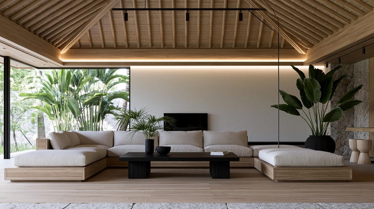
Natural wood-textured roof pop colour combination for large halls.
In rooms with wooden furniture, a white ceiling paired with wood-textured insets complements the wooden furniture in the room, and enhances natural warmth.
This subtle POP colour combination keeps the ceiling from feeling flat.
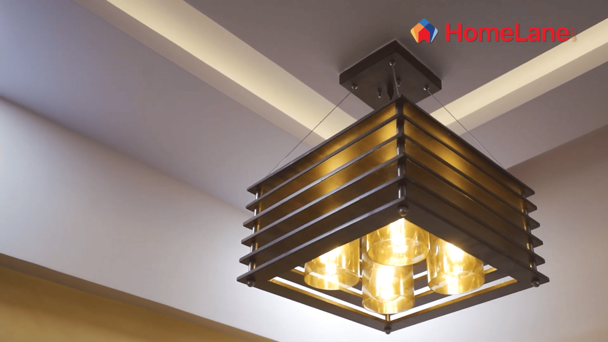
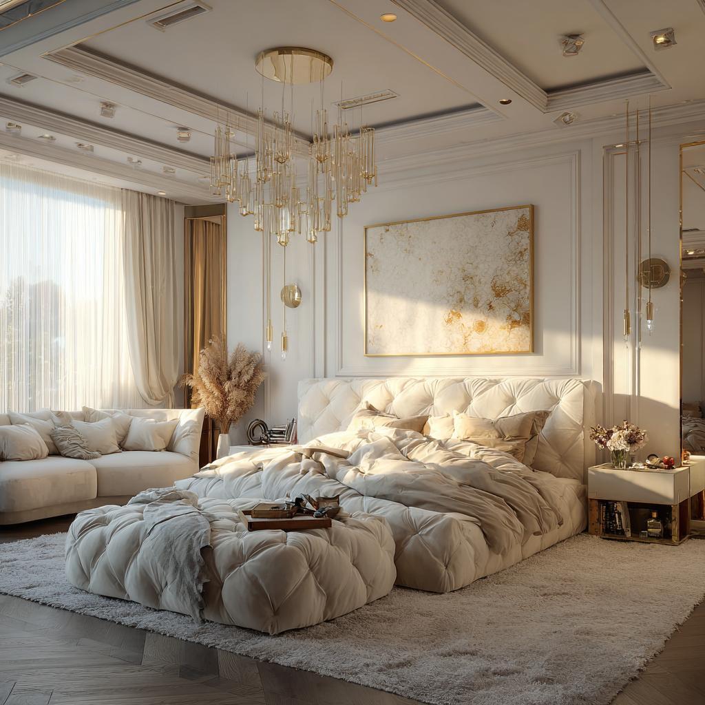
10. White and Metallic Highlights for Modern Touch
Elegant pop ceiling design colour combination for master suites.
It adds quiet glamour without overwhelming the room.
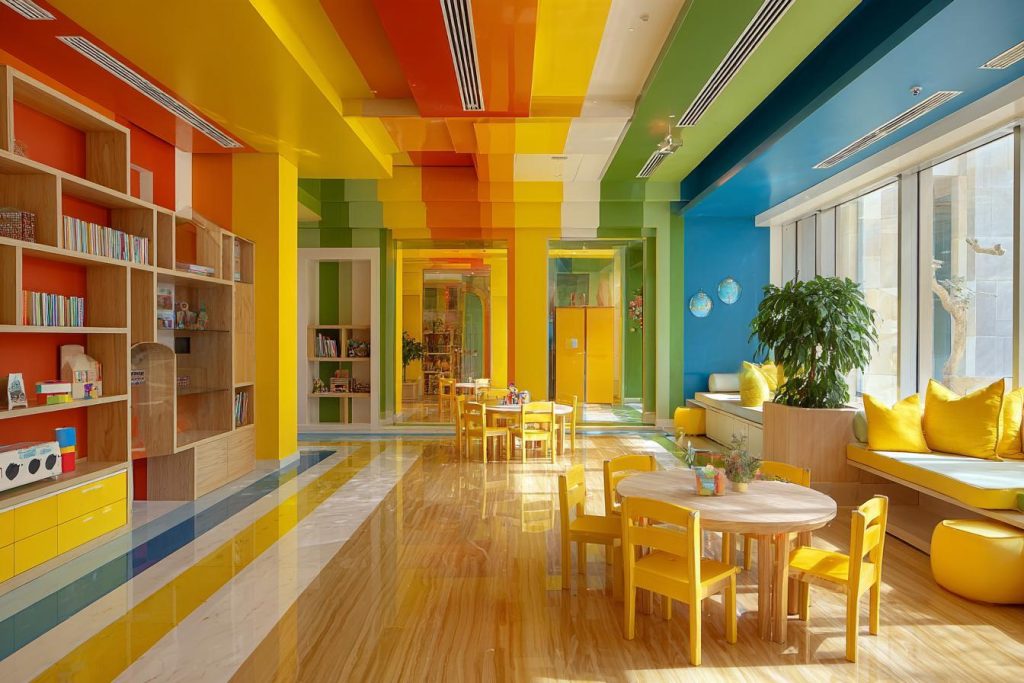
Understanding Light Reflectance Value Principles
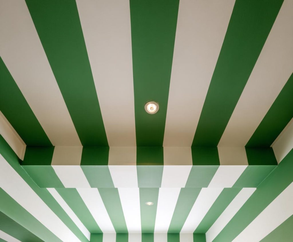
Bold and bright pop design color combination for school playrooms.
Light Reflectance Value, or LRV, measures how much light a colour reflects. Higher LRV shades make rooms feel brighter. Lower LRV shades absorb light.
For Indian homes with limited daylight, lighter ceilings are usually more forgiving.
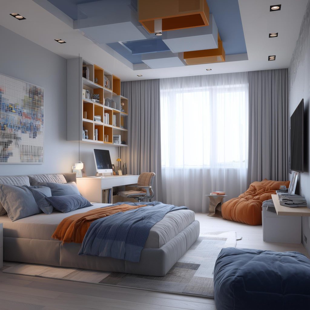
Choosing Warmer and Lighter Neutral Tones
Vibrant pop color combination for bedroom with creative panels.
Warmer neutrals often feel more welcoming than cool greys. In a POP colour combination for living rooms, warm whites, creams, and light beiges prevent the space from feeling clinical.
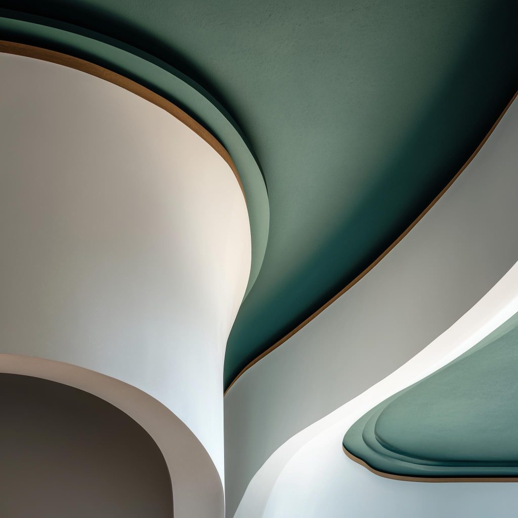
Strategic Use of Accent Walls and Bright Colours
Modern pop ceiling colour combination for hall with curved lines.
If you love bold colours, keep them limited to borders or recessed sections. A balanced POP design colour combination allows colour without shrinking the room.
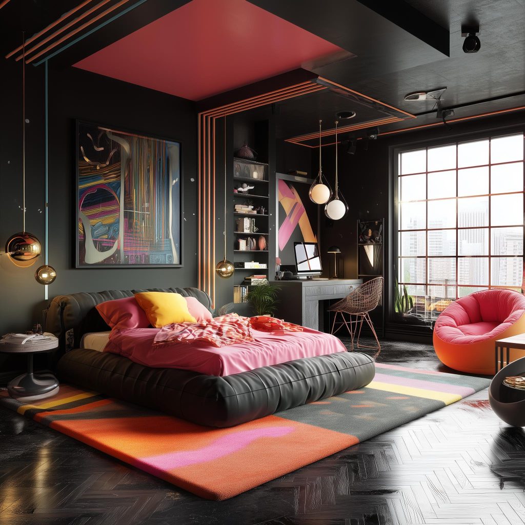
Avoiding Dark and Cool Colour Pitfalls
Bold black and pink pop color combination for a modern bedroom.
Dark blues or deep greys on ceilings can lower perceived height. Use them only in large rooms with strong lighting.
Coordinating Colours with Natural and Artificial Light
Modern ceiling pop colour combination with fluid layered curves.
Always observe how your ceiling shade looks at different times of the day. A POP colour combination may appear lighter in the morning and warmer at night.
Testing Colours with Samples in Actual Lighting
Never skip sampling. Paint a small section and observe it for a few days. This prevents regret later.
POP Finish Selection: Matte vs Glossy
Serene sky blue and cream pop ceiling colour combination for hall.
Matte finishes absorb the light and hide imperfections. Glossy finishes reflect and bounce around more light but highlight surface flaws.
For most Indian homes, matte works better for a refined look.
Enhancing Colours with Complementary Decor
Industrial chic pop colour combination for hall with teal beams.
Your ceiling colours should connect visually with the furniture, curtains, or rugs. A thoughtful POP ceiling colour combination for halls feels lovely when the palette is tied together across the room.
Wrapping Up
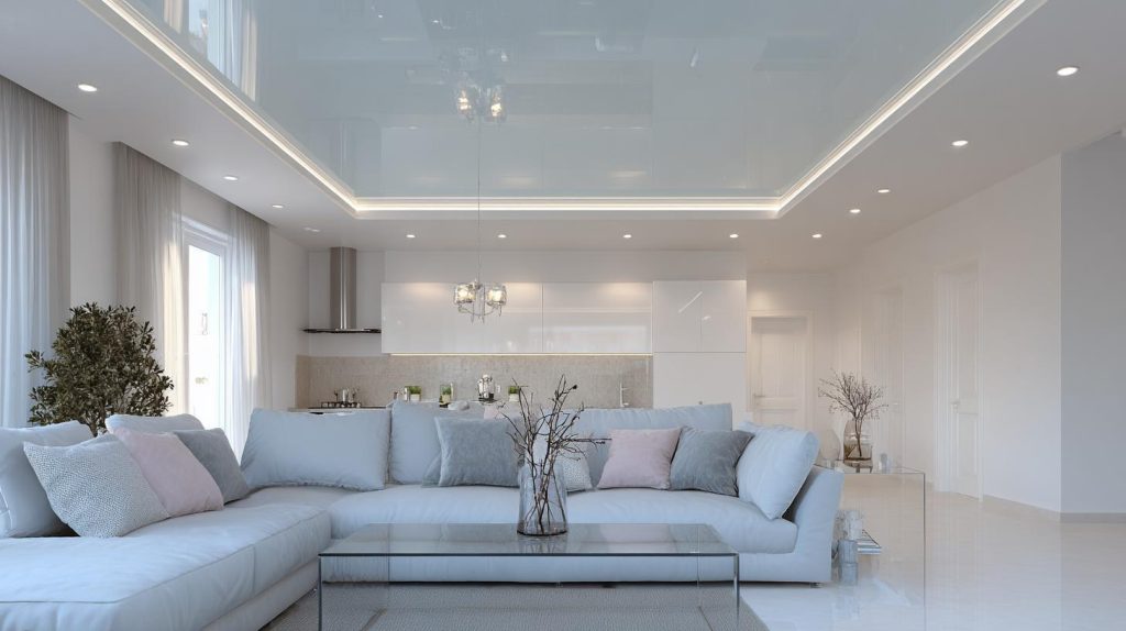
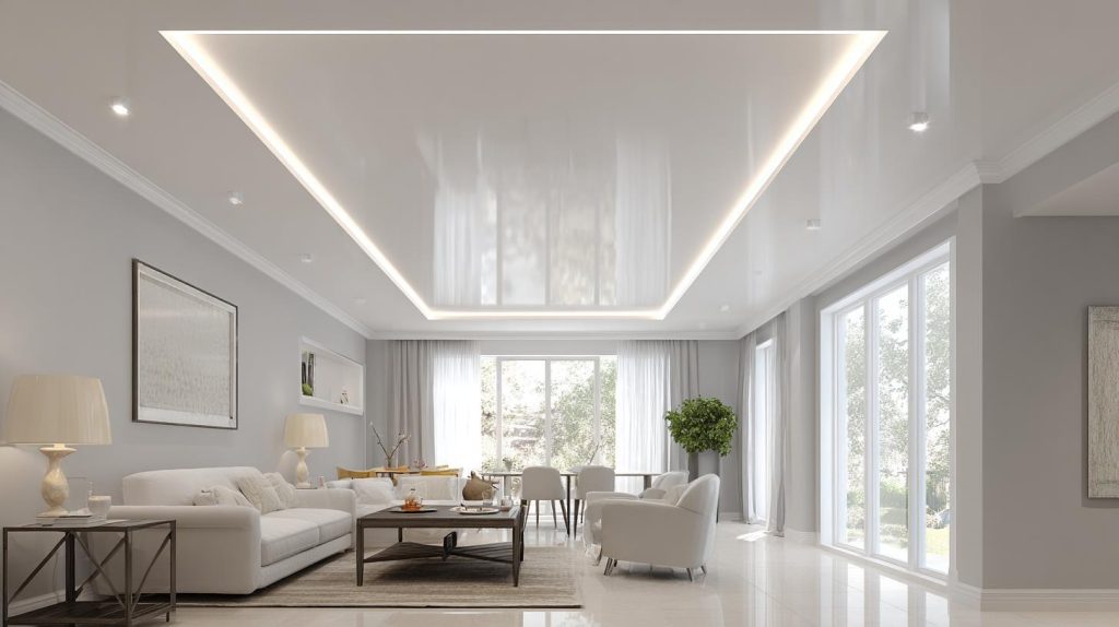
A modern glossy white and grey ceiling pop colour combination with warm cove lighting.
A well-planned POP ceiling is not about showing off. It is about balance. Light, proportion, and subtle colour shifts can transform a space without overwhelming it.
If you are unsure which POP colour combination suits your home, HomeLane designers can help you test shades, evaluate lighting, and choose a ceiling design that feels both modern and timeless.
FAQs
1. What is the best colour for a dark room in India?
Light shades such as warm white, cream, or pale beige reflect more light and help brighten dark rooms. Use paint that is a bit reflective to bounce the light around.
2. Should I use dark colours on the ceiling?
Dark colours can work in large, well-lit spaces but may make smaller rooms feel like the height is lower, or the walls are closing in.
3. How does lighting affect POP wall colour?
Natural and artificial lighting tend to change how colours appear. Always test shades in your actual room, and at different times of the day, before finalising.
4. Are matte finishes better than glossy for low-light rooms?
Yes, it’s safer to use matte finishes as they hide surface imperfections and reduce glare. On the other hand, glossy finishes can increase the amount of light in a too-dark room.
5. Can I use bold colours in a room with little natural light?
Yes, but limit bold colours to accents rather than full ceilings to avoid overwhelming the space. For instance, you can use them as borders, paired with white or a lighter shade.


 EXPLORE MORE