One of the most important decisions that you will ever make when doing up your home is the choice of colour palette for each room and your overall home decor ideas. If you didn’t already know this, colours are powerful! When you enter a room that is done up in shades of sunshine yellow, don’t you feel a zing in your step? And when you are surrounded by drab browns, moody blues and black, you might be forgiven for feeling low. Colours have the power to evoke moods, energize or depress you, and impact the way you feel about a space.
All the colours you use in a room should narrate a winning story that matches your personality. And it goes without saying that the colours you pick for the walls, upholstery, drapes and accessories should pair well with the wood details in the room; whether its flooring, ceilings, furniture or doors and windows.
How can you pick the right colours for your furniture? Here are some combinations that work!
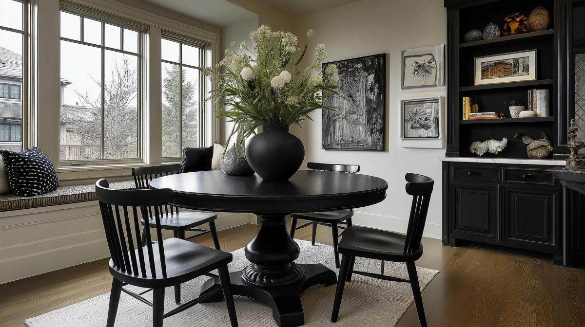
Make a Stunning Statement
Woods with golden-yellow tones, like this warm walnut sideboard and chair, pair well with a wide range of greens and blues, as we can see here. This wall is a deep shade of poster green, but any green shade—right from lemony chartreuse to dark pine — would work as well. The polished walnut flooring matches the furniture and ties the room together.
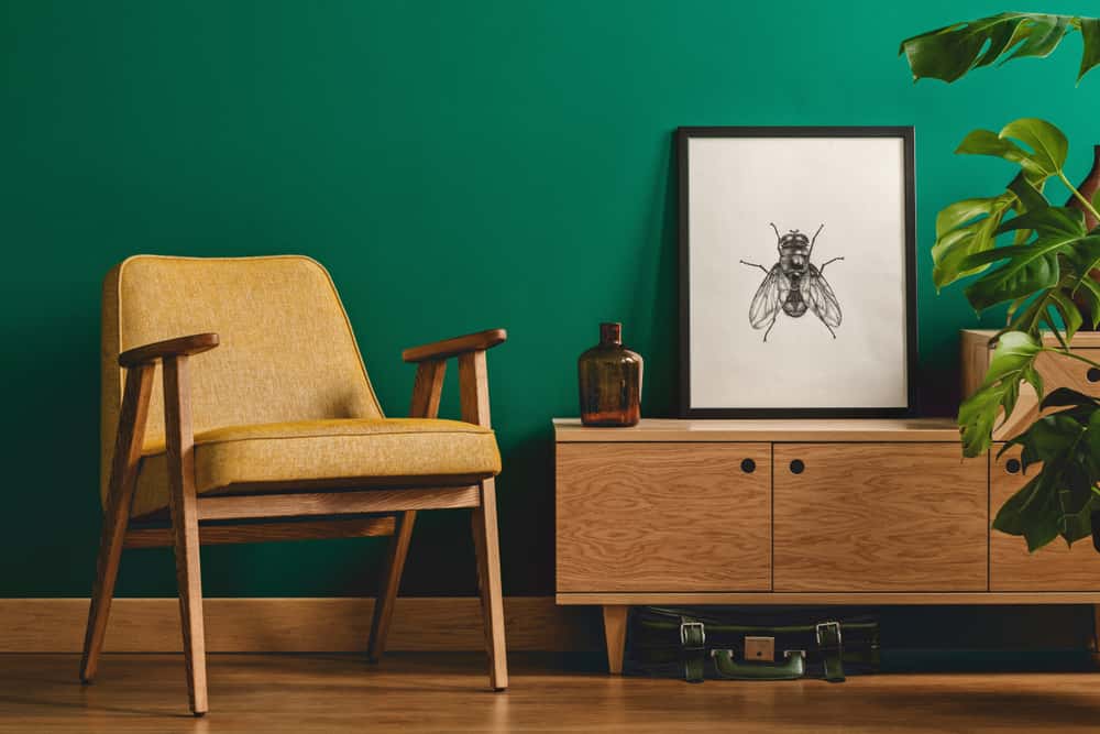
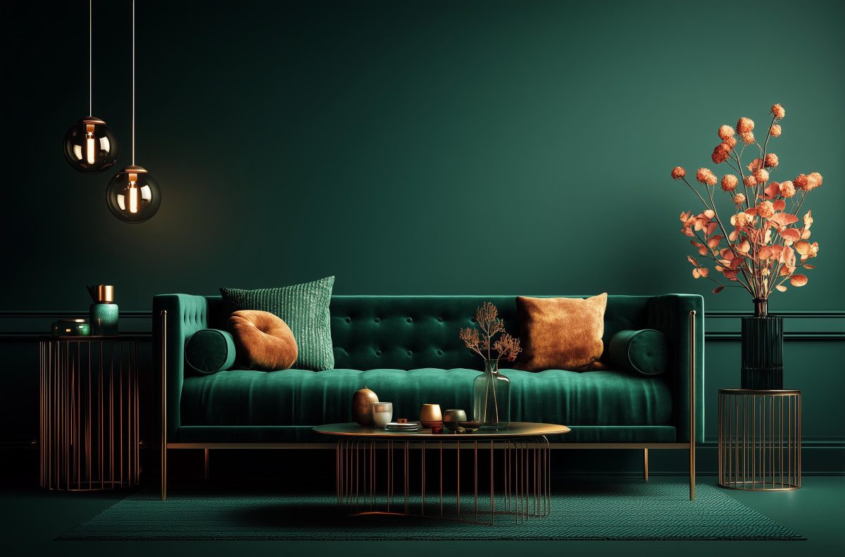
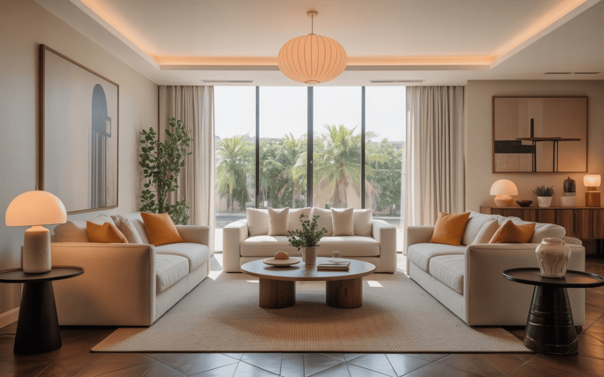
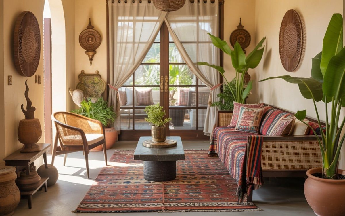
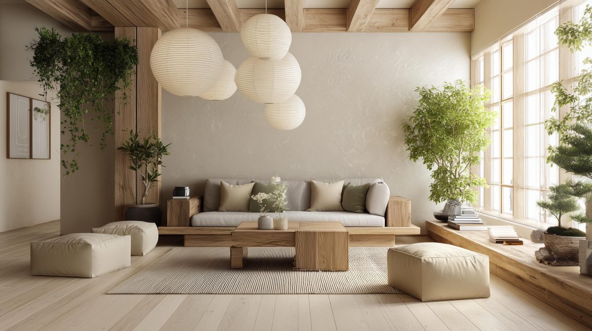
A Cascade of Colours
Oakwood has very distinctive and pretty grains, and goes well with just about any colour in the spectrum! Case in point is this living room, where the stunning oak floor relates well to the triad of grey, orange and green in the walls, artwork and cushions. The arresting colour palette draws focus on the modern white sofa, a study in understated elegance.
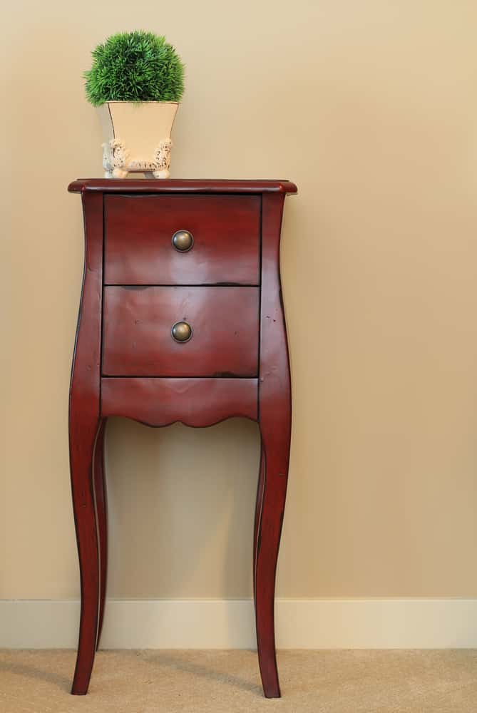
Mahogany Magic
Mahogany is a shade that demands attention, with its deep red tones and distinctive warm patina. Pick colours that will balance the richness of the red, such as toasty shades of beige or khaki, or even grey or cream. Avoid shades of blue, violet or aqua that would clash badly with mahogany. Here, this mahogany wooden dresser sits pretty against a wall painted a lovely shade of buttery cream.
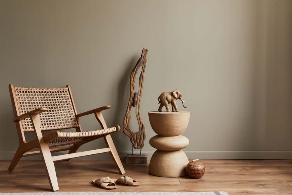
Handsome Pairing
The rich notes and lovely grains of polished teak wood are showcased to perfection by warm, saturated neutrals, like this taupe wall. The colours of the teakwood chair and driftwood sculpture are exquisitely highlighted, yet touched with a quiet elegance that calms and comforts.

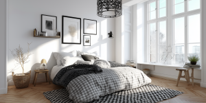
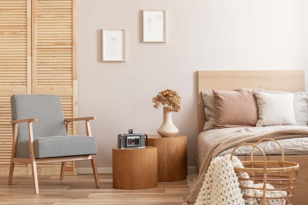
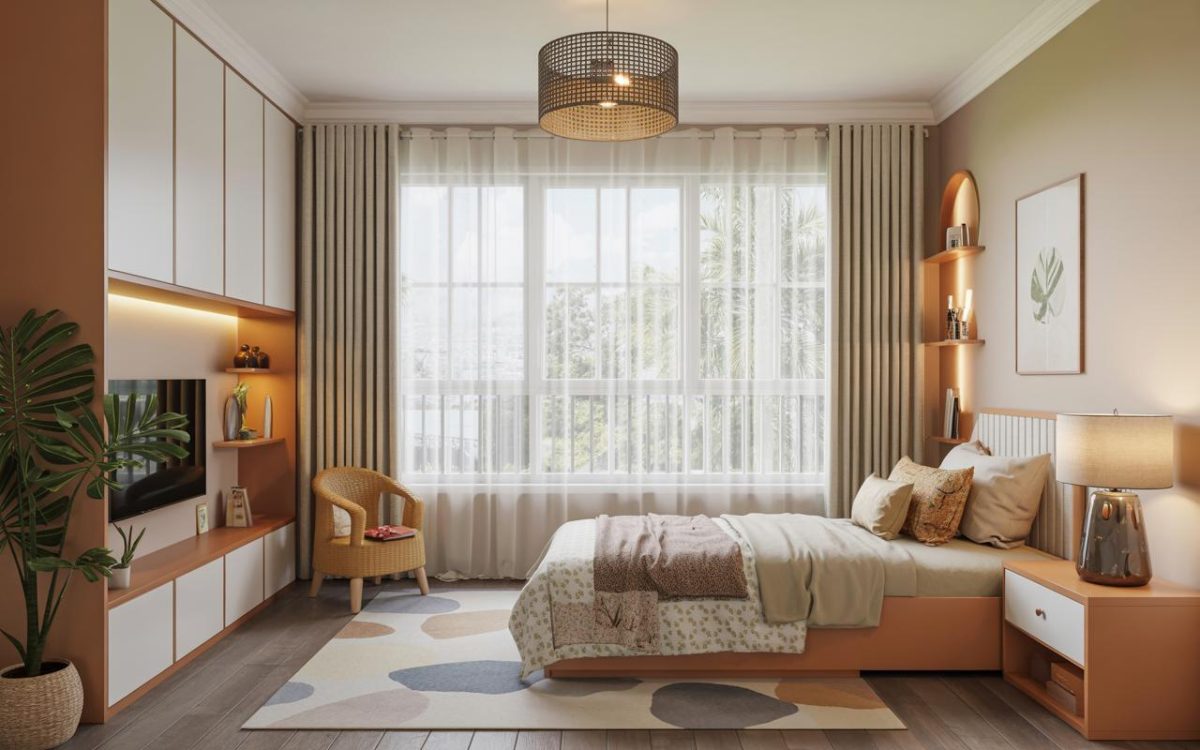
A Symphony in Pastels
Soft and airy yet versatile, pastel colours are always the right choice for a bedroom. This charming space is painted in soft pastels, right from the blonde slats of the white cedar cabinets to the golden hues to the light wood furniture, shown to perfection against the rose-tipped walls and the blush bedcovers. The armchair upholstered in dotted grey provides a subtle contrast.
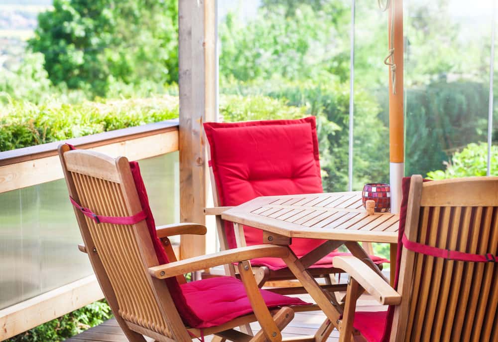
It’s Tea-time!
Add vibrancy to tea time with these tie-up crimson chair cushions that call attention to the Scandinavian-style cedar wood chairs. Note how the solid, saturated colours stand out in sharp contrast to light or medium tones of wood. The opposite also applies, and you can pay more attention to darker shades of wood by contrasting them against light, neutral or toned-down colours.
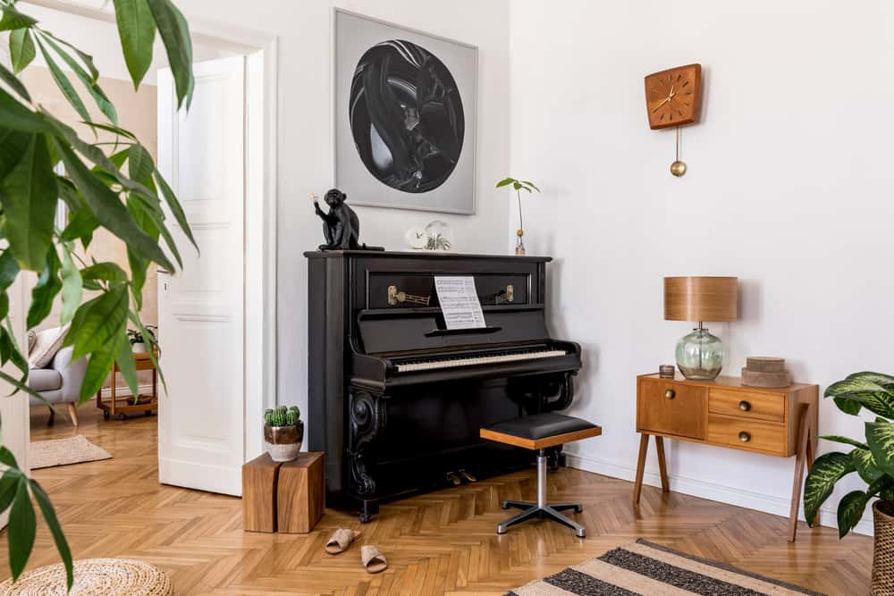
Different Strokes
When combining different shades of wood in the same space, it pays to pick a neutral colour palette like white, cream or soft grey. The white paint and other accessories in this gorgeous family room accentuate and enhance the beauty of the rosewood piano, wooden parquet flooring, and teak sideboard — allowing each piece to have its own individuality and yet harmonize beautifully with the totality of the room.
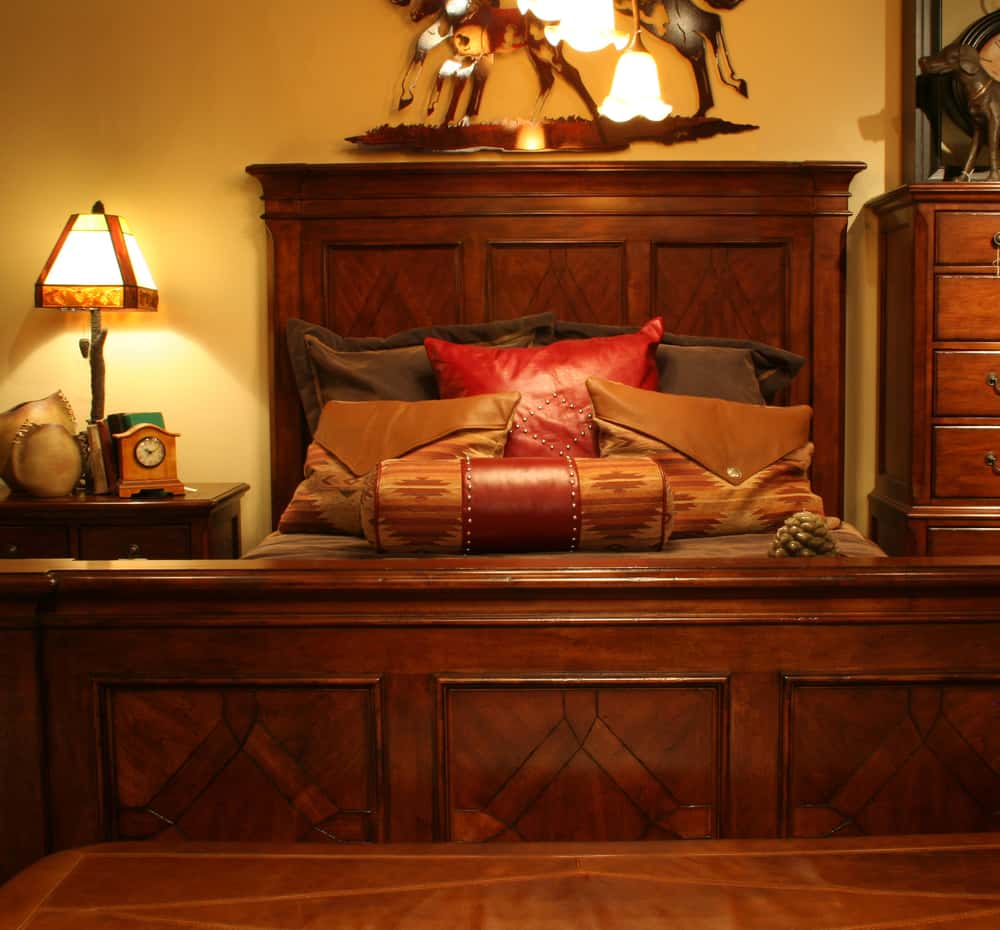
Mellow Yellow
Warm yellow walls bring out the gorgeous red tones of this highly polished cherry wood bed, highlighting the intricate hand-worked paneling and grooves on the sides. Bright pillows in red, brown, and tan leather add to the elegance of this very masculine room.
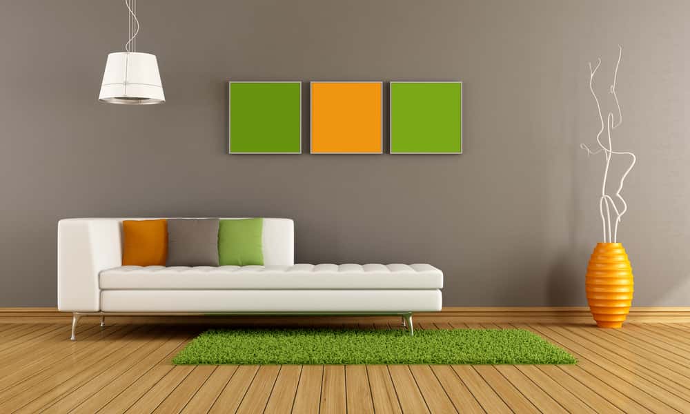
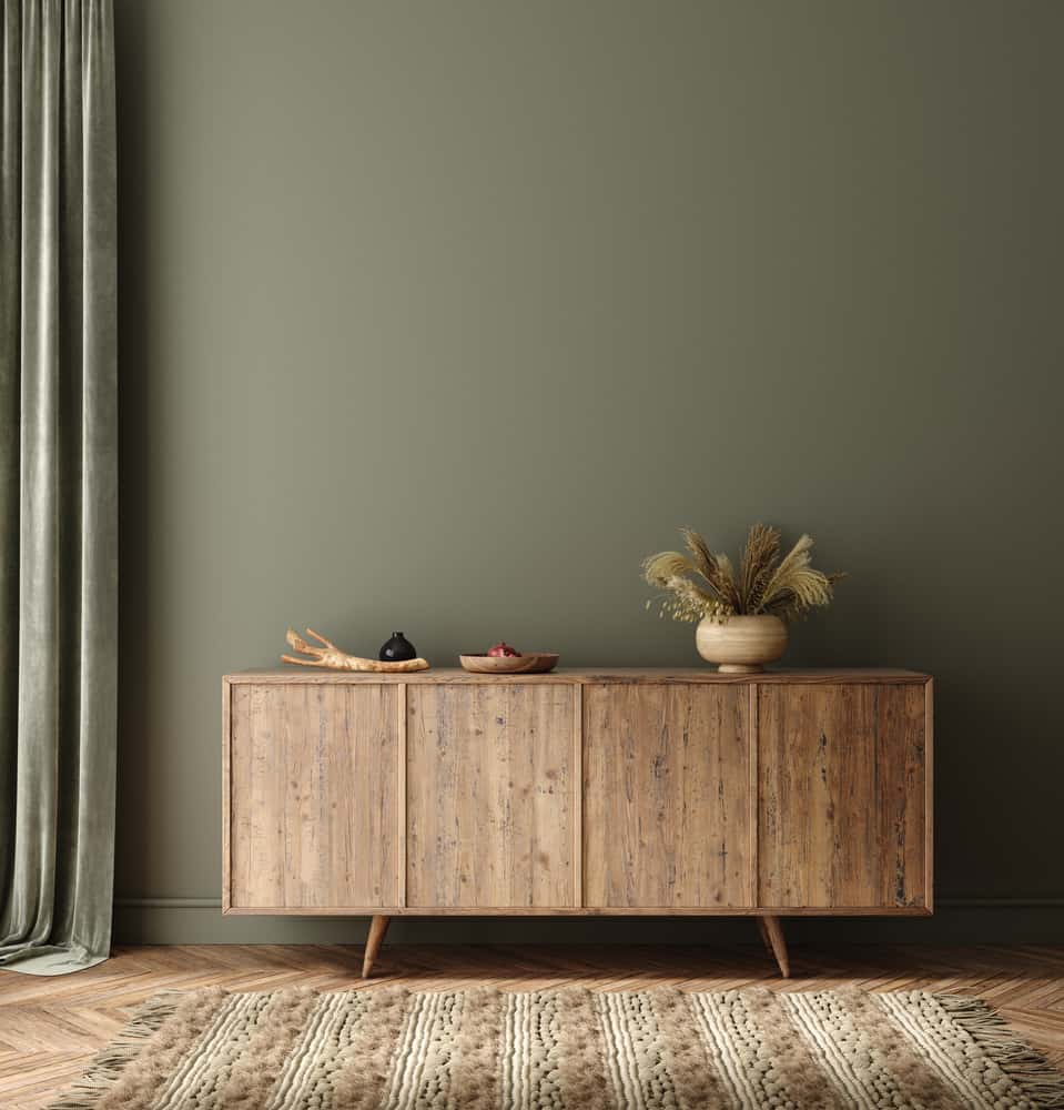
Earthy Tones
Medium brown woods such as knotty pine easily pair with high-intensity wall colours like olive green. You can’t go wrong with green; you can always find a shade to suit almost any colour of wood! Here, the textured brown rug accentuates the colour of the cabinet quite beautifully.
Tips to Keep in Mind
- Always pick a complementary colour as the backdrop for your wood. Thumb rule: opt for light against dark, and dark against light.
- Remember that wood with yellow undertones, like rubberwood or oak, will go well with green or yellow; while dark wood like rosewood or teak is best showcased against variants of white. If you’re using wood with pale blonde undertones, you can run the gamut of vibrant shades such as red, violet, or orange, to cool hues like blue and green.
- Try the rule of three: pick one primary colour which is the wood, and work the rest of the room around varying hues of two complementary colours.
- If in doubt, you can’t go wrong if you paint the walls in a neutral shade like white, grey, beige, or cream! You can use pops of colours in the accessories to personalize your decor.
- When using wood that has sharply defined grains, use furnishings that are in solid colours, rather than patterned and multicoloured fabrics which could end up looking too busy.
Need help choosing the best colours to complement and contrast the wooden furniture in your home? We’ll help you pick a palette that pleases! The HomeLane team of colour-savvy designers is just a call away.


 EXPLORE MORE