Choosing colours for your home can often be overwhelming, especially in Home Interior Design, if you have no clue what goes with what. Colours mean different things to different people—and your choice of colours for your home should reflect your personality and speak to your heart.
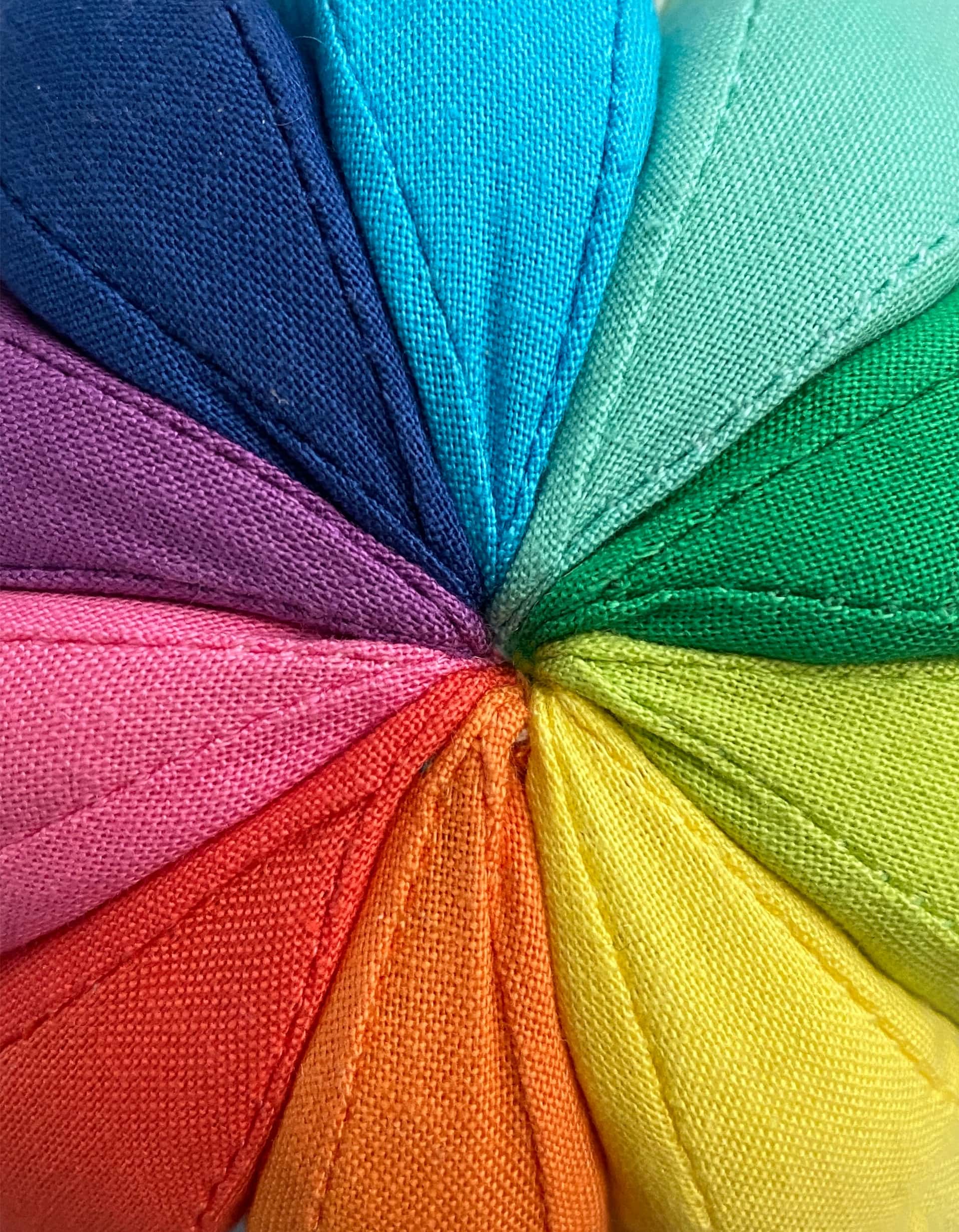
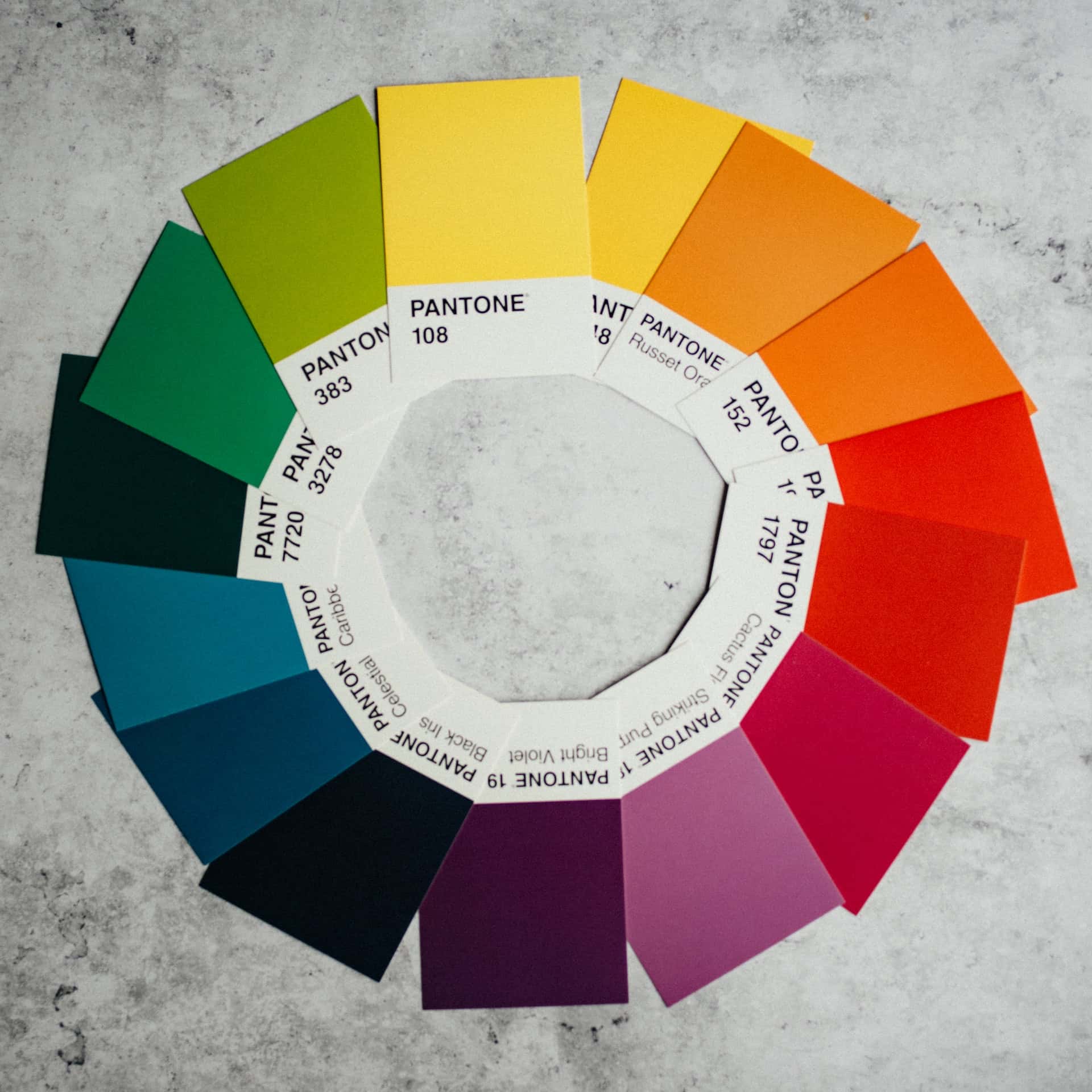
While the theory of colours seems very complicated, it really isn’t. When you’re picking colours for Home Interior Design, one of the easiest tools to work with is the colour wheel. Every designer’s secret weapon, a colour wheel is exactly what it sounds like: a wheel that depicts all the colours, arranged in a way that shows their relationships to each other. By understanding the colour wheel and following a few simple rules, you can create harmonious colour schemes with ease and put together your home décor like a professional.
Ready to find out how to mix and match colours with confidence in Home Interior Design? This primer on analogous colour schemes is a good place to start.
What is an Analogous Colour Scheme?
An analogous colour scheme is simple to find on the colour wheel. Start with any colour, and pick any two colours directly on either side. An example would be yellow, yellow-orange and orange; or yellow, blue and green.
Analogous colours are those that occur together in nature, without being forced. For example, a single leaf may have shades of green, yellow-green and yellow—all colours that are next to each other on the spectrum and are closely aligned, with similar chromatic traits.
The Psychology of Analogous Colours
Analogous colours are used by designers to articulate the expression they are looking to create. Based on the colours chosen, they can create a serene and cooling aesthetic (say pale blue, teal, pale green) or dial up the heat (think vermillion, tangerine, chrome yellow). A triad of bright orange, yellow-orange, and yellow can be used to make your spaces bright and vibrant, if that’s what you’re looking for.
Colours allow designers to connect with their audience, create moods and evoke emotions. By choosing an analogous colour scheme, you can be sure that your colour choices will never look out of place together.
Tips for Working with an Analogous Colour Scheme
1. First Pick the Dominant Shade
Which is your favourite colour? Pick it as the dominant shade, and then choose two secondary colours on either side. You can even pick different saturations of the same shade; for instance, pale violet, red and pink are a triad of colours that work well together.
2. Use the 60:30:10 Rule
The 60-30-10 rule is a quick rule-of-thumb to suggest the proportions of each colour in your space, in order to get a peaceful, visually appealing balance.
What this rough-and-ready reckoner means is that 60% of your space will be the dominant colour, 30% will be your accent colour, and 10% will be an accent or pop of colour.
As an example, you can use the colour proportions in this way:
60%: The walls, large carpets, and upholstery in the room can be centred around the dominant colour.
30%: Wing chairs, curtains, cushions, and small rugs can be in the secondary colour.
10%: Add pops of the third colour in the form of cushions, artwork on walls, accessories, and so on.
3. Add a Neutral or a Contrast
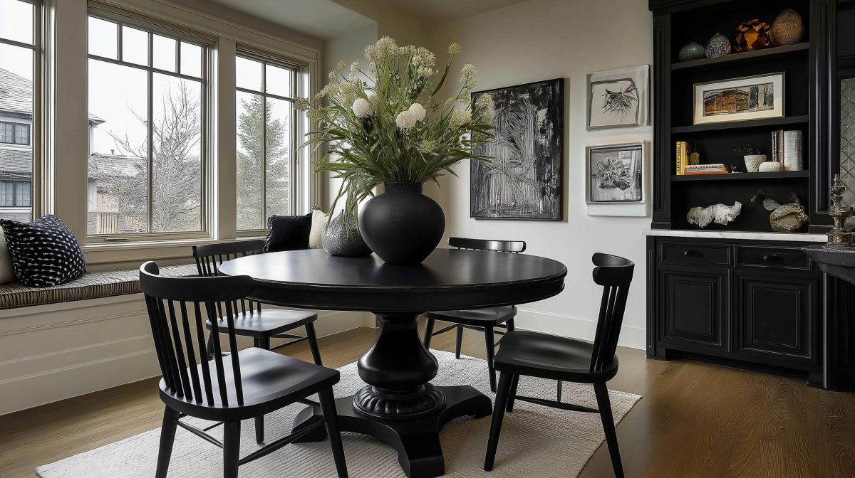
While analogous colour schemes look well put-together, too much of these similar shades can get overwhelming, especially if the colours are saturated. Picture a room in dark shades of purple, red and pink, for instance, and you will know what we mean! Always add a neutral shade like cream, white or grey to balance the saturation in the room and make everything ‘flow’ together well.
Analogous colours could end up looking too similar, if you choose subtle micro-tints that are not very far apart on the wheel. In case your chosen triad of hues is very light, or ends up looking almost monochromatic, you can consider adding a contrast—a shade that’s on the opposite end of the spectrum—to shake things up and provide focus. This could be, for instance, something like powder blue-deep blue-pale aqua, combined with pops of red.
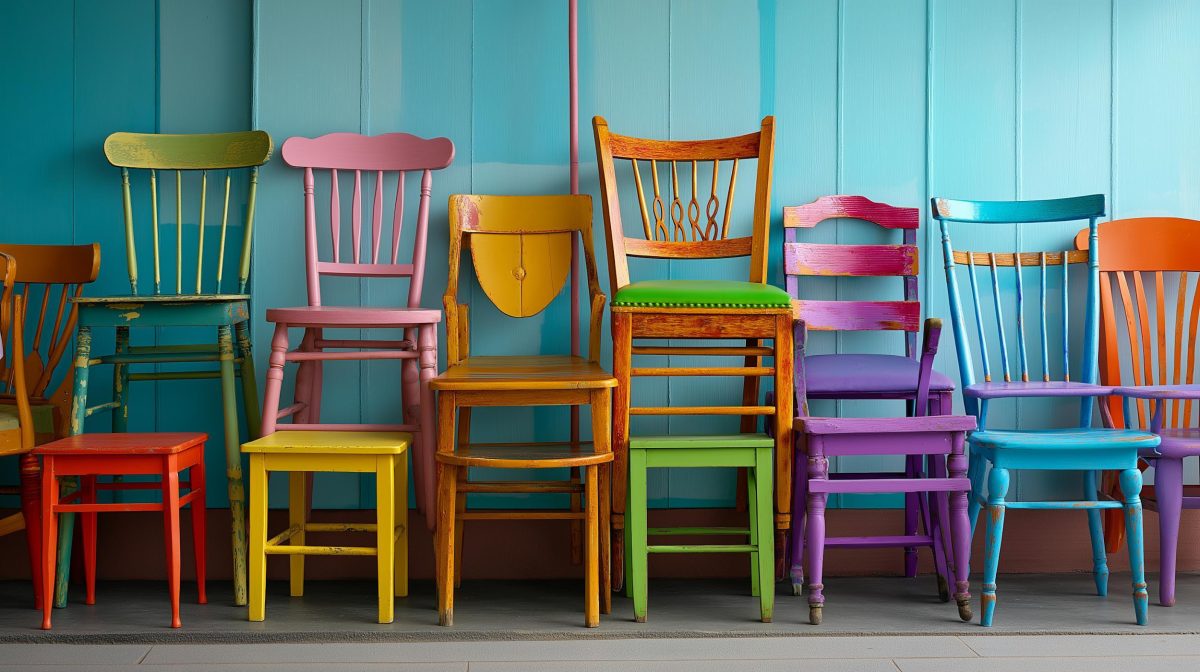
Examples of Analogous Colour Schemes
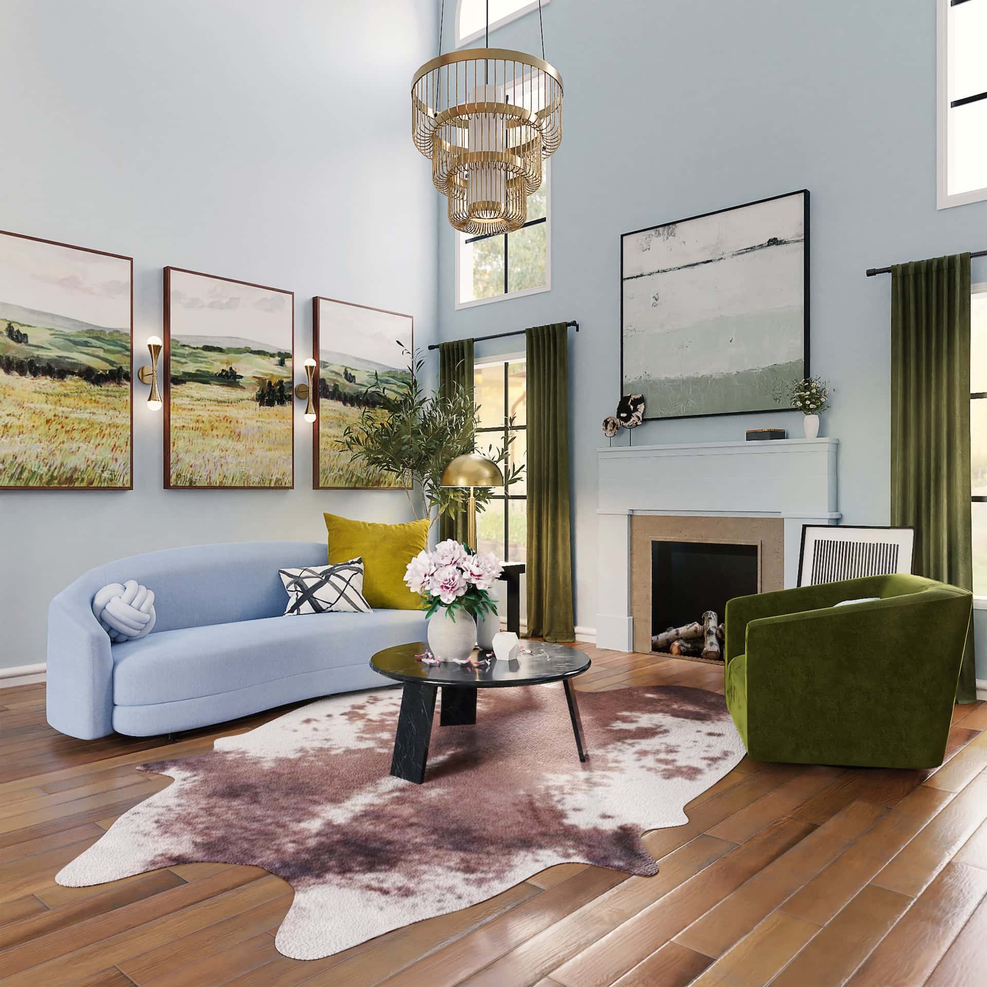
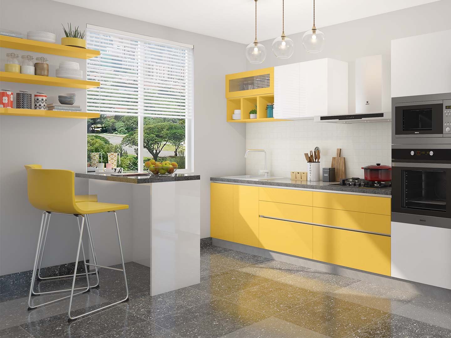
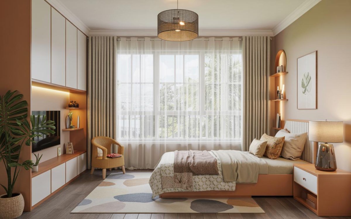
Blue, Green and Yellow
This cheerful, set of colours is all about sunshine, natural greenery and blue skies. Using these colours will ensure an abundance of positive vibes and sunny cheer in your living room!
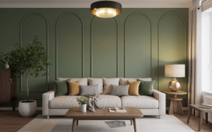
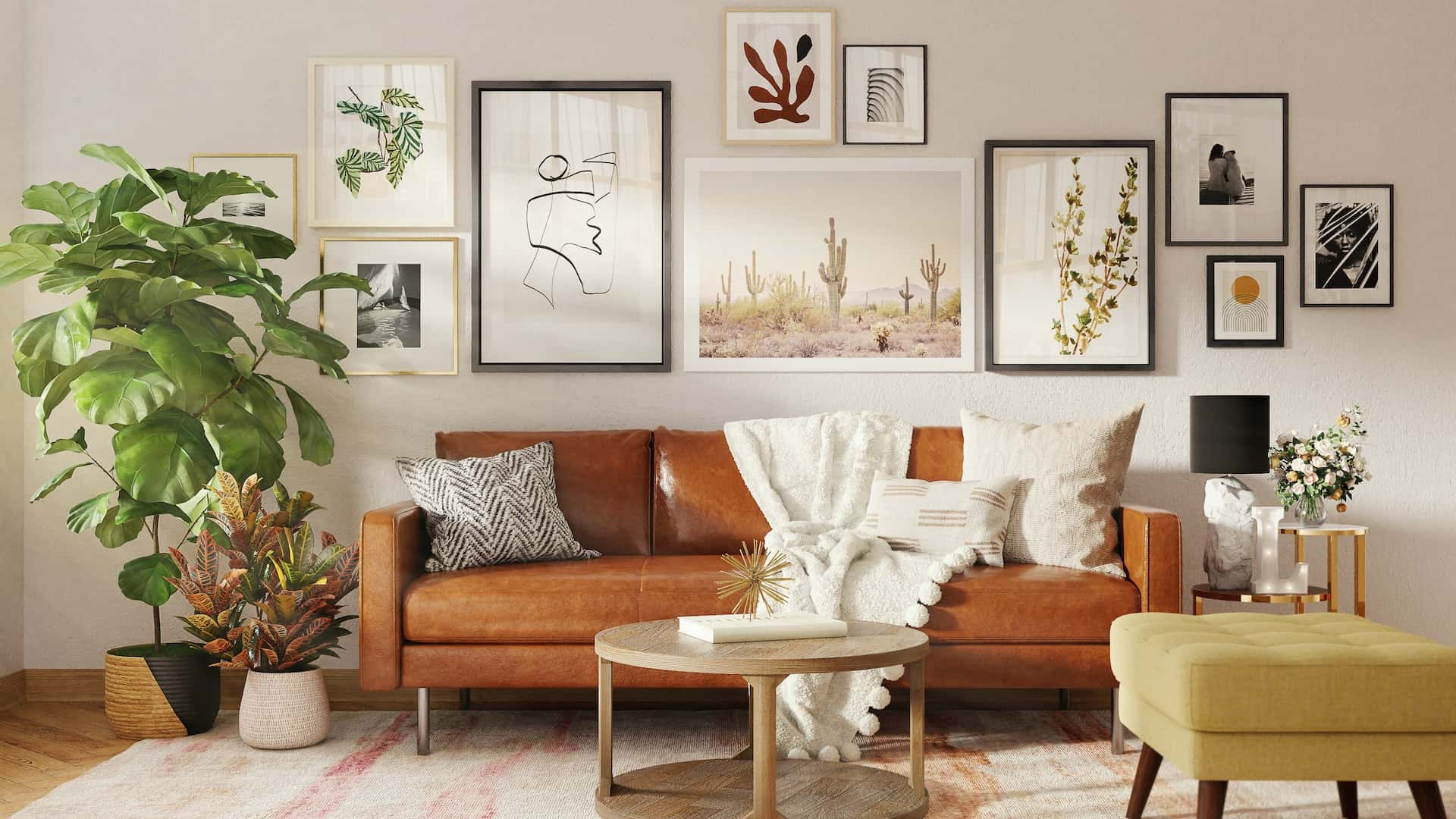
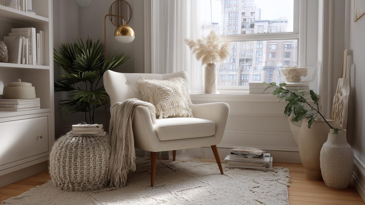
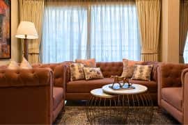
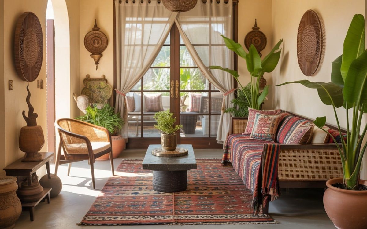
Tan, Yellow and Green
Green and yellow are undoubtedly a pairing made in heaven. Deepen the saturation of yellow to get tan, the perfect complementary shade to this duo! We love the way all the pictures in the gallery wall fall in line with the selected palette.
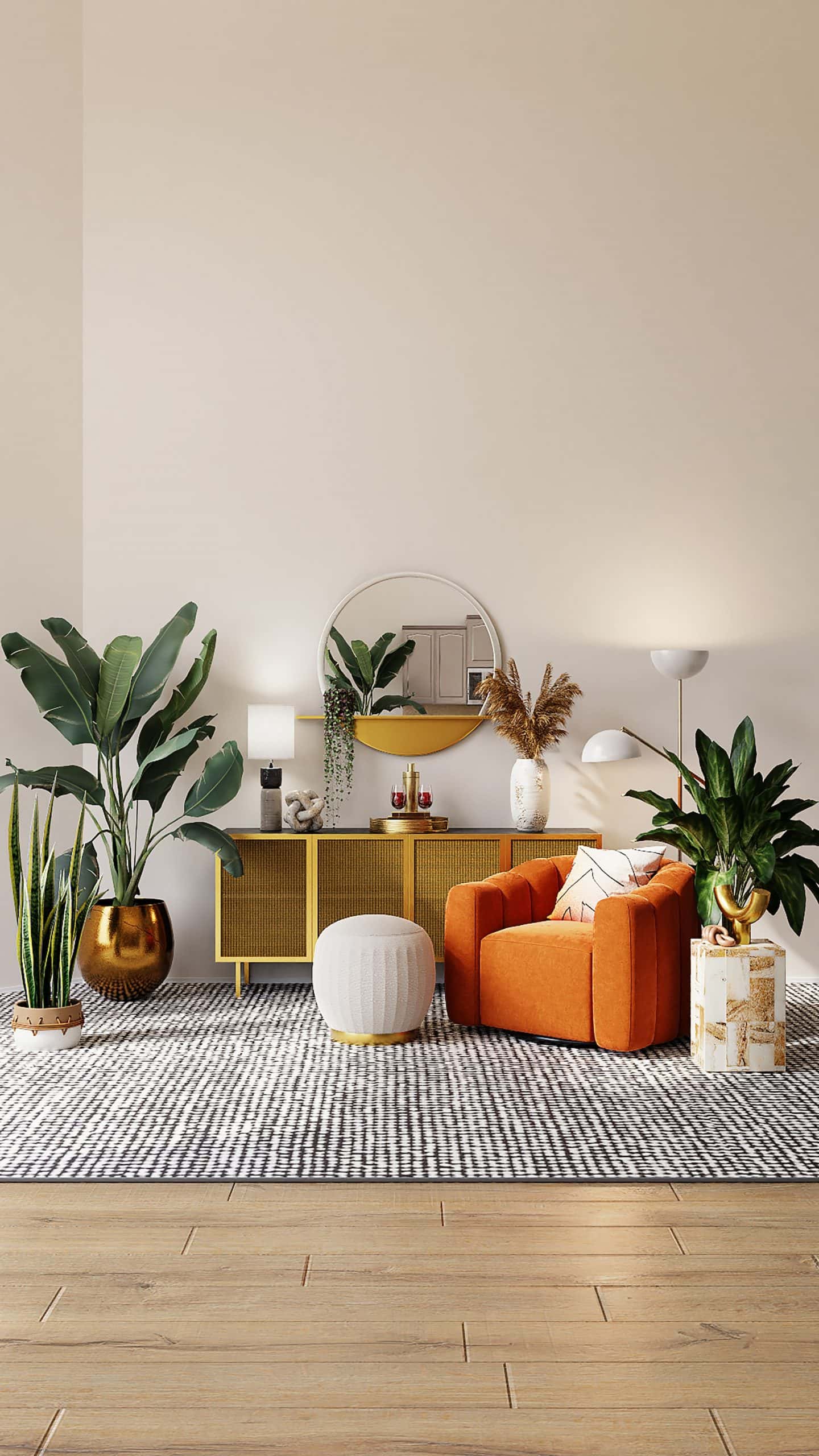
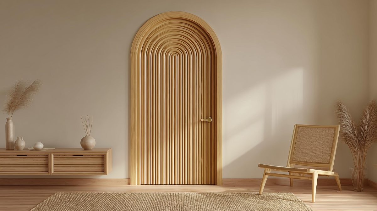
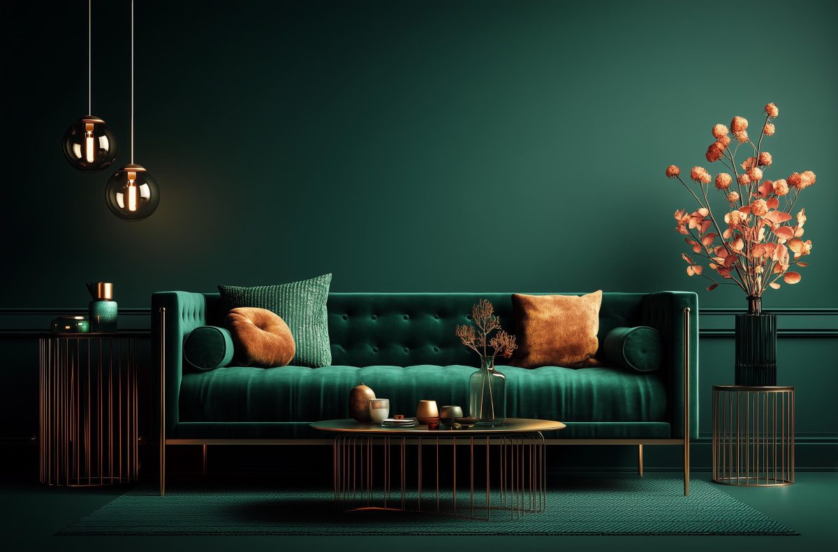
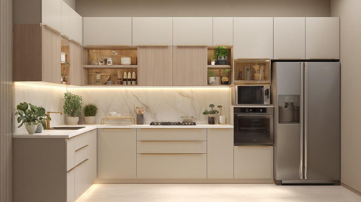
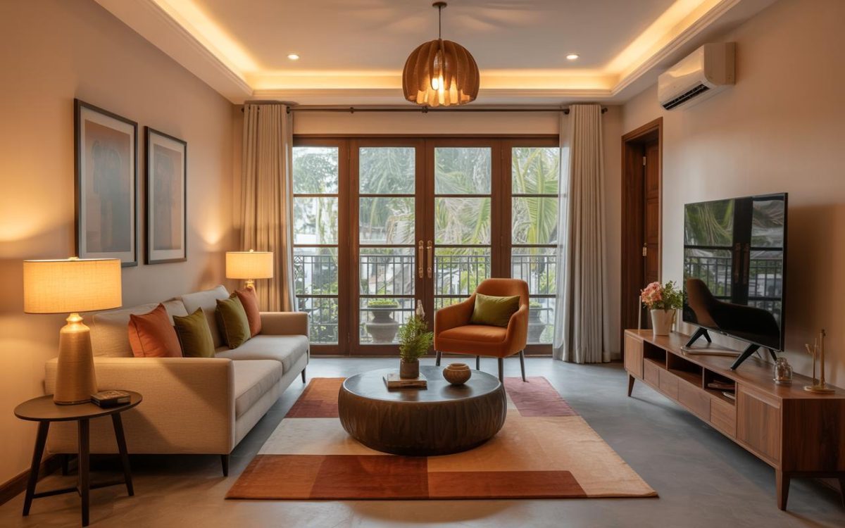
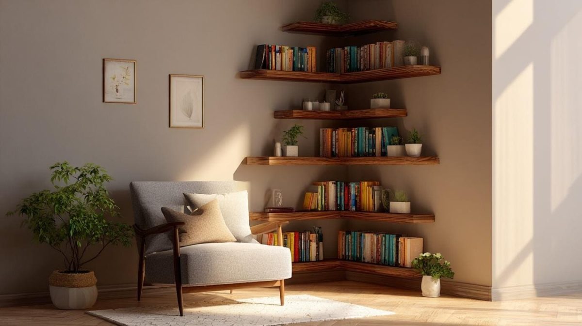
Green, Yellow and Orange
In this peppy seating corner, lush green and exuberant yellow are elevated by a dash of citrus orange. The abundance of white tones down the intensity and serves as a cool neutral backdrop that ties the palette together.
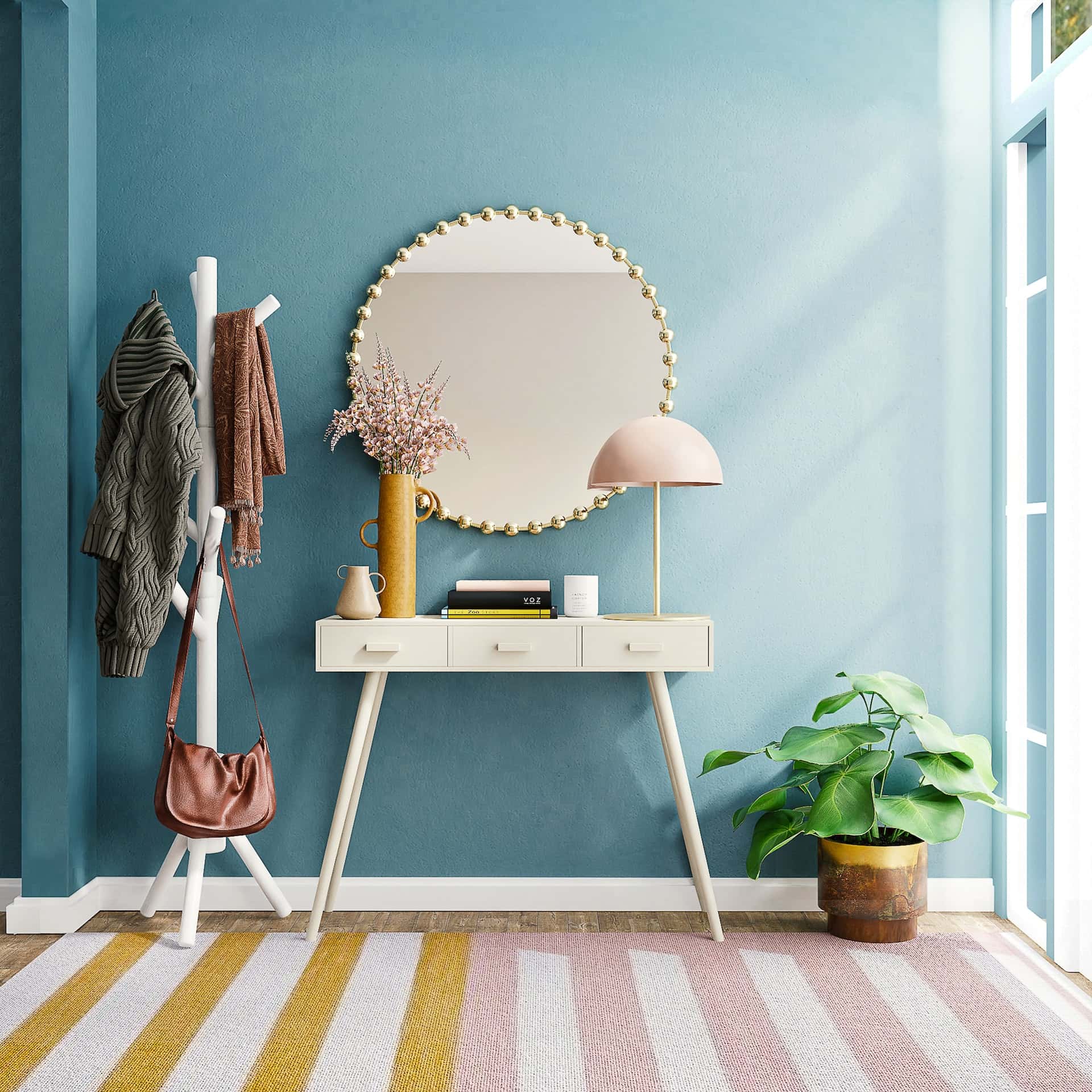
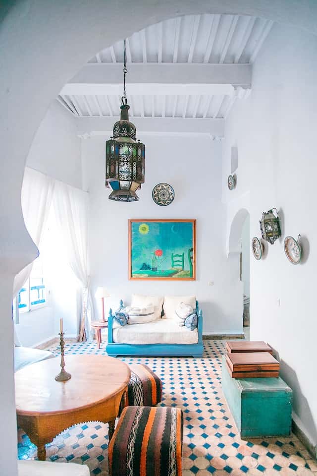
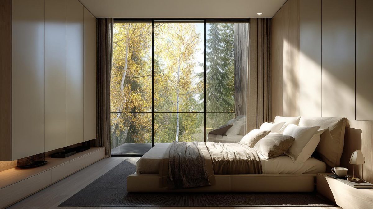
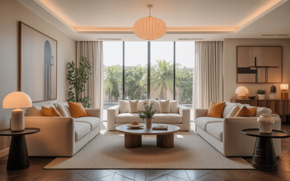
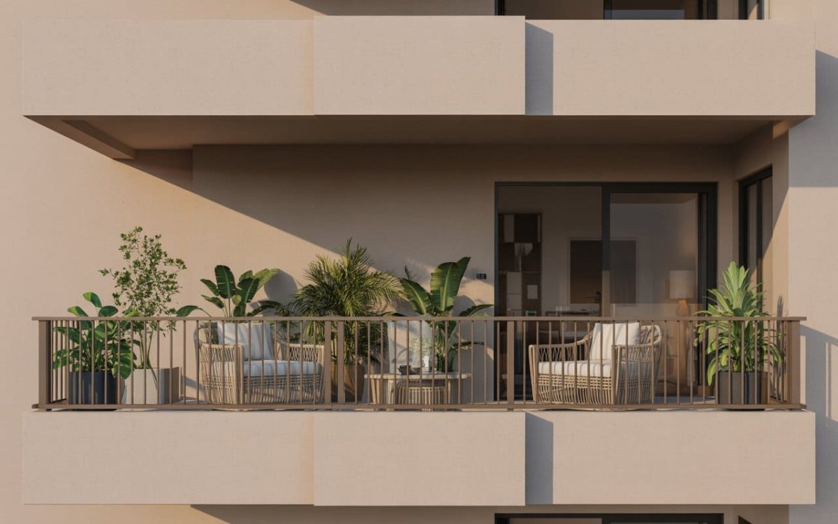
A Blue-Green Palette with Pops of Tangerine
This is a lovely example of how pops of a contrasting shade can elevate the décor by several notches. Here, a breezy hallway filled with light uses analogous shades of blues and greens on a crisp white backdrop, and adds pops of tangerine to create vivid contrast. The play on patterns and prints adds stunning visual interest.
Let’s Wrap Up!
The easiest way to create a visually pleasing harmony of hues is to work with analogous colour schemes. All you need to do if you’re in doubt about your choice of colours is to turn to the colour wheel, and look for three colours that sit right next to each other. Add a neutral or a contrast accent colour if you wish, dial up or tone down the colour saturations, and you can create a colour composition that sings!
Still sounds difficult? Not to worry—HomeLane has your back! Our talented designers will work out the colour aesthetics of your dream home, just the way you like it. We can’t wait to get started, so do give us a call!
FAQs
1. What is an analogous colour scheme?
Analogous colours are a group of any three colours that are next to each other on the colour wheel. These colours are found together in nature, and have a harmonious feel. When working with an analogous colour scheme, you can pick one as the focal colour (usually the primary colour in the group), and use the other 2 hues as secondary accent colours.
2. What are the 4 analogous colours?
In an analogous colour scheme, there is usually a group of 3 colours (3 is the minimum, but you can pick 4 closely-related hues) that are close together on the colour wheel. Here is the list of most common groupings of analogous colours, based on the colours of the rainbow:
- Violet – Red-violet, violet, blue-violet
- Blue-Violet – Violet, blue-violet, blue
- Blue – Blue-violet, blue, blue-green
- Blue-Green – Blue, blue-green, green
- Green – Blue-green, green, yellow-green
- Yellow-Green – Green, yellow-green, yellow
- Yellow – Yellow-green, yellow, yellow-orange
- Yellow-Orange – Yellow, yellow-orange, orange
- Orange – Yellow-orange, orange, red-orange
- Red-Orange – Orange, red-orange, red
- Red – Red-orange, red, red-violet
- Red-Violet – Red, red-violet, violet
These triads of colours comprising the most common analogous colour schemes are listed in the order of coolness (blues and greens are on the cooler side of the spectrum, while oranges and reds are warm).
3. What are the 3 rules to group analogous colours?
An analogous colour scheme comprises three hues that are placed right next to each other on the colour wheel.
- The first shade is the dominant colour, and should be a primary colour (a quick refresher: red, yellow and blue are the three primary colours!)
- Pick a secondary or tertiary colour next.
- The third colour will usually be a blend of the first two colours.
4. What are the characteristics of an analogous colour scheme?
An analogous colour scheme is a ready reckoner used by interior designers to pick the perfect colour palette. It involves three colours that are positioned together on the colour wheel, and share similar chromatic attributes. A fourth neutral colour can be added to tone down the palette and add some visual empty space.
One of the three colours can be a primary colour—red, blue, or green— and the others will be colours that are on either side of the first colour on the colour wheel.
5. Where are analogous colour schemes used?
Analogous colour schemes are used wherever colour plays an important role. They can be spotted in nature—take the colours of a leaf, for instance, or the hues in the petal whorls of a flower.
Interior designers use analogous colour schemes as a tool to help them create harmonious colour palettes. Fashion designers pick analogous colours in their dress designs, or while choosing the most hot and happening shades for the next season’s colour palette. Artists and painters gravitate toward these harmonious hues without even thinking. Claude Monet’s ‘The Water Lily Pond’ painting is a case in point, which uses an enchanting triad of blues, greens and pale yellows—one of the most popular among all analogous colour schemes used by the colour-conscious everywhere.
6. Why are analogous colour schemes important?
Monochromatic and two colour combination offer a simple, minimalistic aesthetic; but the lack of colour can get dull after a while. While there’s no doubt that colours add vibrancy and visual interest to any space, choosing a colour palette that works is often hard, especially if you are someone who can’t make up their mind easily!
This is where the importance of analogous colour schemes comes in. Working with the colour wheel and keeping this grouping of three in mind, it becomes easier to choose colours that blend beautifully together and create harmony in any space.
Designers use these sets of colours to articulate a specific feeling, expression or mood. For instance, a colour set of soft violets, pinks and red could convey a romantic theme. Another set of blue, aqua and green could be used to add cool calmness to a space, while a set of red, orange and yellow would crank up the heat!


 EXPLORE MORE