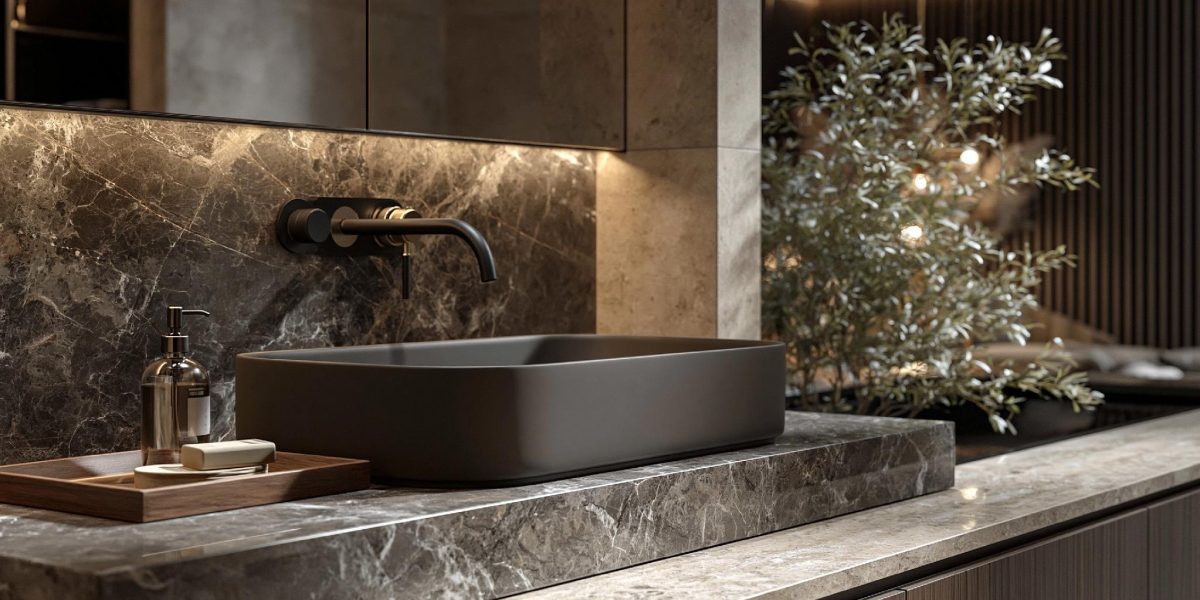
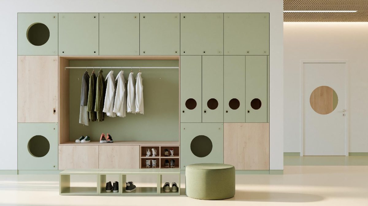
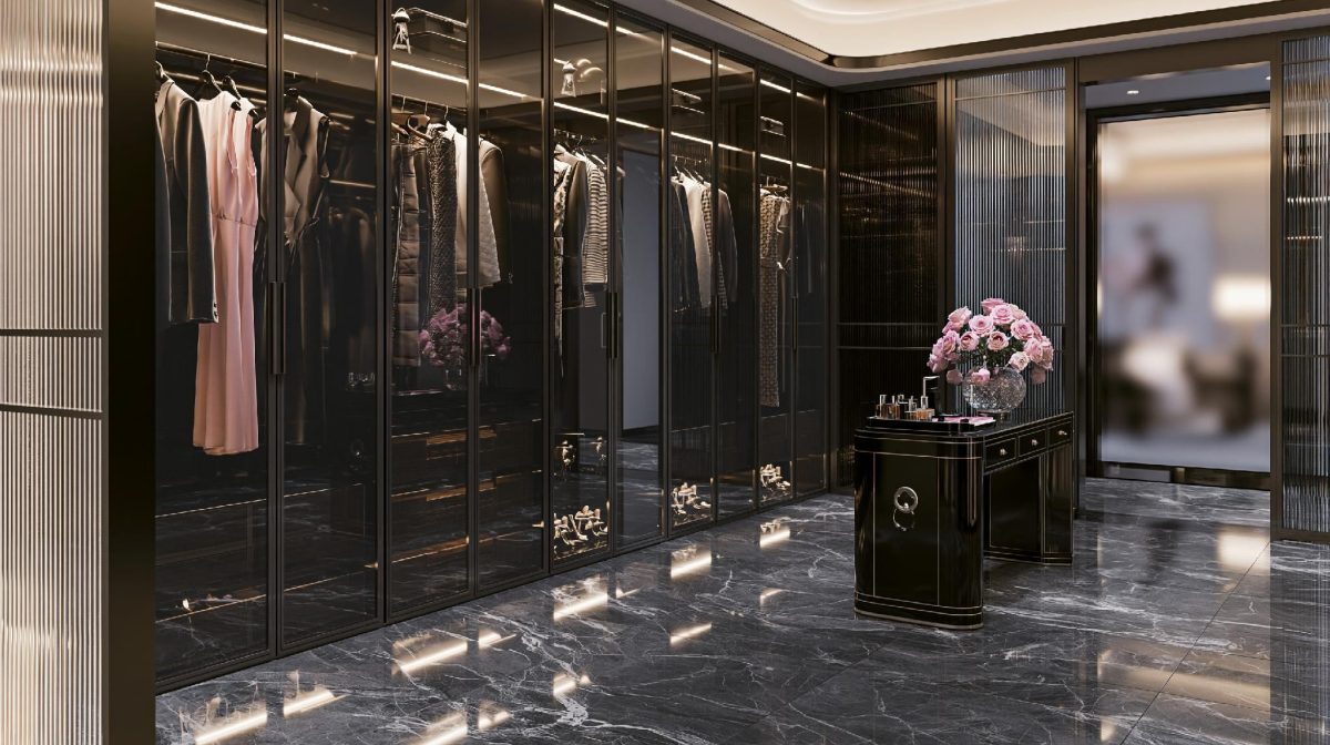
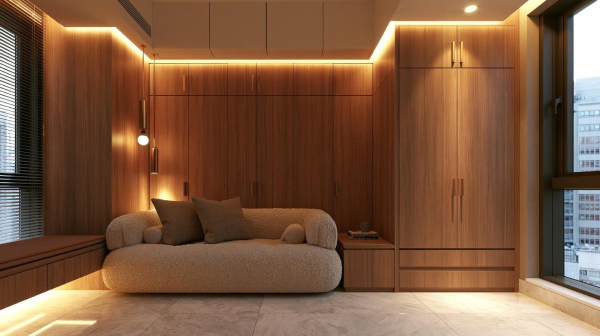
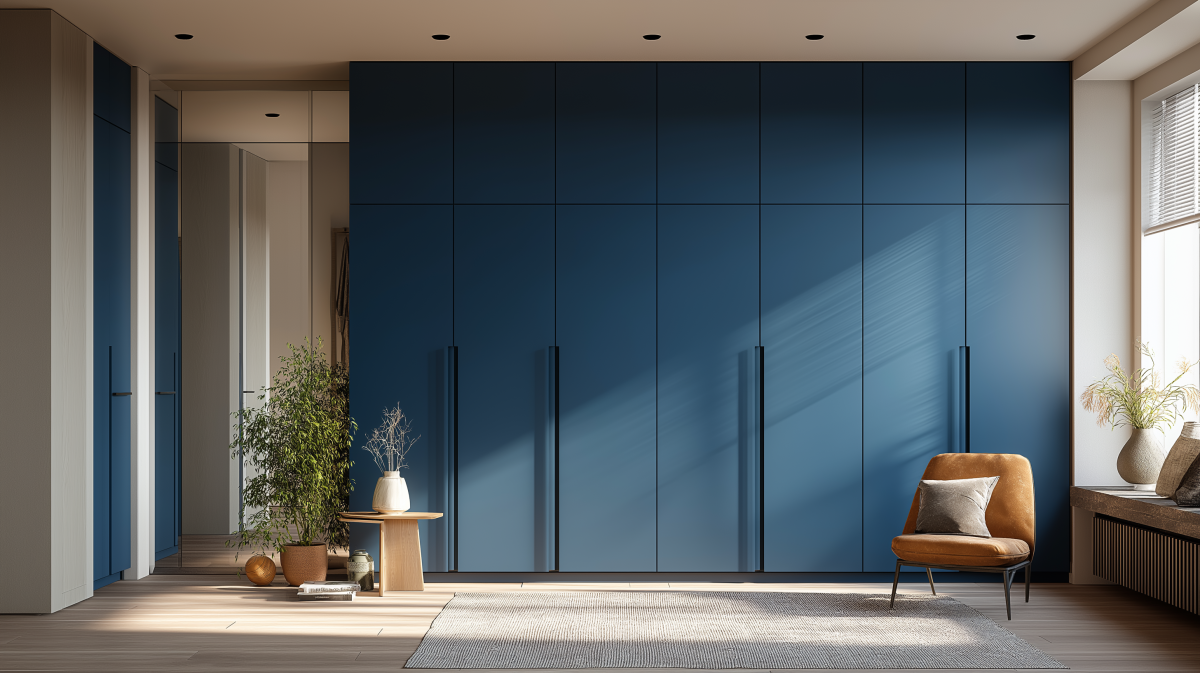
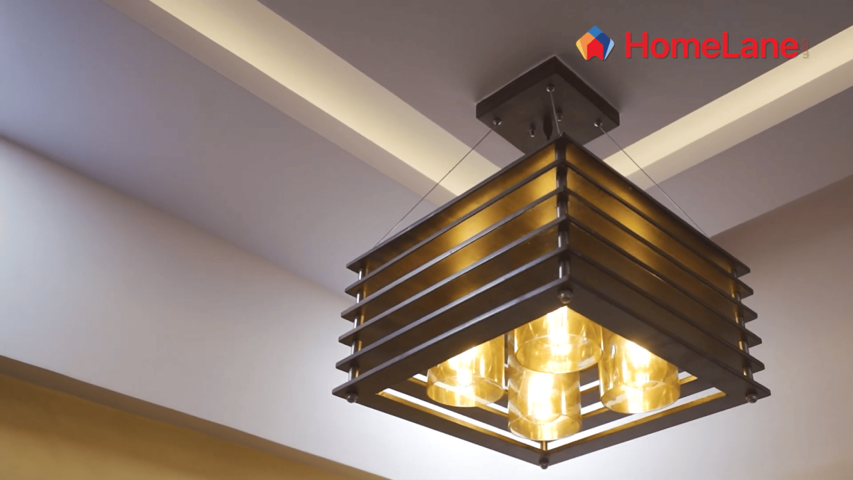
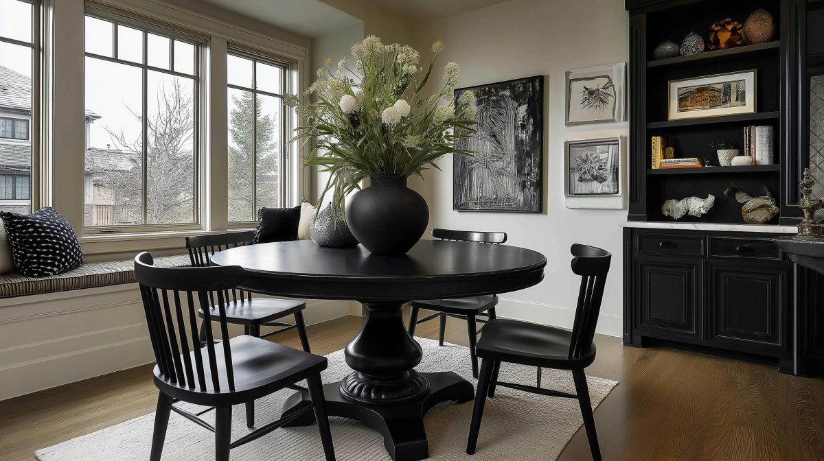
Contrast is one of the essential features of home decor and home interior design. It can be created by selecting light and dark colours and using them in the same room. If you use dark colours on the walls and light colors on the furniture, it will significantly contrast colours in the room. Moreover, you can create a contrasting effect by applying colour contrast on the walls. You can paint three walls with light colours and the fourth wall with a darker colour or vice-versa to elevate your home decor.

What is Contrast?
In a simple language, the contrast in interior design refers to colour combinations of darker and lighter shades. Contrast is when two or more elements are placed together such that their opposite characteristics become prominent. If the same colour is used for both the walls and the furniture, the room’s overall appearance becomes dull.
HomeLane is one such platform to access professional interior designers who can create dynamic compositions in your house based on the concept of contrast. Designers use many features to bring out a contrast in the rooms of your home. For example –
- Light and dark
- Bright and dull
- Organic and geometric
- Feminine and masculine
- Big and small
- Ornate and plain


Importance of Contrast in Interior Design
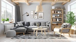
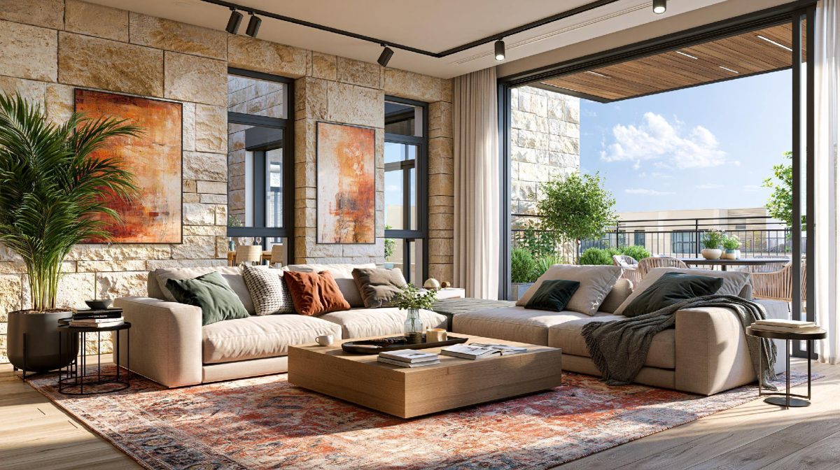
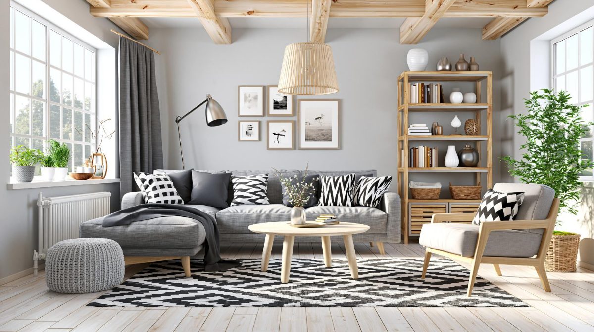
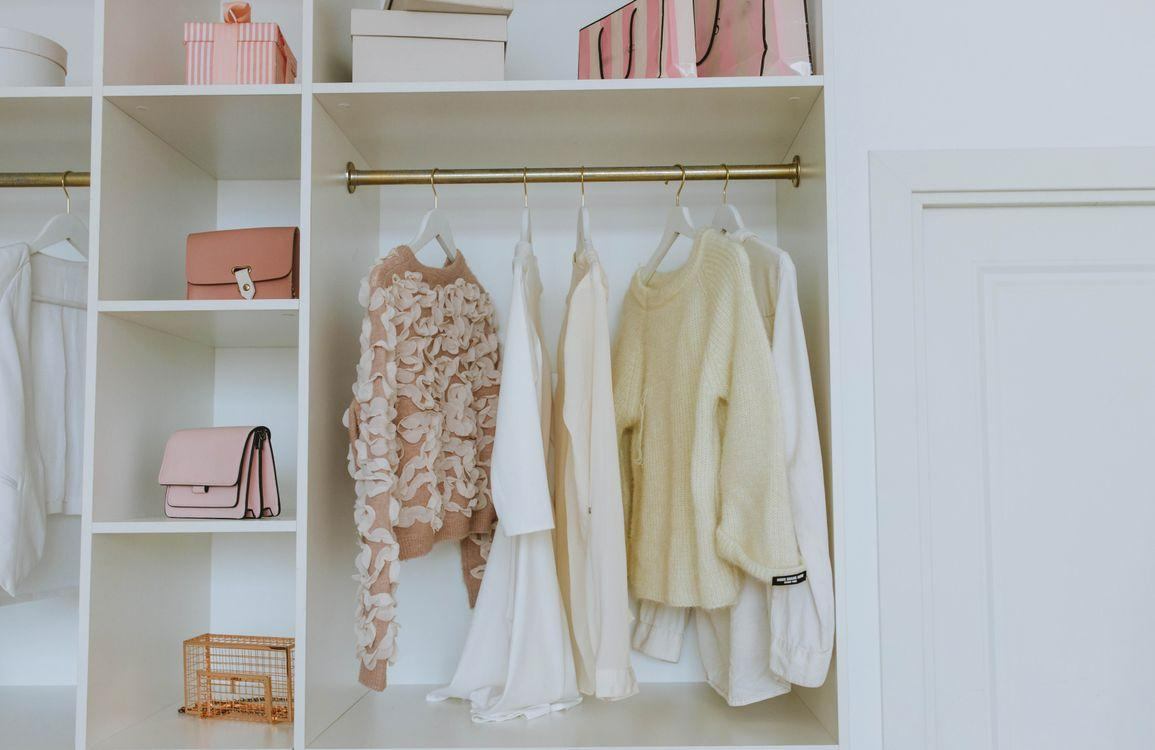
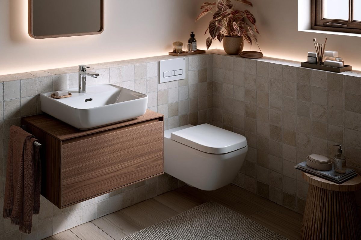
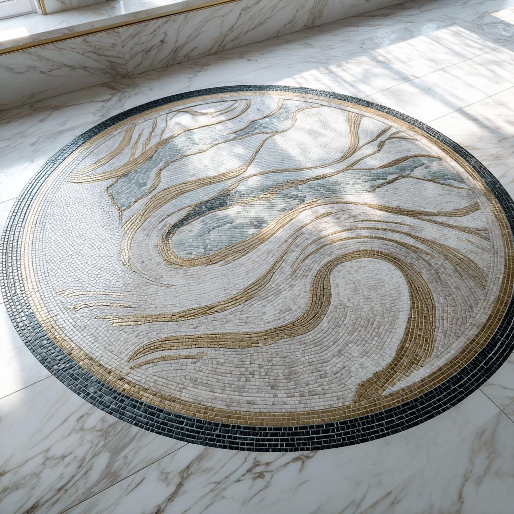
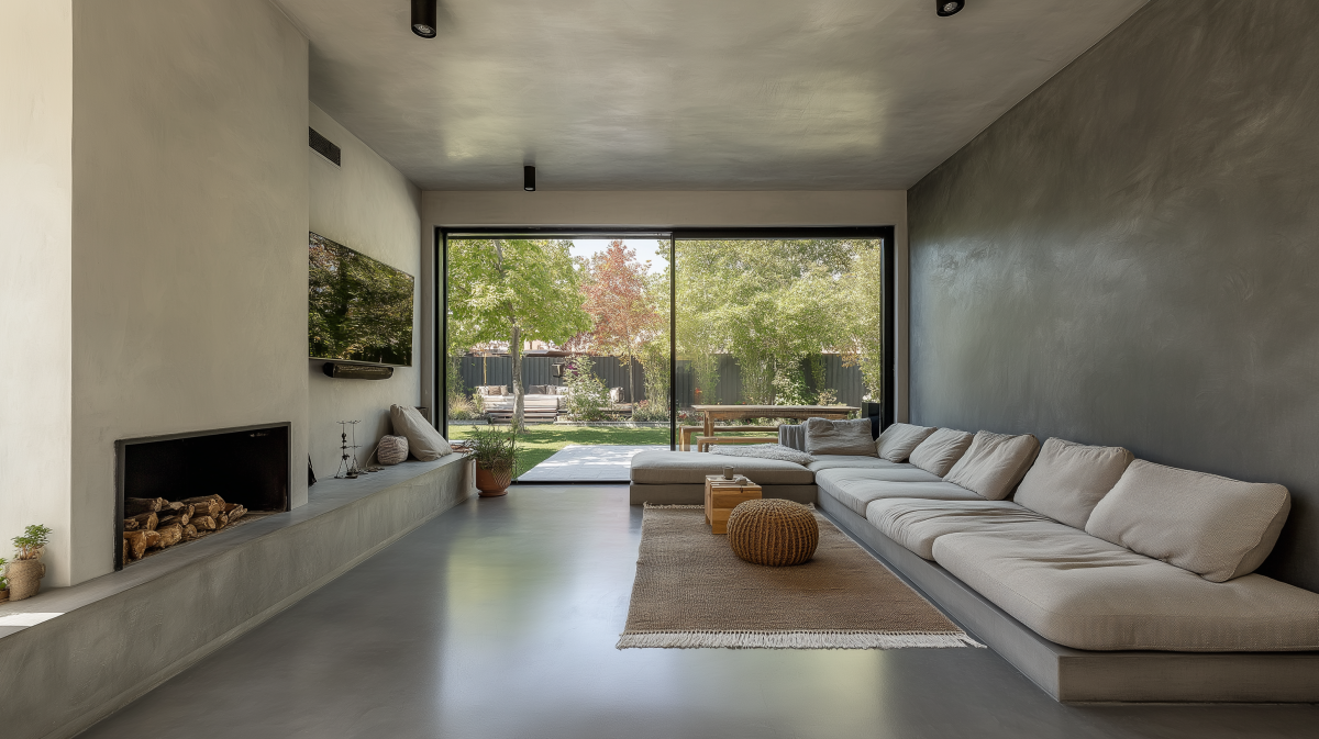
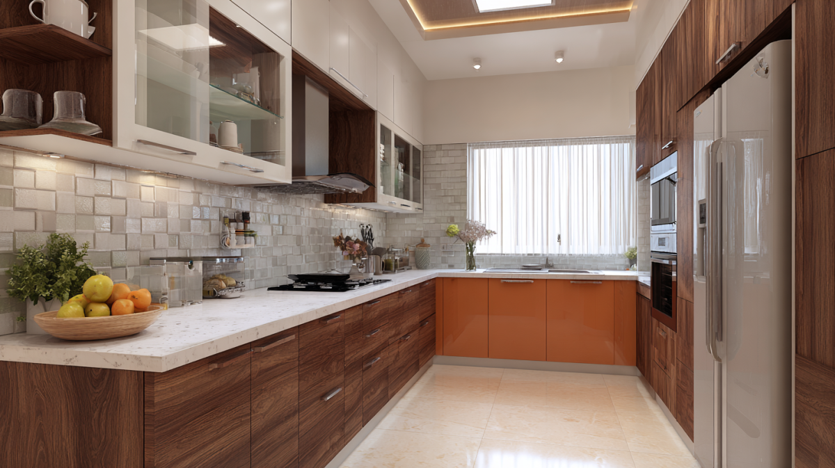
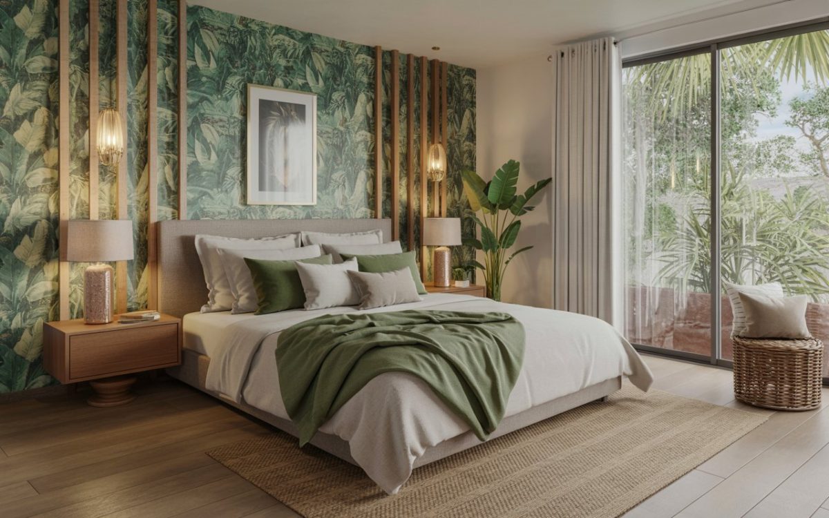
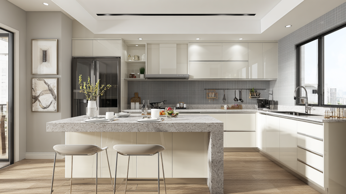
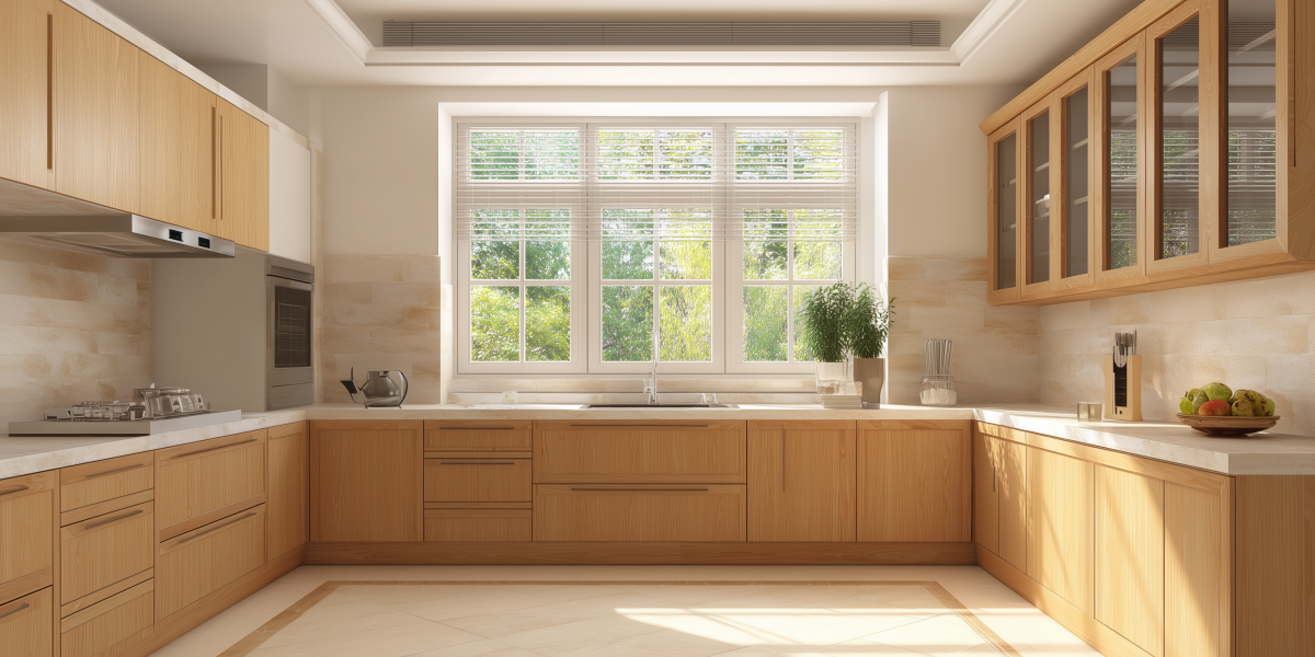
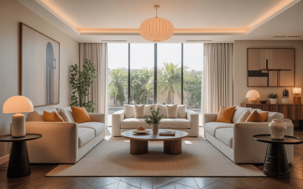
When you put contrasting textures or colours together, visual weight is added to space; this means that parts of your home interiors attract attention. The best way of doing so is by using two contrasting textures that are close to one another. Contrasting colours bring out the best home interior, whether walls or furniture, tiles or the ceiling.
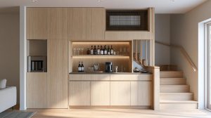
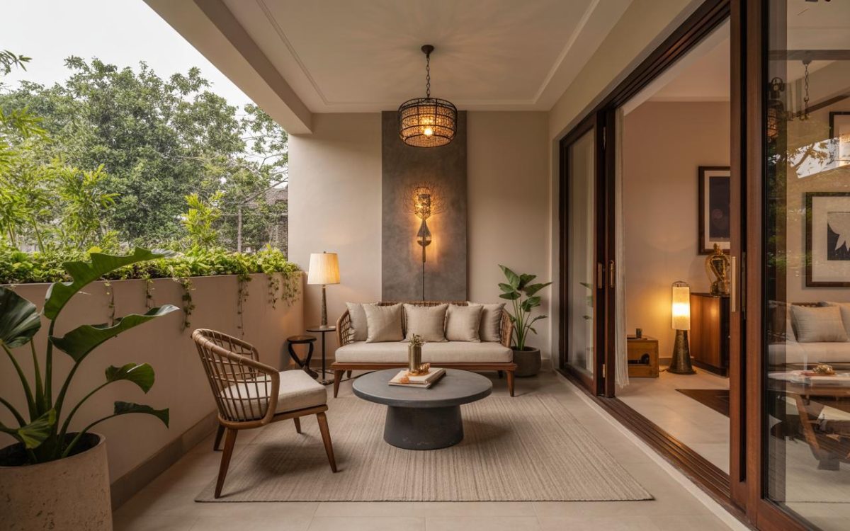
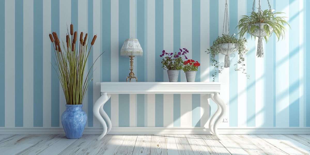
Think of combining features of rough textiles under sleek furniture, textured lighting, and décor on smooth surfaces, a dark shade of colour on the main wall, or light coloured furniture in a room with dark walls. Besides this, you can choose to create colour contrast for your home interior by blending pieces made of wood and stone and pair them with metallic elements in the room. In the case of fabrics, you can pair up a patterned design with a simple solid colour.

How to Choose Colour Contrast for Your Home Interior
If you have finally decided to use colour contrast as your home’s main interior design feature, let’s put that wish to reality! The tricky part is to determine what colour combinations would suit best to your home. The easy way to do this is, choose one colour and then select the rest of the colours that will look good in contrast with it. If you already have the furniture, you can contrast the colour of the wall and vice versa. You can make colour combinations on your own, but the following combinations might help you decide.
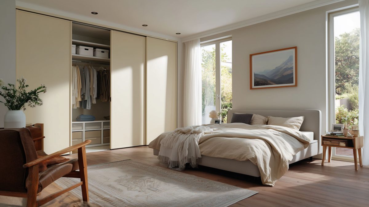
- Indigo and White – Indigo and White is a soothing colour combination. Indigo provides a subtle warm ambience to the room and creates a cosy environment.

- Lavender and Off-white – Lavender and Reserved White is a colour combination that provides a peculiar individualized look to any room.

- Shades of Purple – When contrasted with lighter shades, shades of purple, especially darker ones, give a beautifully bold look to the room. It could add a playful as well as a royal look depending on the shade of purple. It’s a rare but subtle colour combination.

Adding contrast to your home interior is as important as buying paint or furniture. The striking look that the contrast effect provides to a room is entirely worth the investment. You can find out more about colour combinations on the HomeLane, where experts can provide you with professional tips and help you design your home interior.


 EXPLORE MORE