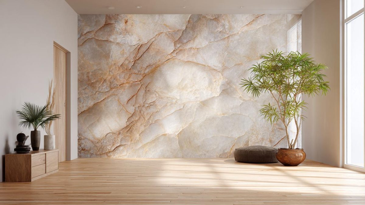
As a homeowner, do you want your interiors to look dramatic? Or do you want them to be soothing? Many prefer something in between.
Whichever camp you fall into, you should know that the colour scheme plays a large role in creating these effects. Interiors with blacks and darker hues look vivid. Pastel shades will be relaxing. Bright shades are fresh and lively.
That’s why colour psychology is an important part of interior design. Colours create an atmosphere and set a mood. Over the years, cognitive scientists have associated specific emotions with specific colours. Red is passionate. Blue is serene. Purple is luxurious. Whatever your favourite colour, it will have a mood to go with it.
By now, you may be thinking that this is informative, but not very helpful. After all, no home interior is made up of only one colour. It would be strange if the walls, the upholstery, the curtains and accented areas were just one shade. Well, that’s where a triadic colour scheme comes in.
What is a Triadic Colour Scheme?
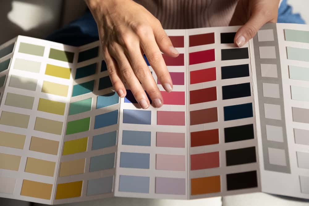
To understand what triadic colours are and how they can help with the interior of your dreams, let’s first look at the colour wheel.
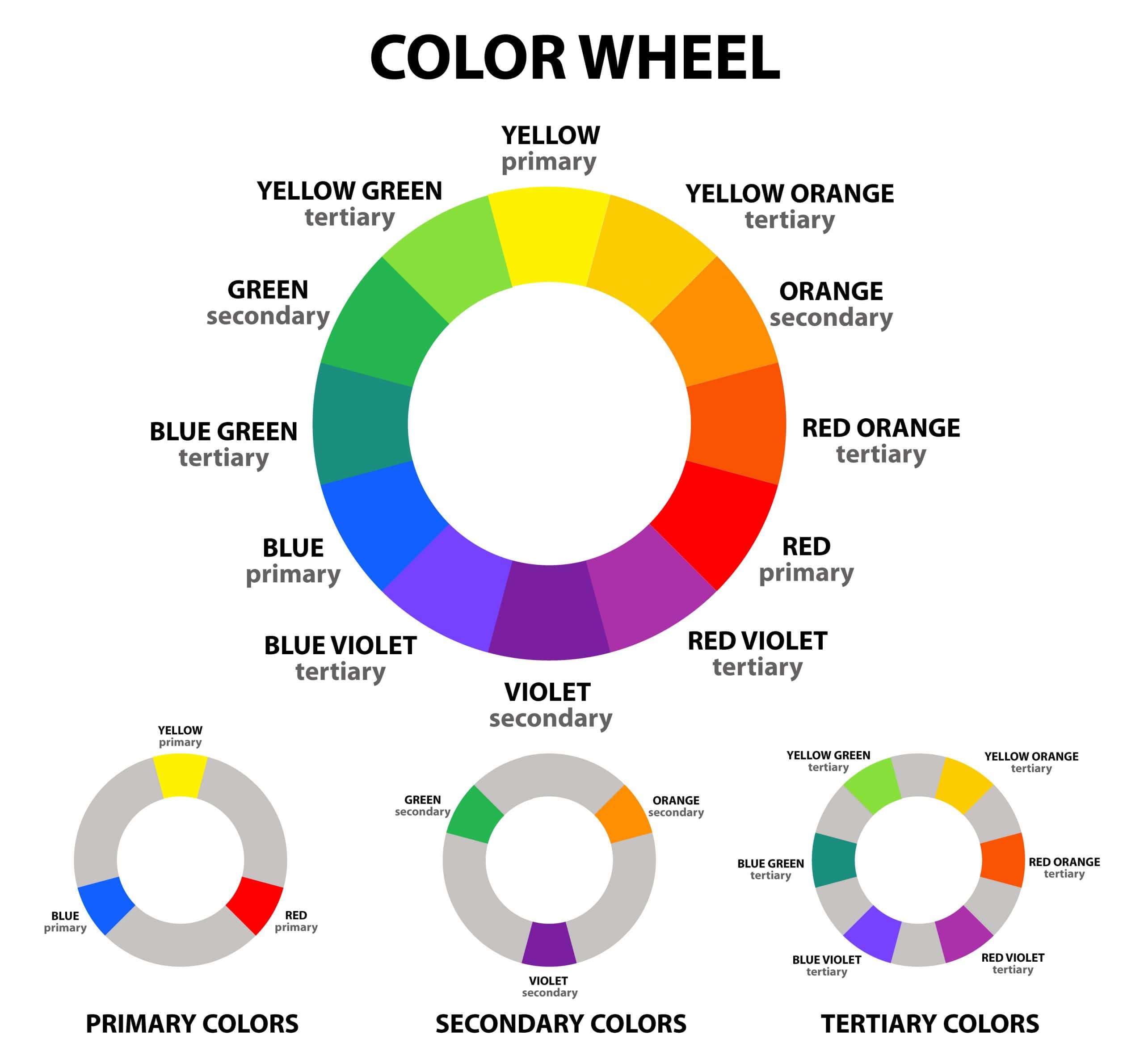
The colour wheel was conceived by Isaac Newton in the 17th century. (He also came up with the concept of gravity when an apple fell on his head, but that’s another story.) Newton mapped the colour spectrum onto a wheel, on the basis of wavelengths of light.
In a colour wheel, relationships between primary, secondary and tertiary colours are geometrically represented. As you know, the three primary colours are red, yellow and blue. The three secondary colours are orange, green and purple. And the six tertiary colours, which are formed by mixing a primary with a secondary, are Red-Orange, Yellow-Orange, Yellow-Green, Blue-Green, Blue-Purple and Red-Purple.
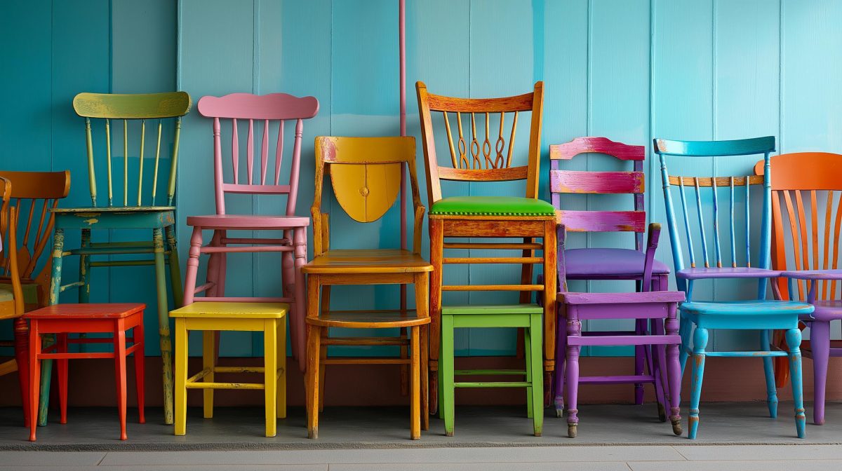
With this in mind, let’s explain the concept of triadic colours. These are any three colours equally spaced around the colour wheel. Some examples are red, yellow, and blue; purple, green, and orange; blue-purple, red-orange, and yellow-green. In triadic colour schemes, one colour typically serves as the dominant colour. The other two work as accents.
Triadic colour schemes can be dramatic, exciting, or simply memorable. Interior designers, brand guideline experts and fashion gurus all make use of triadic colours to convey the right mood for their creations.
Choosing a Triadic Colour Scheme for Interiors
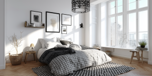
Now that we’re clear about triadic colours, let’s explore how you can use them to the best effect for your interiors. A triadic colour scheme can make quite a statement. Such schemes are often used for children’s rooms, kitchens, dining rooms or living rooms.
It’s important to keep in mind that a triadic colour scheme is all about balance. As we’ve pointed out, it’s best to choose one colour that will dominate. Let the others underline and accentuate the effect. After all, you want your colour scheme to be streamlined, not confusing.
A blend of red, blue and yellow is a common triadic colour scheme. Purple, orange and green are popular, too. Triadic colour schemes that include tertiary colours can also make a fresh and unconventional statement.


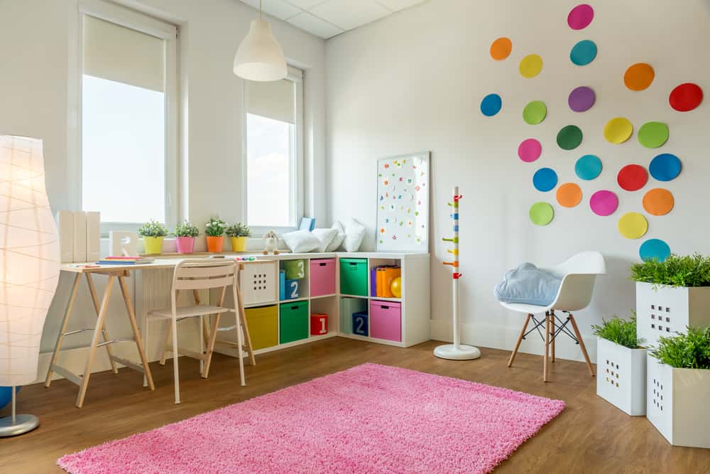
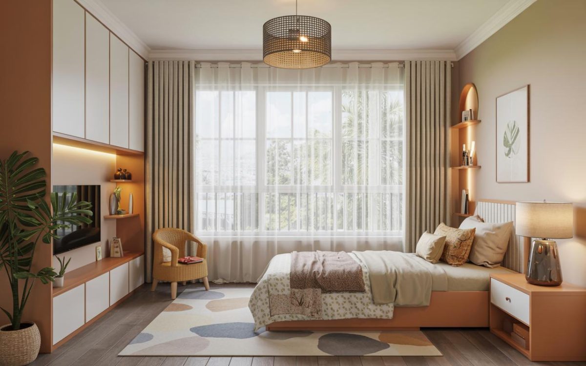
Triadic Colour Schemes for Children’s Rooms
A triadic colour scheme lends itself to any child’s room. This can make it appear playful, fun and lively. Here, there are many ways to use a dominant colour and complement it with accents.
For example, there could be an accent wall in a bright colour. This can be complemented by a neutral colour on the other walls, with the third colour appearing on toy shelves, lamps and bunk beds.
Alternatively, all the walls could be a single colour, with the other two triadic colours on surfaces such as window sills, curtains and tables. There are so many exciting possibilities.
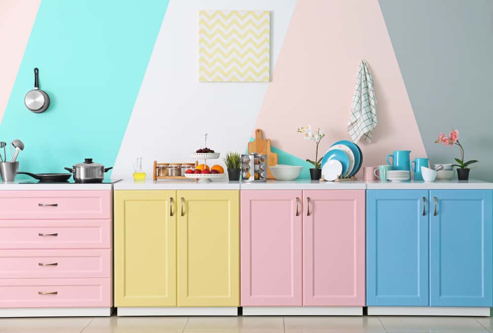
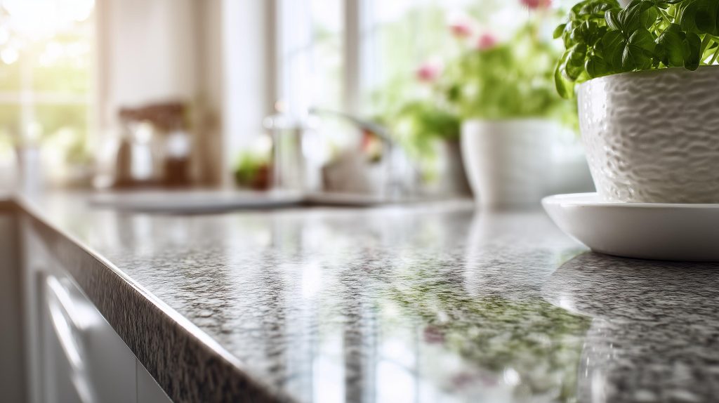
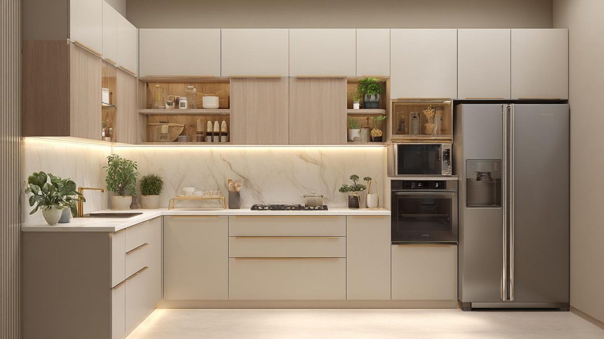
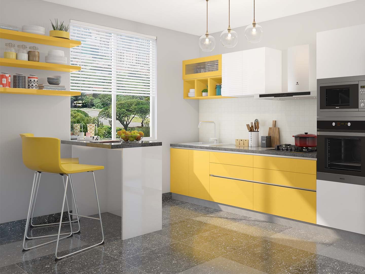
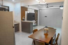
Triadic Colour Schemes for Kitchens
Kitchens are another area where you’ll often come across triadic colour schemes. The range of surfaces and textures in the cooking space lends itself to such a scheme.
As with a children’s room, you could have a dominant colour on the walls, with shelves and tabletops providing a burst of other shades. You can create a sense of energy with a glossy pale colour combined with bright and vibrant shades.
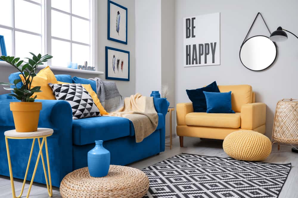
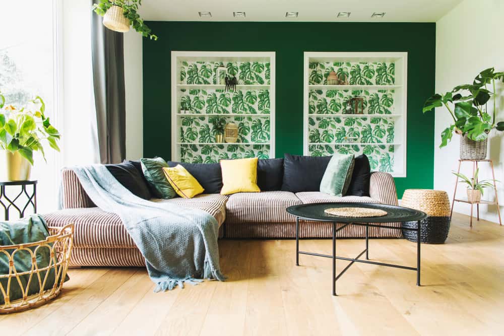
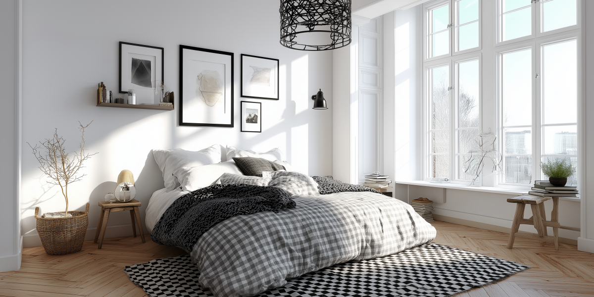
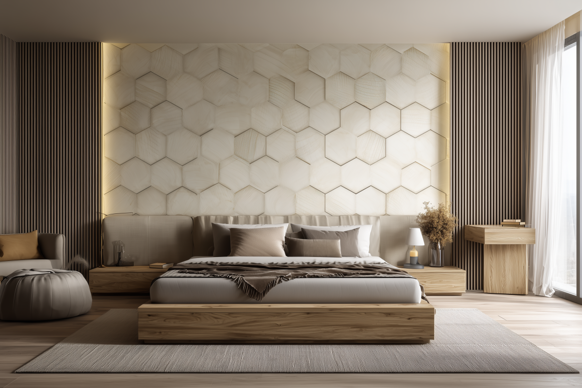
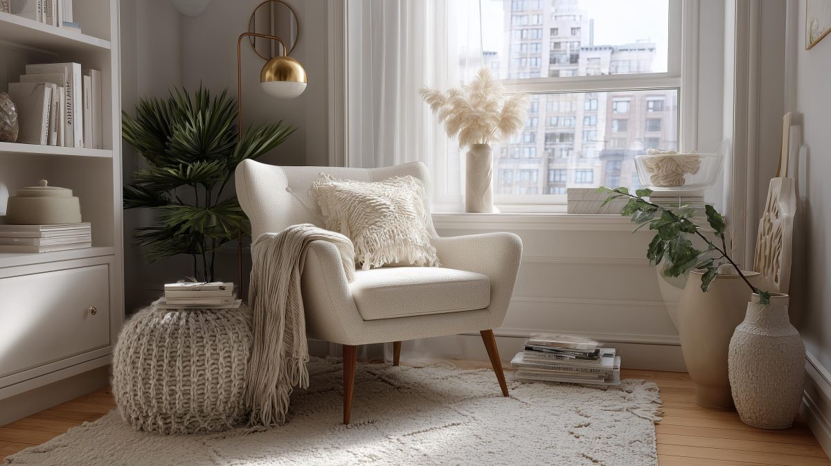
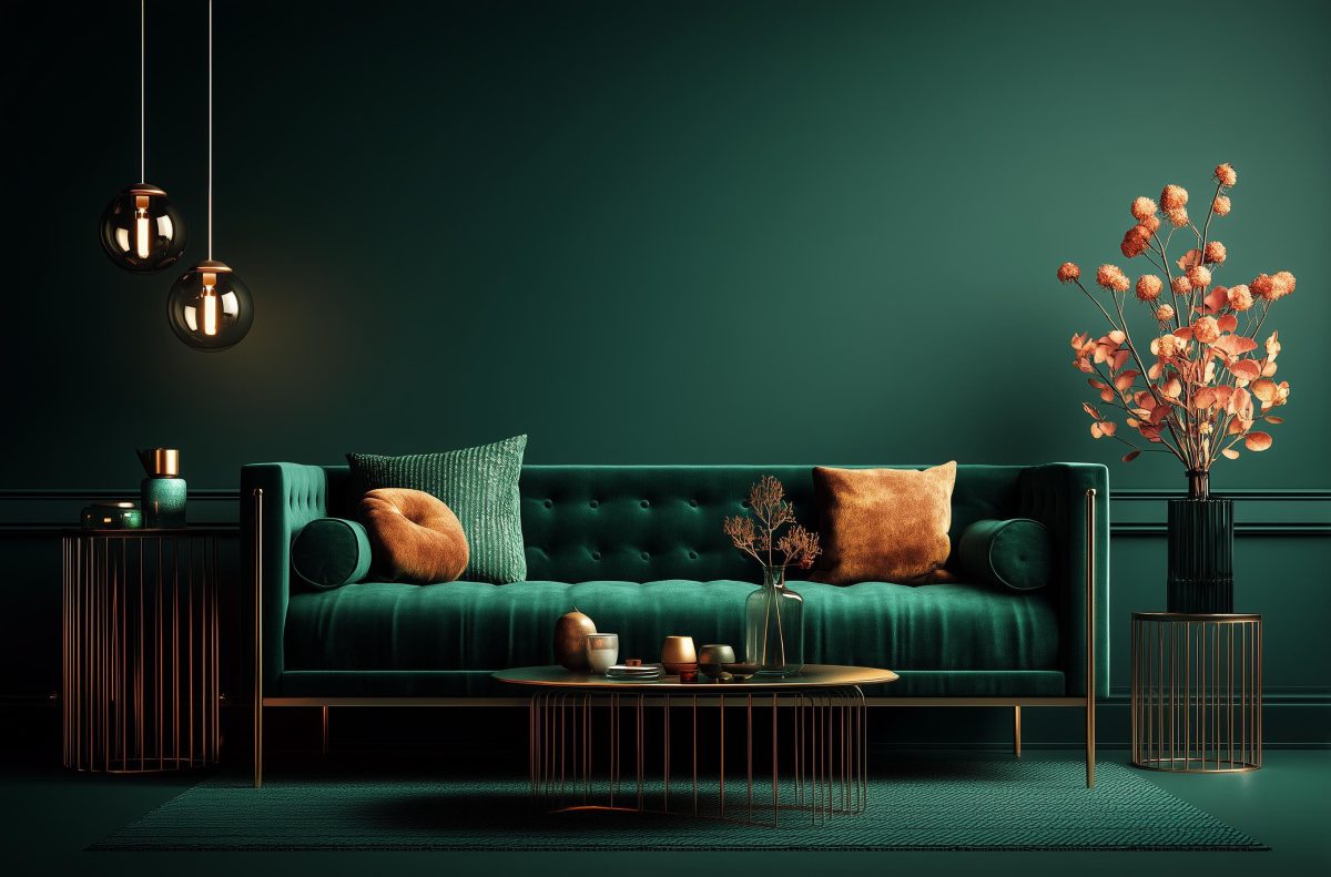
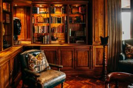
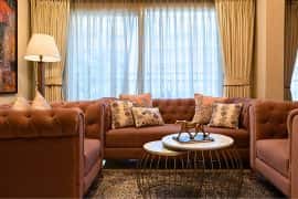
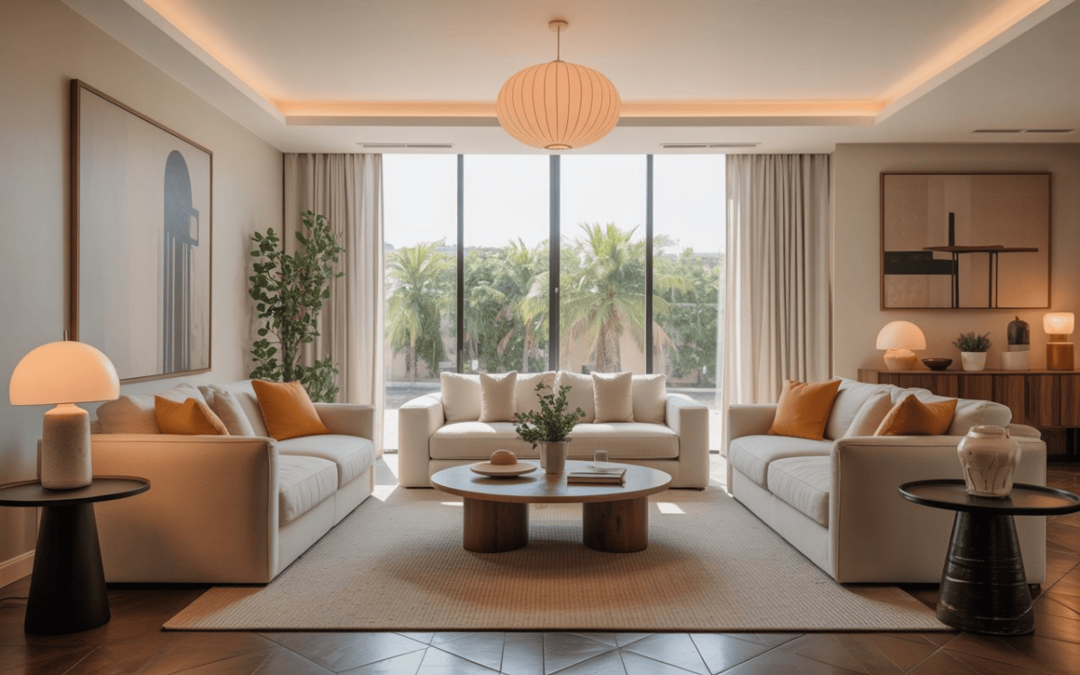
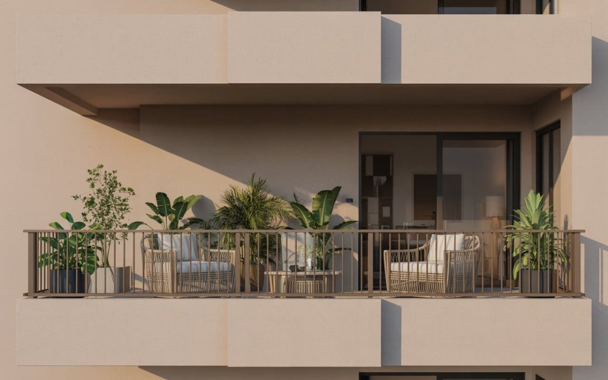
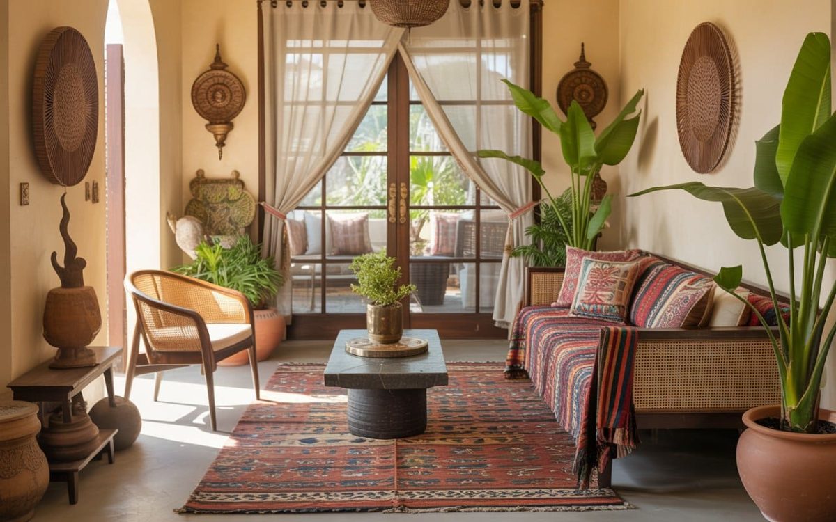
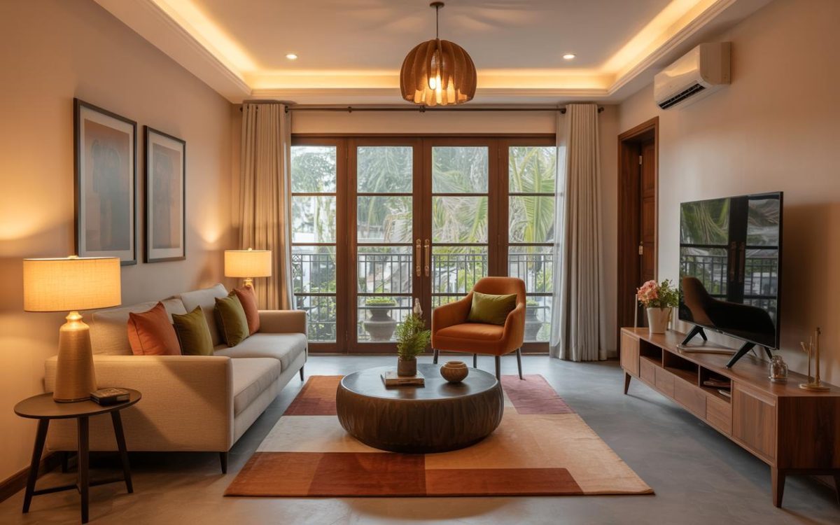
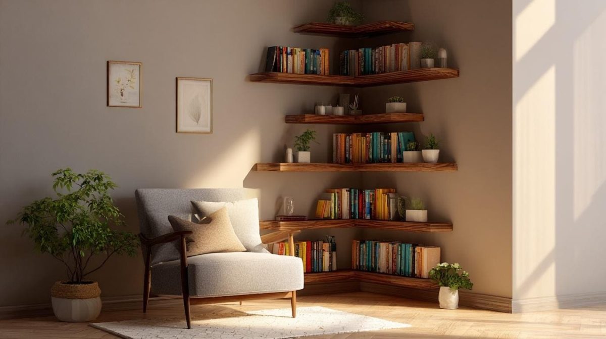
Triadic Colour Schemes for Living Rooms
Some interior designers feel that living rooms are where triadic colour schemes really come into their own. This is because living rooms are typically larger than the other rooms in the house, and they have more space and objects for colours to blend or pop.
Accent walls are well suited to living rooms, matched with colourful sofas, lampshades and other accessories. In such cases, don’t be afraid to break out of the triadic colour wheel and include some different colours, too.
Five Tips for Using Triadic Colours
- Begin with deciding on the overall mood and tone of the room. Think of the emotions you want to convey and the uses to which the room will be put.
- Then, choose a dominant colour to match the above mood.
- From the colour wheel, choose two adjacent colours. These three will be your triadic palette.
- The dominant colour can be bold and saturated, with the others of less intensity.
- While the dominant colour is typically on the walls, the other two colours can appear on upholstery, curtains, shelves and accessories.
At HomeLane, we’re a group of design experts with hands-on experience in using colours to make interiors spring to life. Whether you’re looking for ideas or inspiration, we’ll be happy to deliver. Book a free design session with us today.


 EXPLORE MORE