The colour of monarchy and prosperity, wine evokes various emotions in your interior design. From peace to elegance to strength, if there’s one colour that speaks the loudest, it is this. Needless to say, wine has been used since time immemorial as a colour of expression.
With its luscious undertones, the colour modernizes the space as much as it makes it regal. Read further to know how you can incorporate this luxurious hue in the various areas of your home. We’ll cover the advantages and disadvantages of the colour, as well as how you can make the most of it.
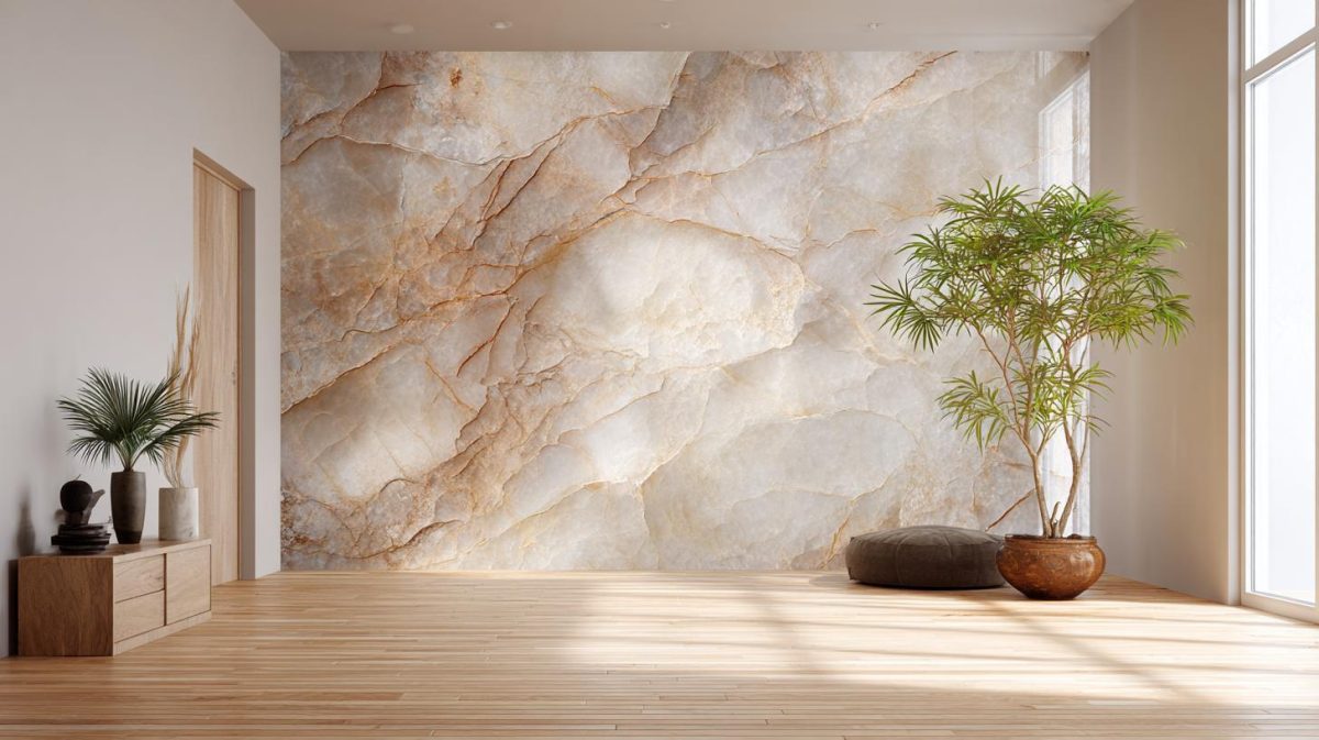
What is Wine Colour?
Wine colours, just like the drink they are named after, inspire elegance, calm, and a whole lot of fun. There is an array of wine colours, ranging from rich purple to multiple shades of red—rose red, ruby red, garnet red, reddish-brown, and the like.
Decorating with Wine Colours
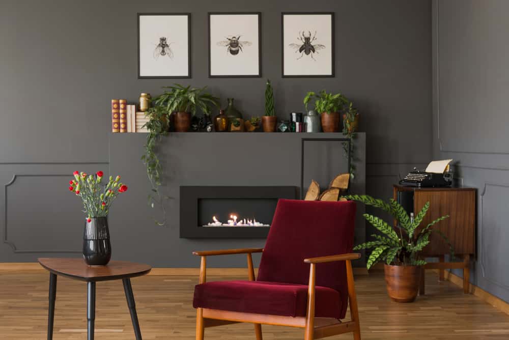
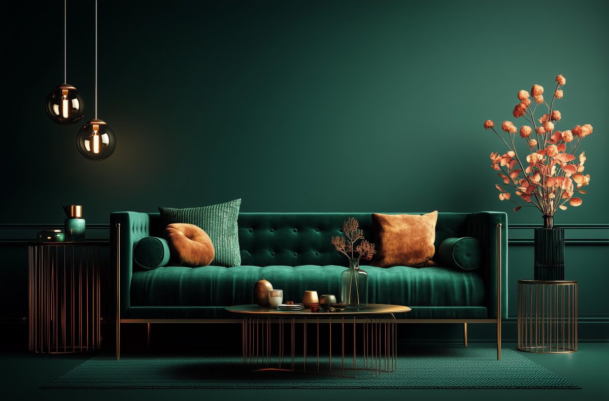
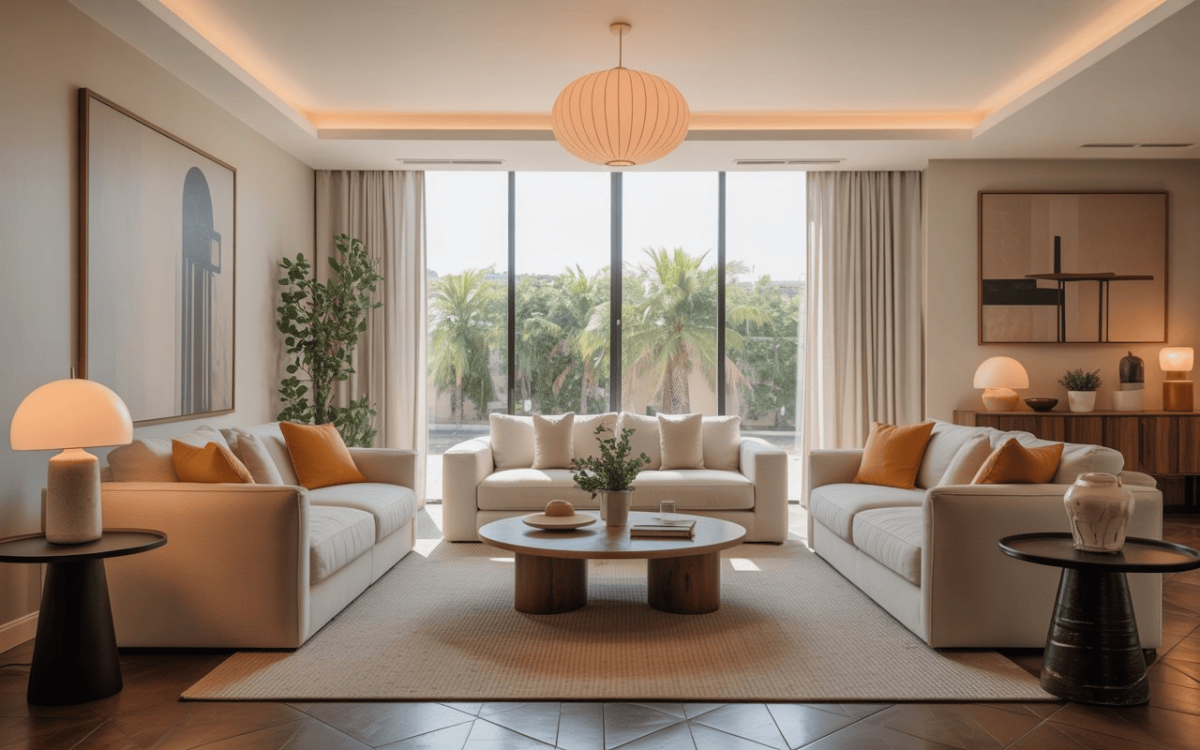
Different shades of wine colours grant different looks to the space. Choose the wine shade that matches or contrasts your house’s interior decor perfectly. Cherry-red-wine coloured walls harmonize beautifully with the various prints and textures of a living room. They accentuate the couches, the fireplace, and the low-lying tabletops to create a cosy and inviting space.
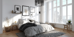
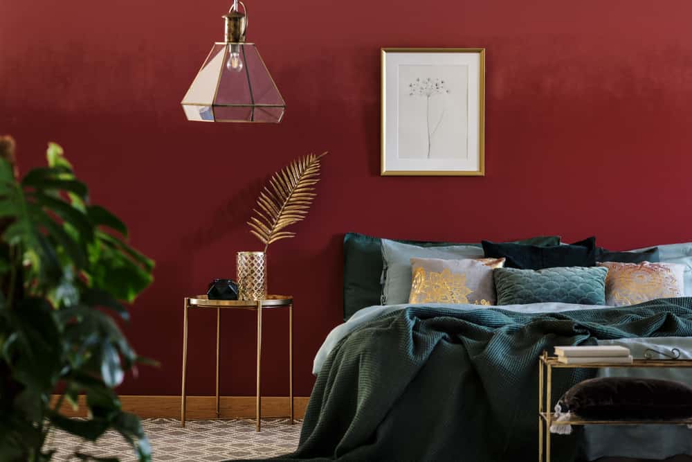
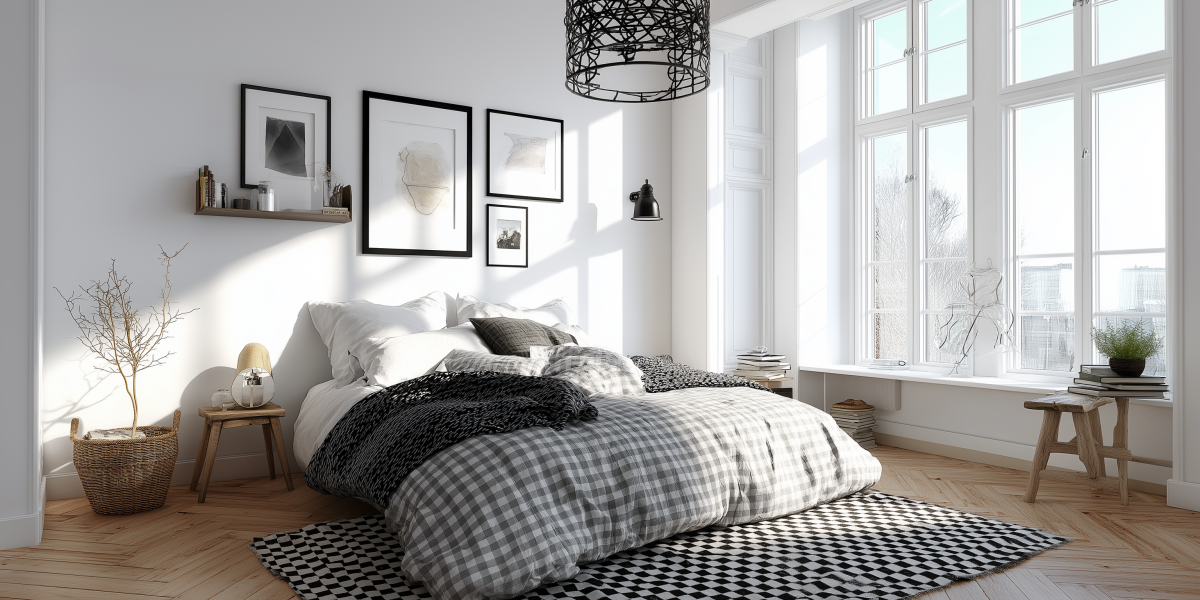
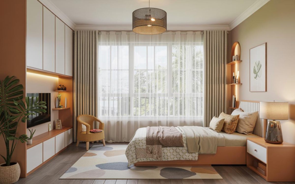
Similarly, merlot shades are perfect for the bedroom. Textured wallpaper in rich and velvety merlot engulfs your bedroom. Its lovely blush-coloured feel adds to the comfort.

Rich brown tones are great for the dining area or a guest room. Brown creates a combined effect of relaxation as well as warmth. A few judicious splashes of cabernet can uplift the look further.
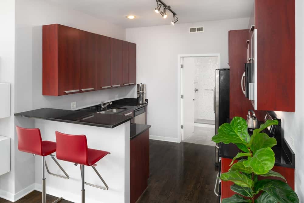
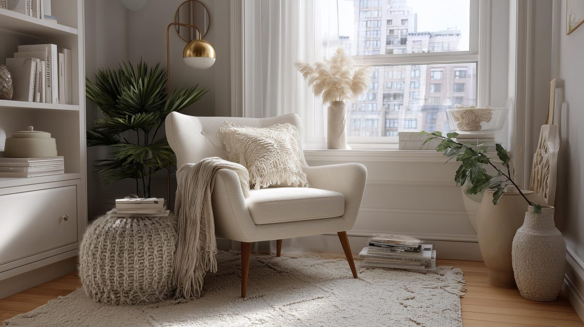
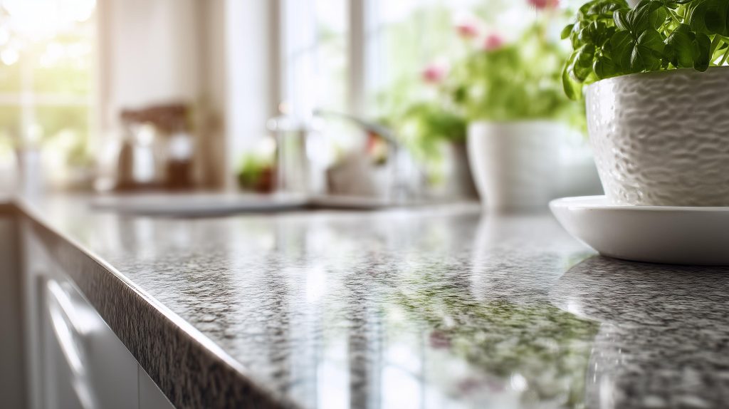
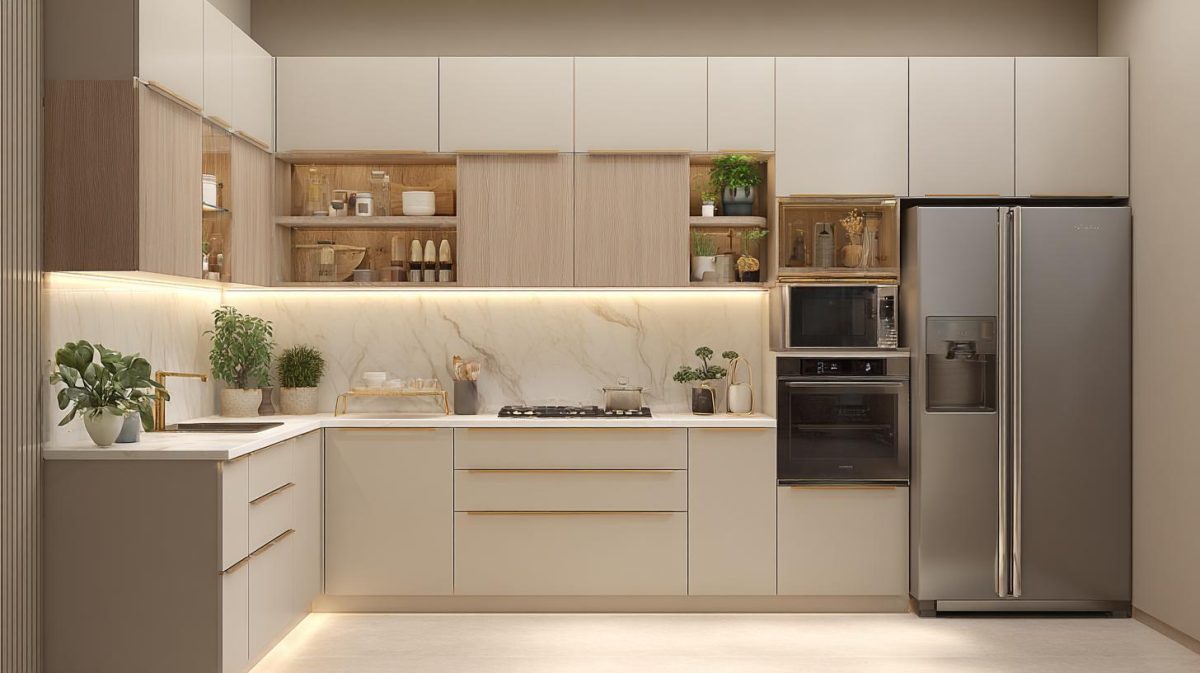
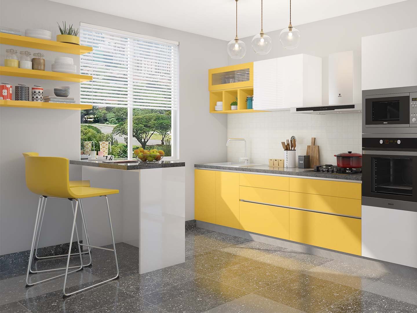
Finally, white wine hues such as chardonnay and champagne lie on the lighter side and give you a clean look. These colours go well with naturally lighted rooms, such as the kitchen, as they retain the warm glow instead of absorbing it. They’re also easy to work with, despite the scale, and pair well with pure white and classic cream colours.
Advantages and Disadvantages of the Colour Wine
Different wine shades create different effects on the interior space.
If you’re looking to paint a tiny room with little natural lighting, then dark wine hues are not the way to go. These will create a gloomy effect. Instead, lighter wine colours such as white, grey, and light red will visibly brighten the space while actively reflecting even the smallest amount of sunshine.
Everyone has a distinct idea of ‘comfort’. Some like the rigid characteristics of high-tech, while others find comfort in a magnificent art décor environment. People who do not enjoy dark wine colours in their bedrooms may find these hues more appealing in their living room or dining area. So, be sure to select a colour that is comfortable for you at the end of the day.
Red is a stimulating colour. It encourages bravery and boldness. When a performer wants to boost his self-esteem, he wears this hue. However, too much red could make you feel irritated or too alert. So, a good way to use wine red is to use it judiciously on one wall and paint the other walls in lighter, neutralizing tones.
Home Interior Using Wine Colour
For the living room:
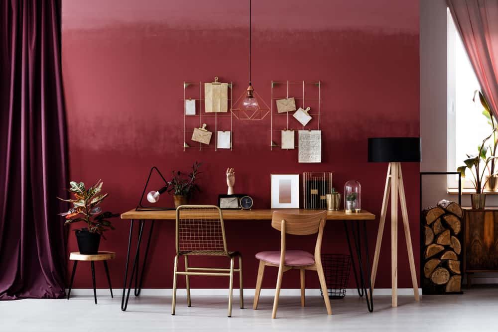
The burgundy hue fits best in the living room. This colour has the aesthetic qualities of tranquillity, passion, power, and warmth. While designing the interiors, consider the walls to be the room’s frame since they will assist you in coordinating the furnishings. Select sofas and the rest of the decoration to contrast the wine backdrop.
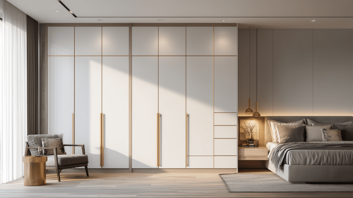
For the bedroom:
Consider painting the wall behind your bed a burgundy colour and choosing light-coloured furnishings. The bedspread is certainly the focal point of the bedroom design. So, light-coloured linens and headboard stand out beautifully against a burgundy backdrop. If you’re incorporating rugs adjacent to the bed, then make sure they contrast with the floor and the drapes. Furthermore, if you go for a wine-coloured wall, the drapes should be transparent rather than opaque. Transparent drapes will give the room breathability, while opaque drapes could make it intimidating.
For the bathroom:
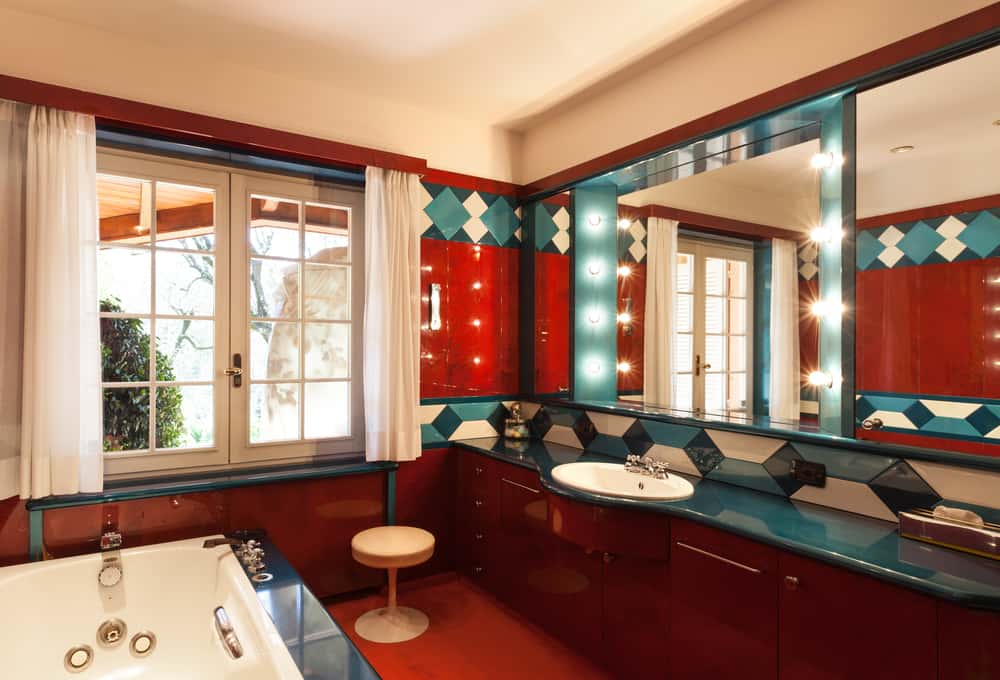
You might wonder how this hue could be used in a bathroom. But it is not an uncommon look. Establishments in the hospitality industry, especially those that wish to emit elegance, often paint their bathrooms wine. You could use the same concept at home. On the one hand, you could choose a wine colour for the walls and add plain bathroom fixtures. On the other, you could stick to plain ceramic walls and elevate them with wine-coloured towels or a shower curtain. In both cases, you achieve a sense of equilibrium. However, in the latter example, the colour is employed merely as a rim.
Hendrickson Photography
When it comes to decorating, you don’t have to pick between red and white wine hues. The two complement each other perfectly.
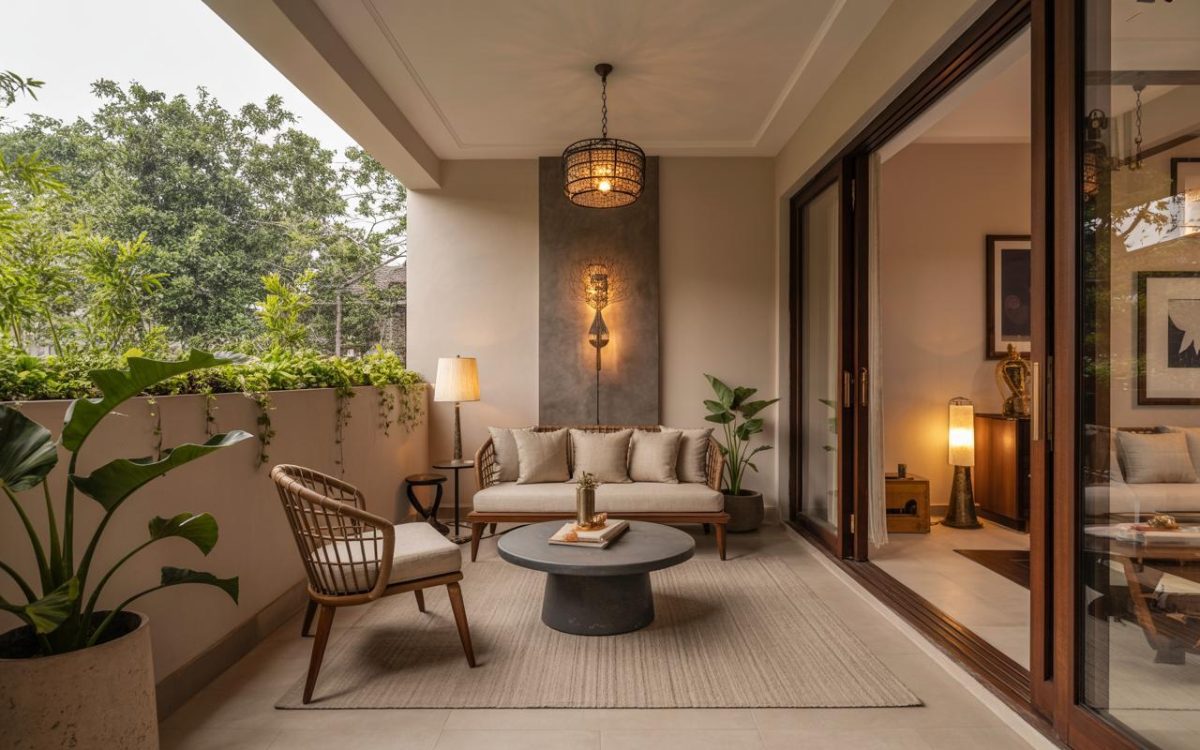
Pro tip: Wine hues could be used to improve your home’s entryway. The entryway is the first thing you see when you step inside. Here, the colour wine can be incorporated into the walls, a rug, or a chair. This will add to the plush red-carpet feel, minus the intimidation.
Explore a contact-less, high-quality design experience from the comfort and safety of your own home with HomeLane’s 1400+ design specialists. Our specialists can create unique home interiors in as little as 45 days. Discover the thrill of decorating your house interior with lifelike 3D graphics and design your ideal home interior in three simple steps: Discover, design, and move-in.
FAQs
1. What is wine colour in interior design?
Wine colour in interior design refers to deep, rich shades inspired by wine, such as burgundy, merlot, ruby red, garnet, and reddish-brown tones. These colours evoke elegance, warmth, calmness, and a regal feel in home interiors.
2. Is wine colour good for home interiors?
Yes, wine colour is an excellent choice for home interiors when used thoughtfully. It adds richness and sophistication to spaces like living rooms, bedrooms, and dining areas while creating a warm and inviting atmosphere.
3. Which rooms are best suited for wine colour interiors?
Wine colour works best in living rooms, bedrooms, dining areas, guest rooms, and even bathrooms. Lighter wine shades suit kitchens and well-lit spaces, while deeper tones like burgundy and merlot work well as accent walls.
4. What are the different shades of wine colour used in interiors?
Popular wine colour shades include burgundy, merlot, cherry red, ruby red, garnet, cabernet, rose red, and lighter wine tones like champagne and chardonnay for a softer look.
5. How can wine colour be used in a living room?
In living rooms, wine shades like burgundy can be used on walls or as accents. Pair them with contrasting sofas, neutral décor, and textured furnishings to create a cosy, elegant, and balanced interior.
{“@context”:”https://schema.org”,”@type”:”FAQPage”,”mainEntity”:[{“@type”:”Question”,”name”:”What is wine colour in interior design?”,”acceptedAnswer”:{“@type”:”Answer”,”text”:”Wine colour in interior design refers to deep, rich shades inspired by wine, such as burgundy, merlot, ruby red, garnet, and reddish-brown tones. These colours evoke elegance, warmth, calmness, and a regal feel in home interiors.”}},{“@type”:”Question”,”name”:”Is wine colour good for home interiors?”,”acceptedAnswer”:{“@type”:”Answer”,”text”:”Yes, wine colour is an excellent choice for home interiors when used thoughtfully. It adds richness and sophistication to spaces like living rooms, bedrooms, and dining areas while creating a warm and inviting atmosphere.”}},{“@type”:”Question”,”name”:”Which rooms are best suited for wine colour interiors?”,”acceptedAnswer”:{“@type”:”Answer”,”text”:”Wine colour works best in living rooms, bedrooms, dining areas, guest rooms, and even bathrooms. Lighter wine shades suit kitchens and well-lit spaces, while deeper tones like burgundy and merlot work well as accent walls.”}},{“@type”:”Question”,”name”:”What are the different shades of wine colour used in interiors?”,”acceptedAnswer”:{“@type”:”Answer”,”text”:”Popular wine colour shades include burgundy, merlot, cherry red, ruby red, garnet, cabernet, rose red, and lighter wine tones like champagne and chardonnay for a softer look.”}},{“@type”:”Question”,”name”:”How can wine colour be used in a living room?”,”acceptedAnswer”:{“@type”:”Answer”,”text”:”In living rooms, wine shades like burgundy can be used on walls or as accents. Pair them with contrasting sofas, neutral décor, and textured furnishings to create a cosy, elegant, and balanced interior.”}}]}


 EXPLORE MORE