The colours picked out of the glossy pages of a lifestyle magazine do not always translate well when it comes to the
home interiors. A gorgeous shade of brown from a design magazine might turn out to be dull and make your space look dark and cramped.
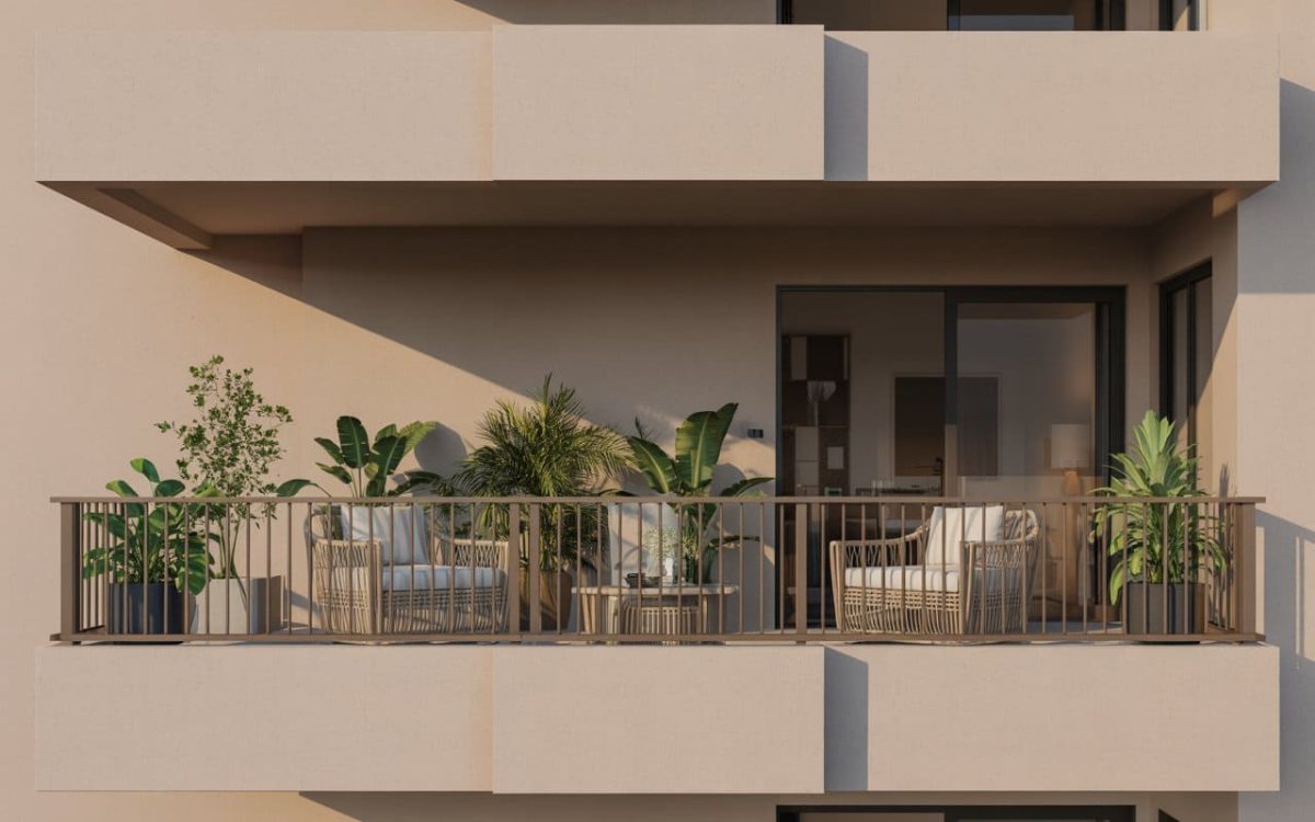
Colours play an integral part in your home decor. Picking the right colour palette is not an easy task. It depends on the size and location of your rooms, the lighting, the layout and even the furnishings you own. It’s important to get your colour schemes narrowed down at the start of your design process.
Find this a daunting prospect? It really needn’t be, we have you covered. Here are some basic rules to help you choose a colour palette that’s perfect for your home.
1. Dark colours vs. light colours
While choosing a colour for your home interiors think of the colours in the rainbow. Colours that are closer to red have longer wavelengths. They feel like they are ‘advancing’ toward you. On the other hand, colours that are closer to violet feel like they are ‘receding’ away. Then again, darker colours seem to advance and lighter shades will recede.
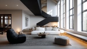
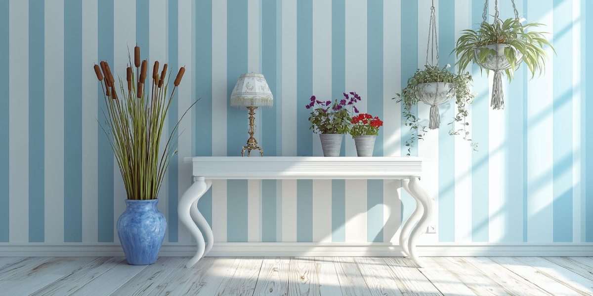
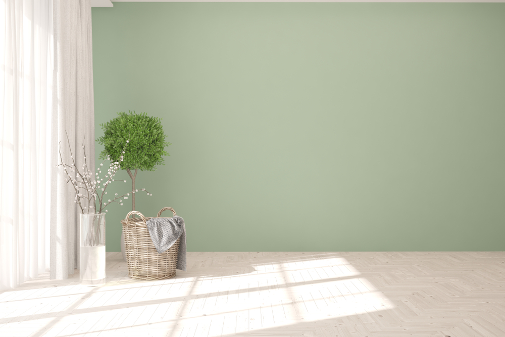
If you want your room to look larger, you should use shades that are similar to light blue, pale green or white. Intensely dark shades of red, brown, orange will make your room appear small and cramped.
2. Pure colours draw attention
A pure colour seems to advance more and instantly draws the eye. While colours that are a combination of two or more pure shades, tend to recede and fade into the background.
This can be used to advantage when you are trying to create a focal interest in the room. Pure shades will always stand out and draw attention.
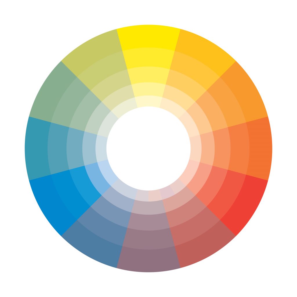
3. Colours are affected by the surroundings
A colour will always be viewed together with the colours around it. This becomes important when you are planning juxtapositions of colour in a room. Keep in mind, the shades that are close to each other on the colour wheel are complementary. They are called analogous colours. While the shades that are at opposite ends of the wheel contrast each other.
For instance, a room done up in green, blue and yellow shades will be in harmony as they complement each other. Green and red do not go very well as they are on opposite sides of the spectrum.
4. Colours affect your mood
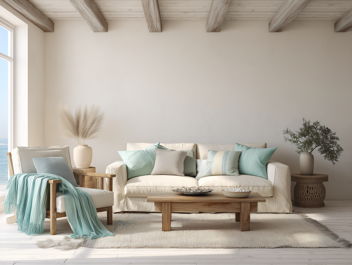
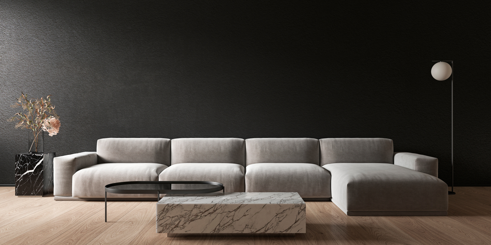
It’s a well-known fact that colours affect your mood. That is all the more reason for you to choose your colour palette with care. As a rule of thumb, shades of blue, green and generally all pastel shades are soothing and relaxing. While shades of red, orange and yellow are invigorating and lively. Your design scheme should always strike the right balance and create harmony in your home interiors.
Try to use colours in moderation. Too much red, for instance, can get uncomfortable after a while. On the other hand, too much pale blue could be overwhelmingly dull. Here’s an easy fix: try balancing a red accent wall with light grey or cream walls to tone down the vibrancy.
5. Colours look different when the light changes
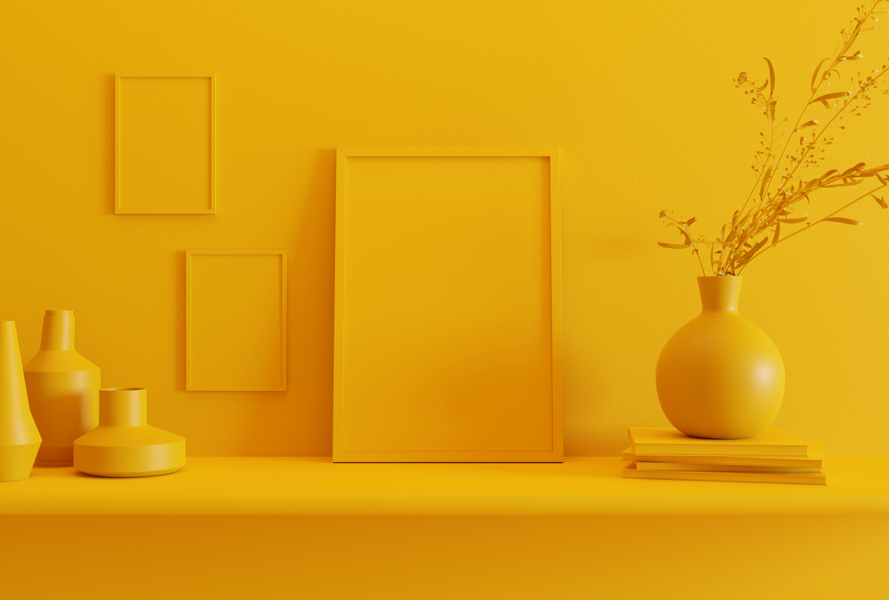
Colour takes on different qualities when viewed in sunlight versus when viewed under artificial light. Make sure you run patch tests to see how your chosen shades look in the daytime and at night. Bright sunshine goes well with shades of yellow, amber and orange. While blues and greens look their best in cool diffused white light.
When you are choosing the colours for your home interiors, keep in mind the positioning of windows and lights in the room. Choose the hues to suit the intensity and quality of the light in the room.
Some Designer Tips and Tricks
Now that you have understood the basic colour rules, here are some tips and tricks that home interior designers follow to get the colours just right.
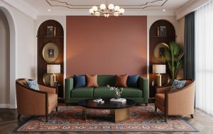
When in doubt, pick the colours from the focal patterns of the room. If it’s the living room, look for the main colour in the upholstery. This will be the main colour in your palette. The colours of the rugs, drapes, walls can be shades analogous to either side of the main colour in the colour wheel. Some examples of analogous shades are yellow-mustard-orange, or yellow-green-blue.
If you are going with one or two shades of colour for the room, think of vertically grading the colour intensity from dark to light. The floors can be dark and intense, while the walls can be medium and the ceiling in the lightest shade.
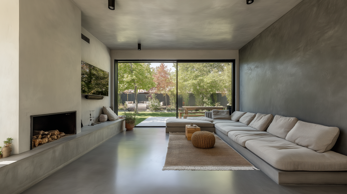
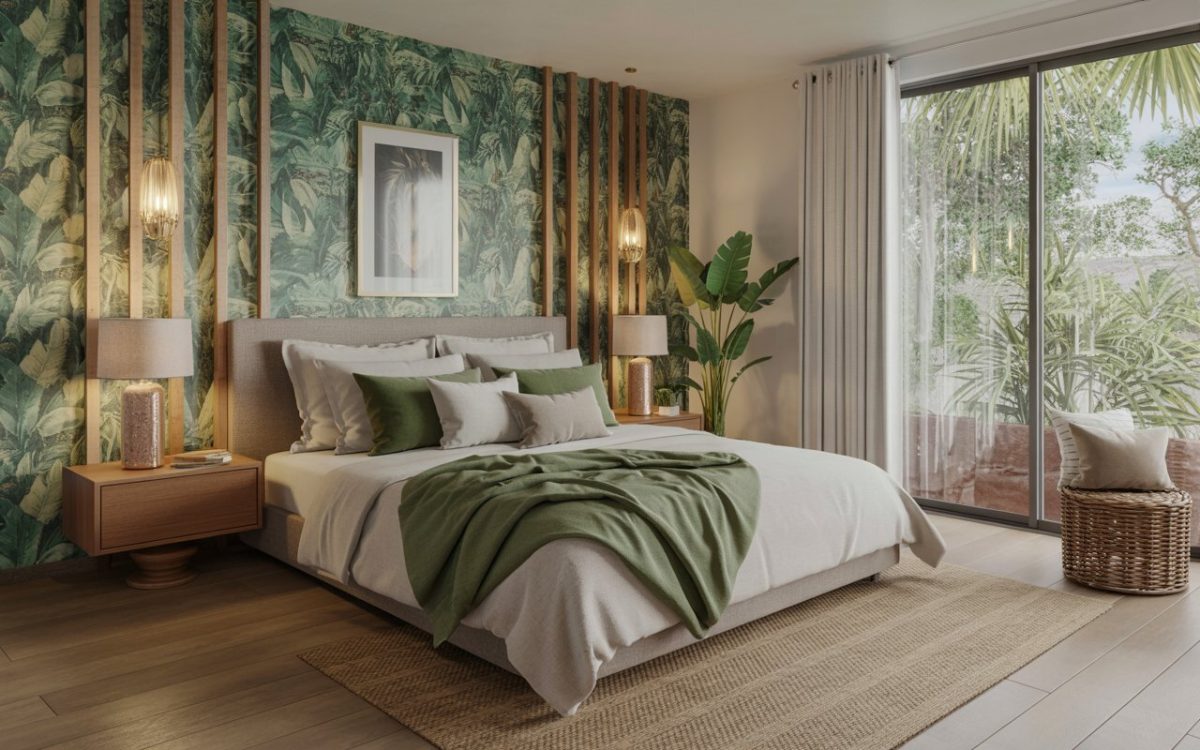
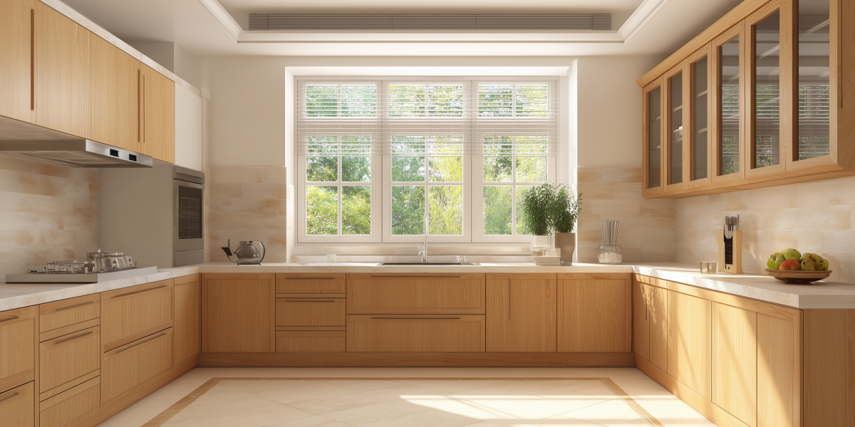
Rooms that are used the most, like the kitchen and living spaces, can have lively and energizing colours. Bedrooms and bathrooms should ideally be painted in low-key and relaxing shades.
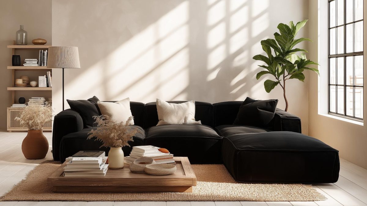
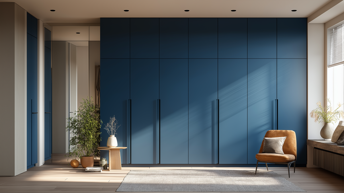
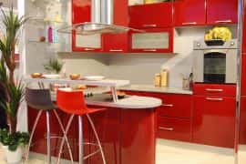
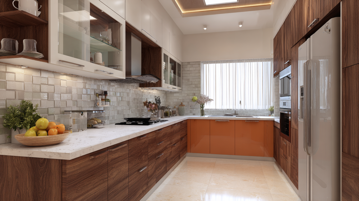
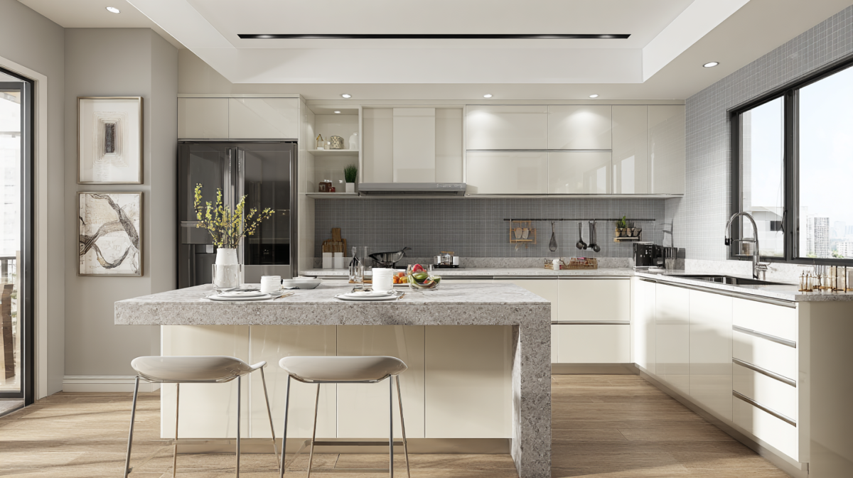
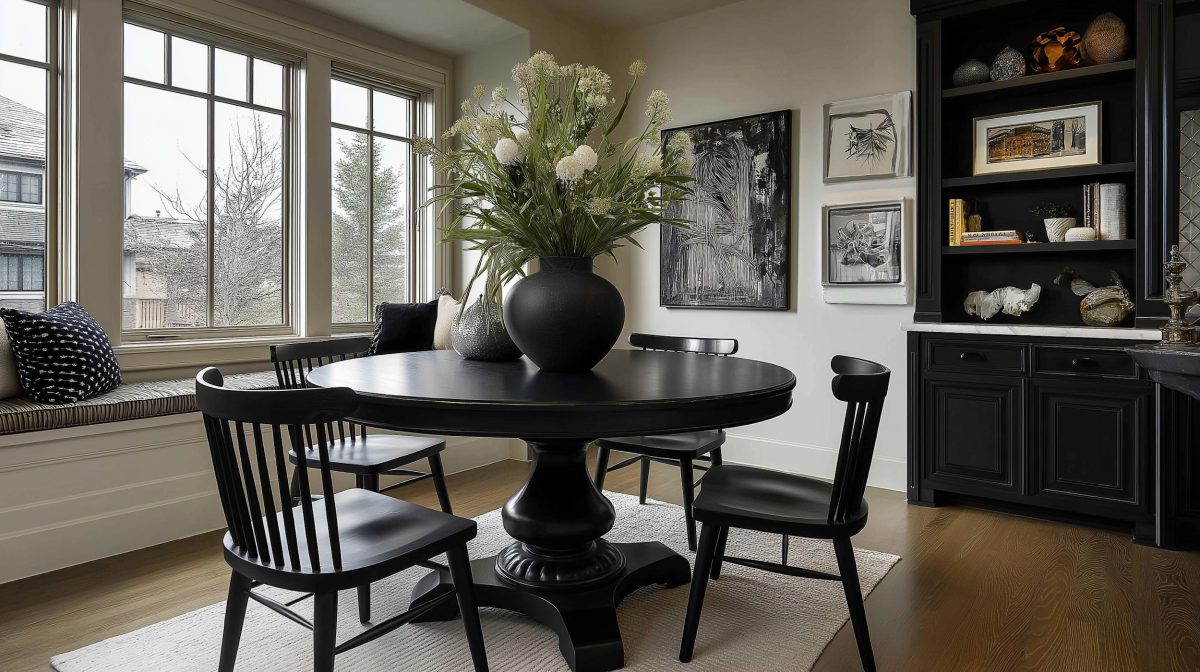
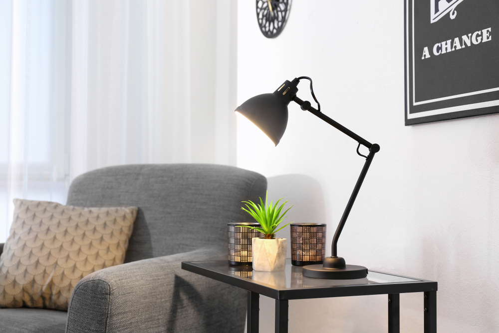
Dual tones are very popular, especially in the kitchens. Choose colours that contrast with each other, like black and white or grey and red, to make an impact.
Go with colours that match your personality! If you have a vibrant and outgoing persona, reds and yellows would suit you well. Whites and pastels are a perfect fit for elegant and simple personalities.
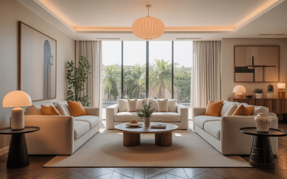
Some designers like to balance out the shades in a room. They are balanced in a ratio of 60 percent of the dominant colour (walls), 30 percent of secondary colours (upholstery and drapes) and 10 percent of the accent colour (accessories). The three shades you pick should complement each other.
In the end, rules are rules, but they are meant to be broken. Your home interiors should be done up in colours that you love. Never compromise on what warms your heart and makes you feel good.
Need help? The
HomeLane experts can help you go through the complexities of colour shades and hues. Choose your favourite with our expertise.


 EXPLORE MORE