The Latest Home Interior Colour Combinations for 2026
By Usha Balasubramanyan- March 04, 2026
Colour trends change every year, but the way colour makes us feel inside our homes matters far more than what is fashionable. As we move into 2026, interior colour combinations are becoming softer, warmer, and more emotionally grounded. Homes are no longer designed just to look good. They are designed to feel comforting, balanced, and personal.
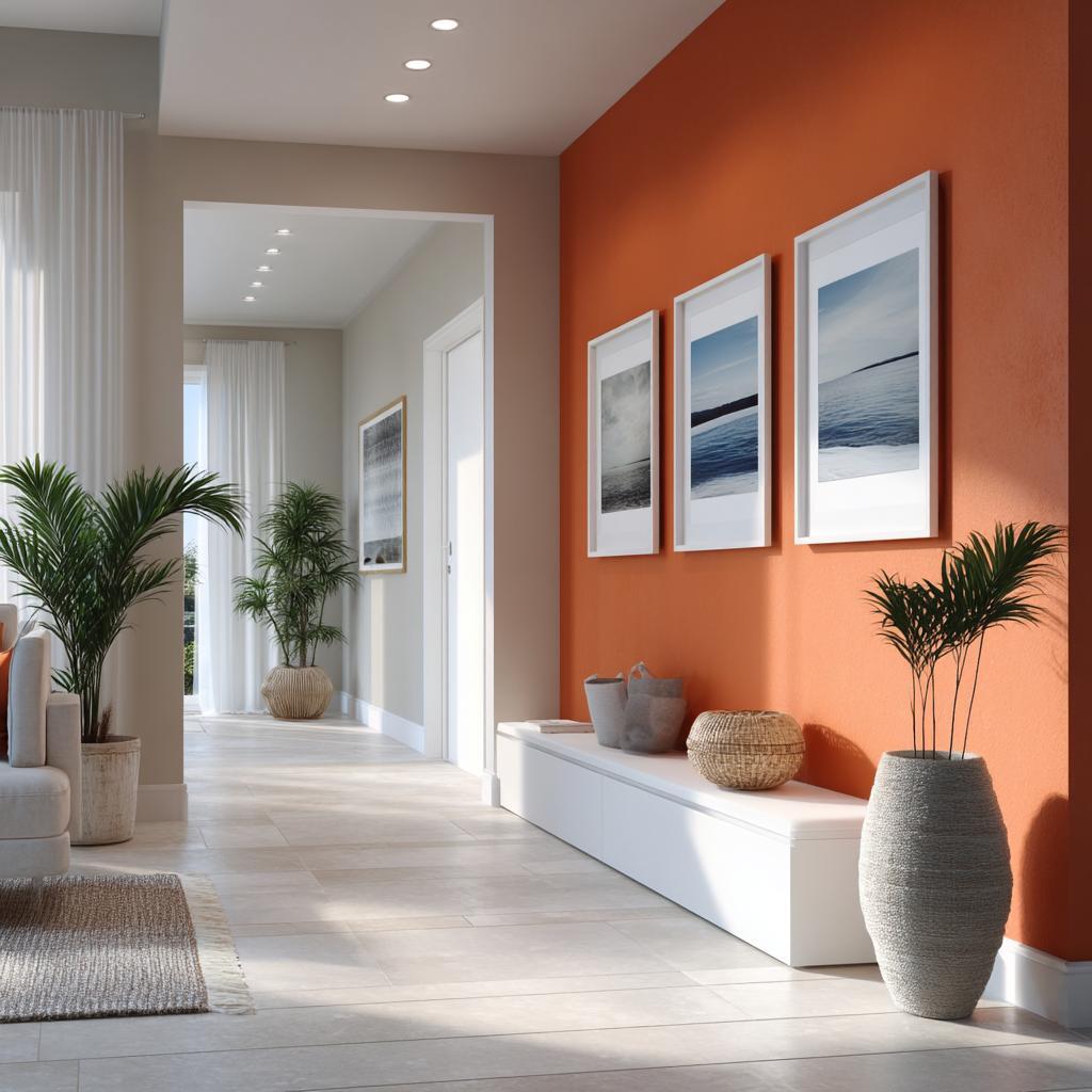
Hall interior colour combination with terracotta accent walls and soft neutral tones
If you are planning a refresh or a full redesign, understanding how colour works together in today’s homes can help you make choices that last well beyond a single trend cycle. Let’s look at trending home interior colour combinations, and figure out what might work for you!
Understanding Colour Psychology: Setting the Mood
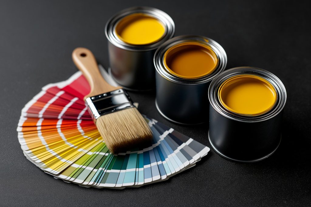
Interior wall painting colour combinations showcased with modern palette tools
Colour has a powerful effect on how a space feels, often before we consciously notice it. Warm colours like beige, terracotta, and muted browns feel welcoming and grounding. Cooler tones such as blues and greens usher in calm and clarity, especially in busy households.
What is changing in 2026 is the way these colours are being paired. Instead of sharp contrasts, we find that homeowners are choosing softer transitions and layered palettes. The aim is emotional comfort rather than visual drama.
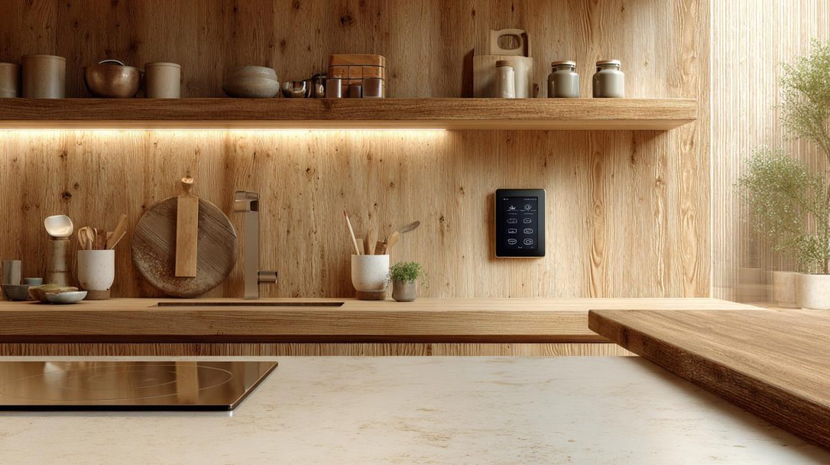
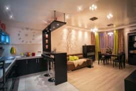
Bedroom interior colour combinations are leaning towards palettes that encourage rest and calm. Living spaces are choosing shades that support conversation and relaxation. Kitchen interior colour combinations are embracing warmth, moving away from stark whites towards colours that feel more lived-in. Hall interior colour combinations set the tone for the rest of the home.
The Latest Home Interior Colour Combinations for 2026
The colour combinations on top of wish lists in 2026 are inspired by nature, craft, and quiet luxury. They feel personal, not trendy, and most importantly, they are easy to live with.
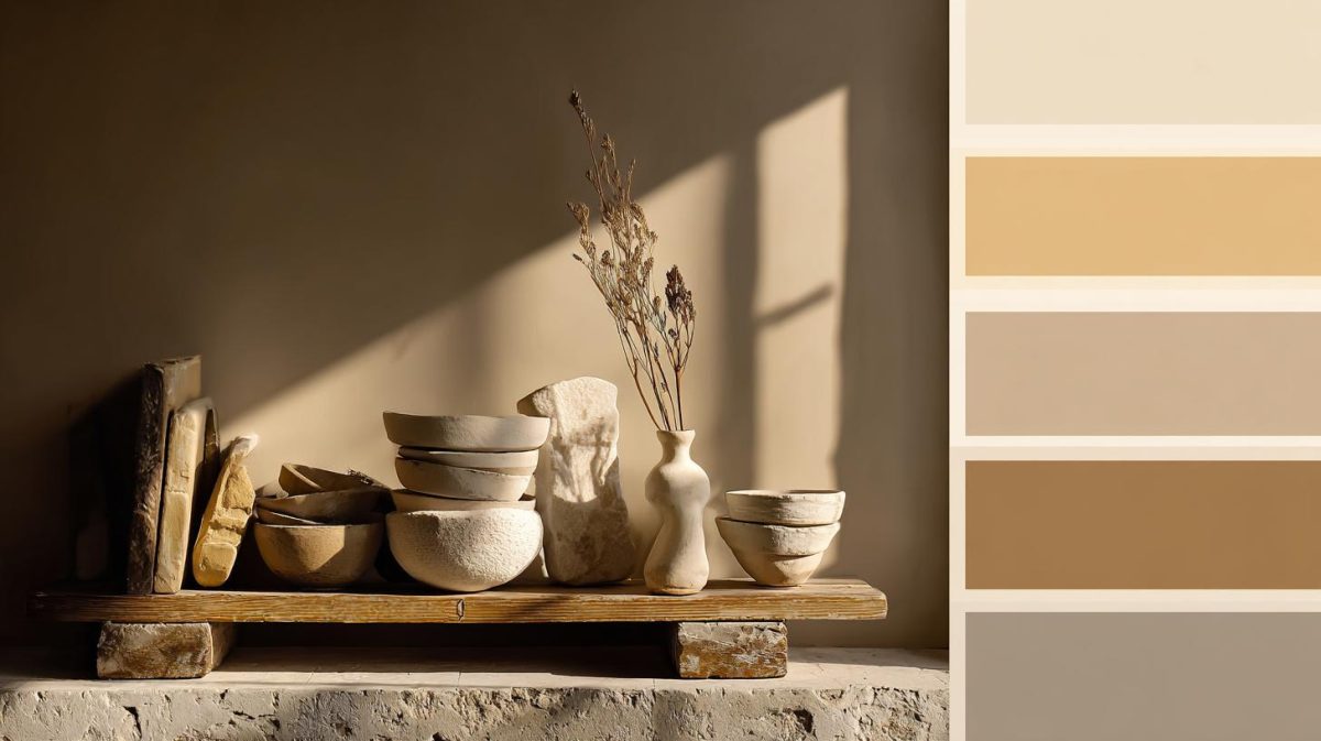
Warm home interior colour combination featuring earthy neutrals for spaces
One of the strongest trends is warm neutrals layered with depth. Think greige paired with soft browns, sand tones, and creamy off-whites. These combinations feel calm, cohesive, and adaptable across rooms.
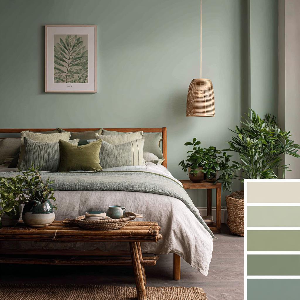
Calming bedroom interior colour combination with sage green and neutral tones
Muted greens with beige or clay tones are also making a strong appearance. Sage green, olive, and mossy hues paired with warm neutrals bring in a lovely sense of balance and connection to nature.
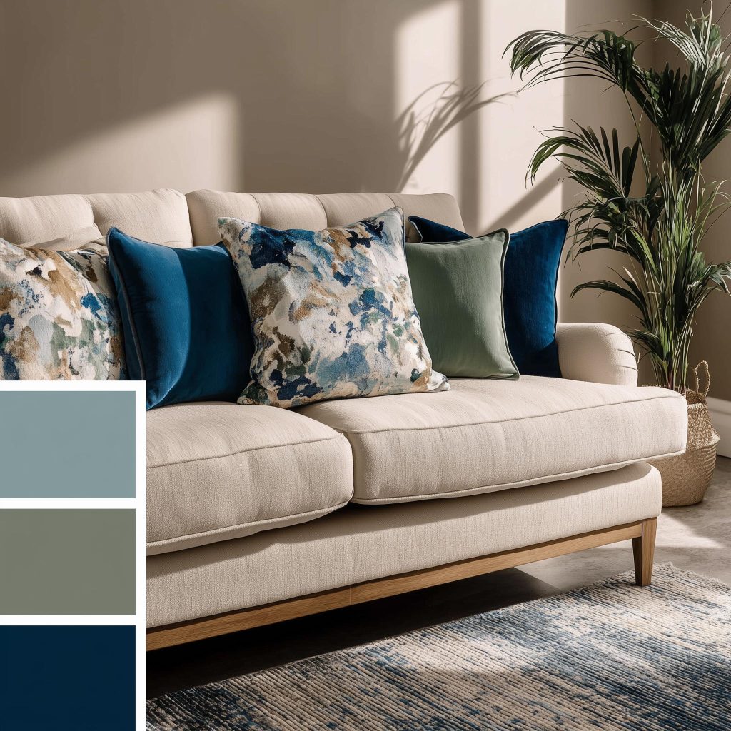
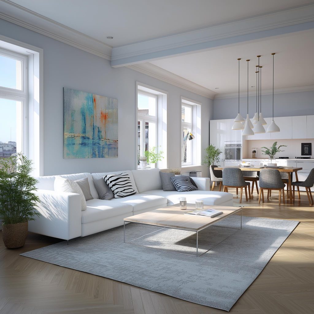
Elegant hall interior colour combination with sofa and blue accents
Soft blues mixed with warm greys or taupe offer a modern yet comforting look. These combinations work nicely in bedrooms and living rooms, where peace matters most.
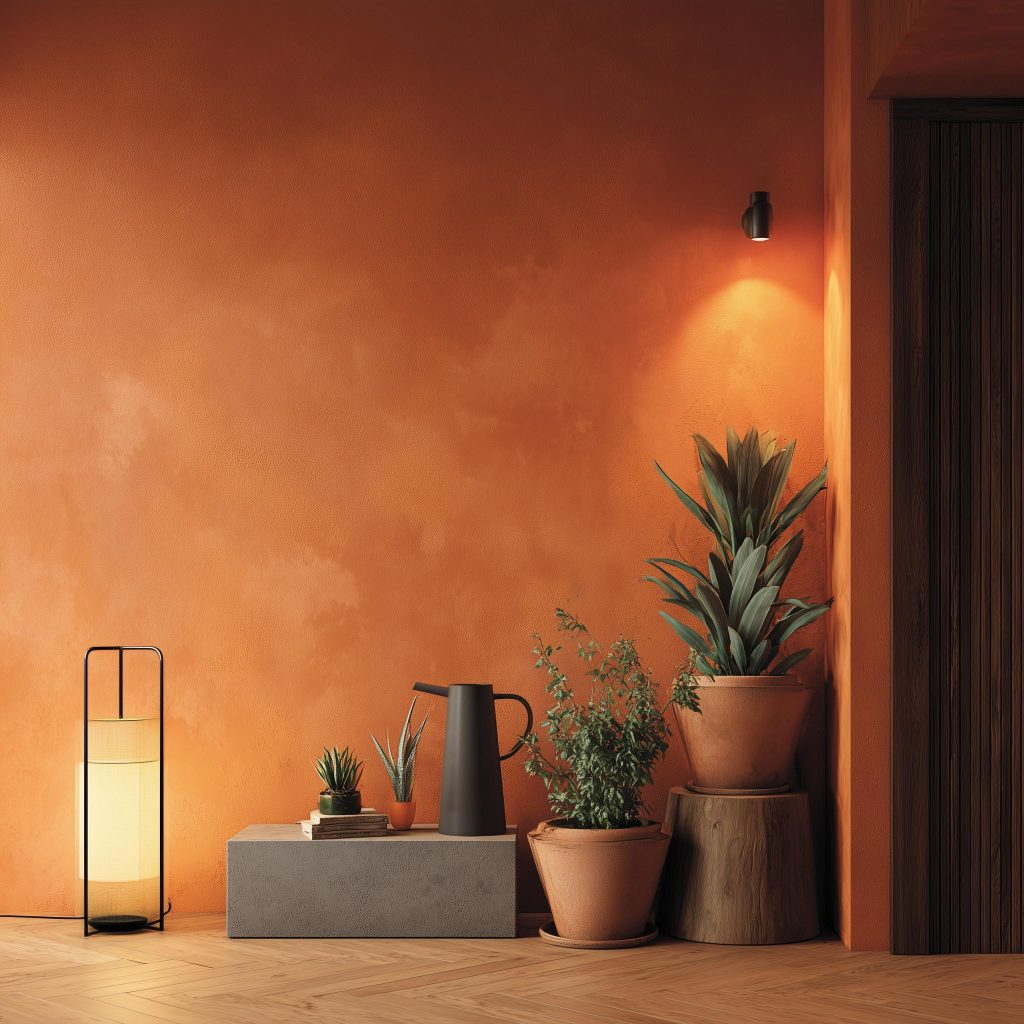
Warm terracotta interior wall painting colour combinations for Indian homes
For those who enjoy subtle character, terracotta or dusty rust paired with soft cream adds warmth without overwhelming the space. Used sparingly, these house interior colour combinations bring personality while staying refined.
Choosing the Perfect Interior Colour Combination for Indian Homes
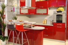
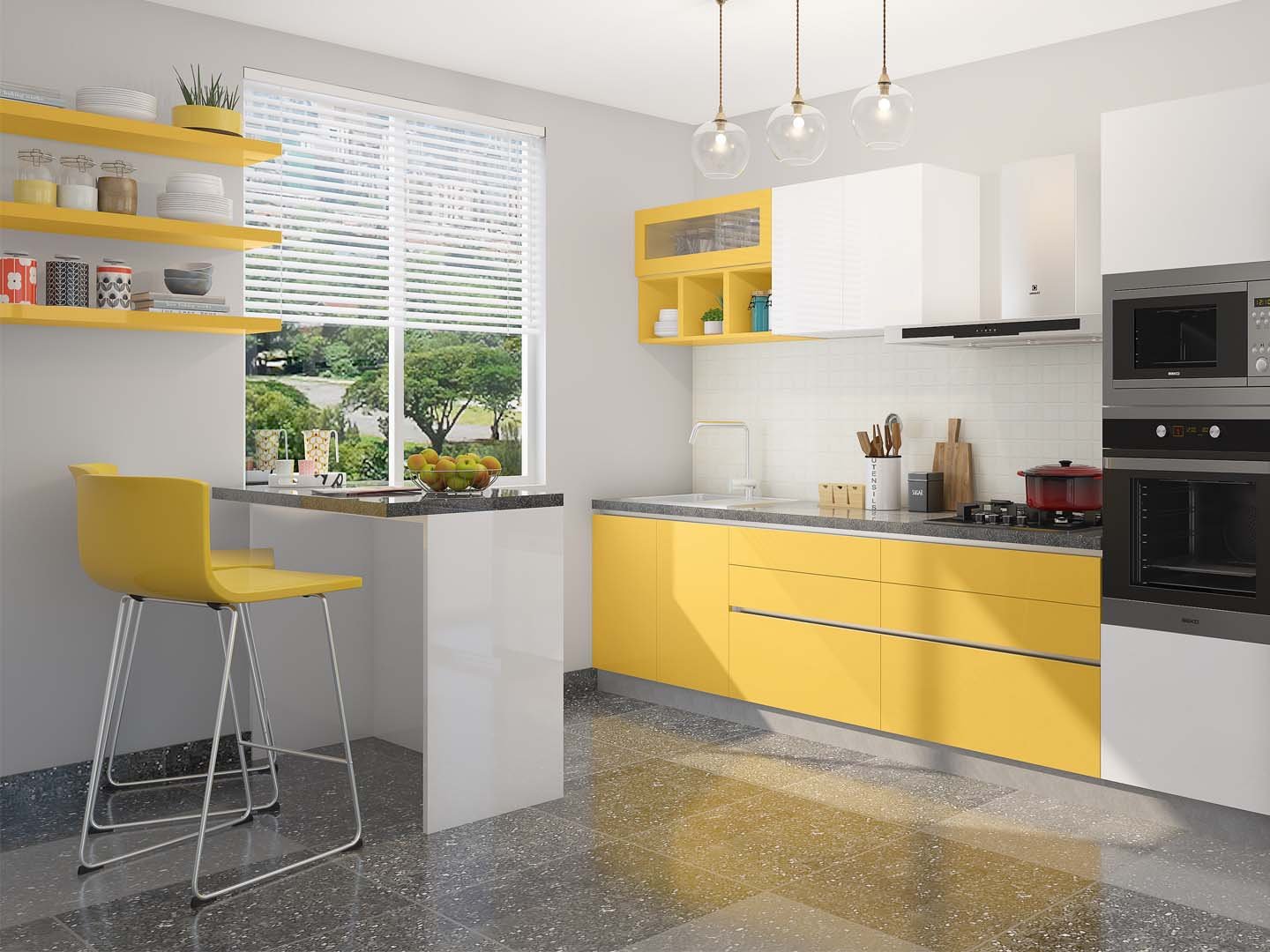
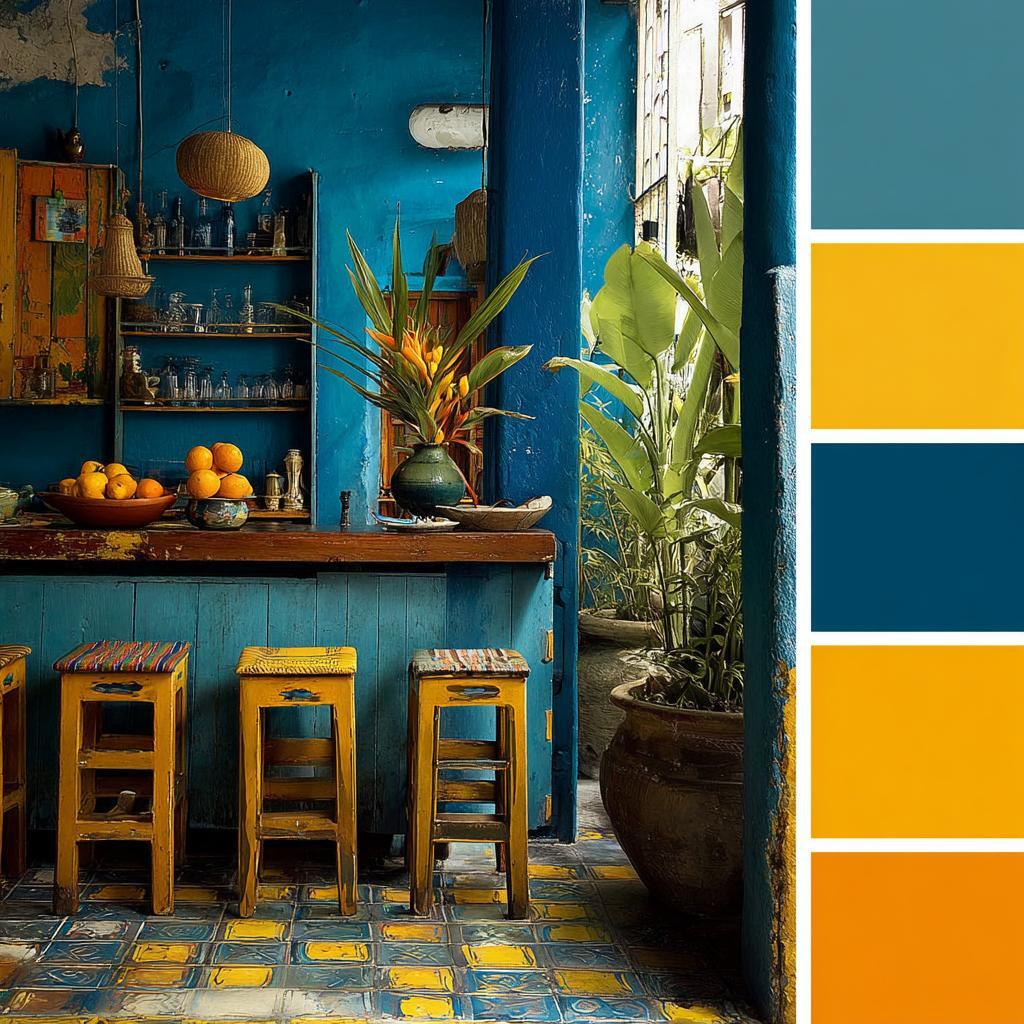
Bold kitchen interior colour combination with blue and yellow for homes
The best colour combination is not the one you see most often on Pinterest or Instagram! It’s the one that works with your home’s light, layout, and daily rhythm.
Start by noticing how natural light moves through your rooms. Take notes, if needed. South-facing spaces can handle deeper or warmer colours easily. Rooms with limited daylight will do well with lighter, reflective shades that prevent the space from feeling heavy.
Elegant hall interior colour combination with soft greys and modern whites
Next, think about continuity. Open-plan homes benefit from colour combinations that flow gently from one area to another. This does not mean everything must match, but the colours should relate to each other in tone or warmth.
Interior wall painting colour combinations should complement the furniture, furnishings and accent pieces. Think of the room as a whole, and see how each element interacts with the other.
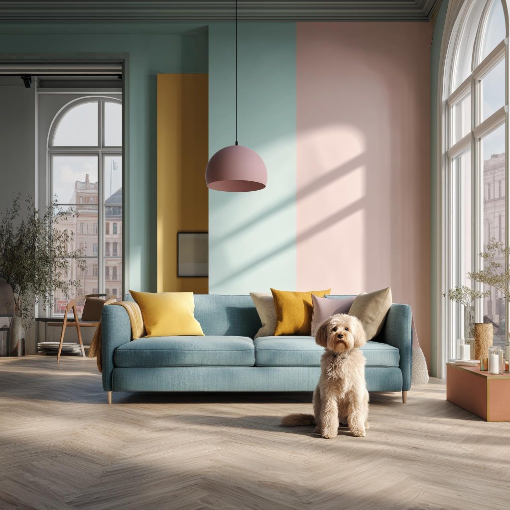
Modern home interior colour combination with pastel tones for stylish living
Lifestyle also matters. Busy homes with children or pets may prefer forgiving mid-tones over very light or very dark shades. Homes where a lot of entertaining happens may enjoy richer accent colours, while quieter households often gravitate towards softer palettes.
At HomeLane, colour planning always starts with how a space is used, ensuring home interior colour combinations feel practical as well as beautiful.
Blending Warm and Cool Colours Thoughtfully
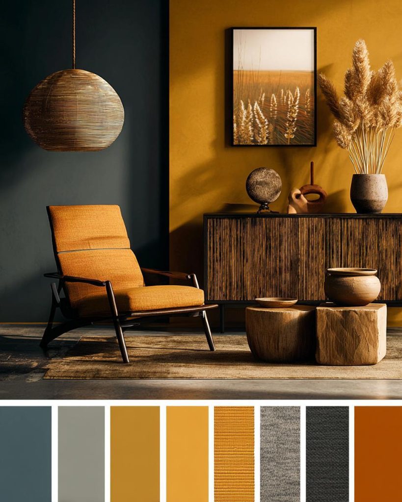
Warm hall interior colour combination with mustard, teal, and earthy accents
One of the most common questions we’re asked is whether warm and cool colours can coexist. And in 2026, the answer is a confident yes, when done thoughtfully!
The key is balance. Choose one temperature to lead and let the other support it. For example, a warm beige base can be complemented by cool blue accents, or a soft grey room can be warmed up with wooden finishes and earthy decor. Interior house painting colour combinations that mix warm and cool shades tick all the right boxes on style and personality.
Avoid using equally strong warm and cool tones in the same visual plane. Instead, let one dominate walls and larger surfaces, while the other appears through furnishings, artwork, or textiles.
Are Accent Walls Still Relevant?
Warm hall interior colour combination with mustard, teal, and earthy accents
Looking for interior wall colour combination ideas? Accent walls are still very much in style for 2026, but they are being used more subtly. Instead of bold, high-contrast colours, accent walls now lean towards deeper shades of the same colour family.
A slightly darker wall focus behind a sofa or bed adds depth, without breaking the harmony in the room. Textured finishes, colour-washed walls, or panelling in tonal shades are replacing sharp colour blocks.
The focus has shifted from attention-grabbing to atmosphere-building.
The Role of Natural Light in Colour Choices
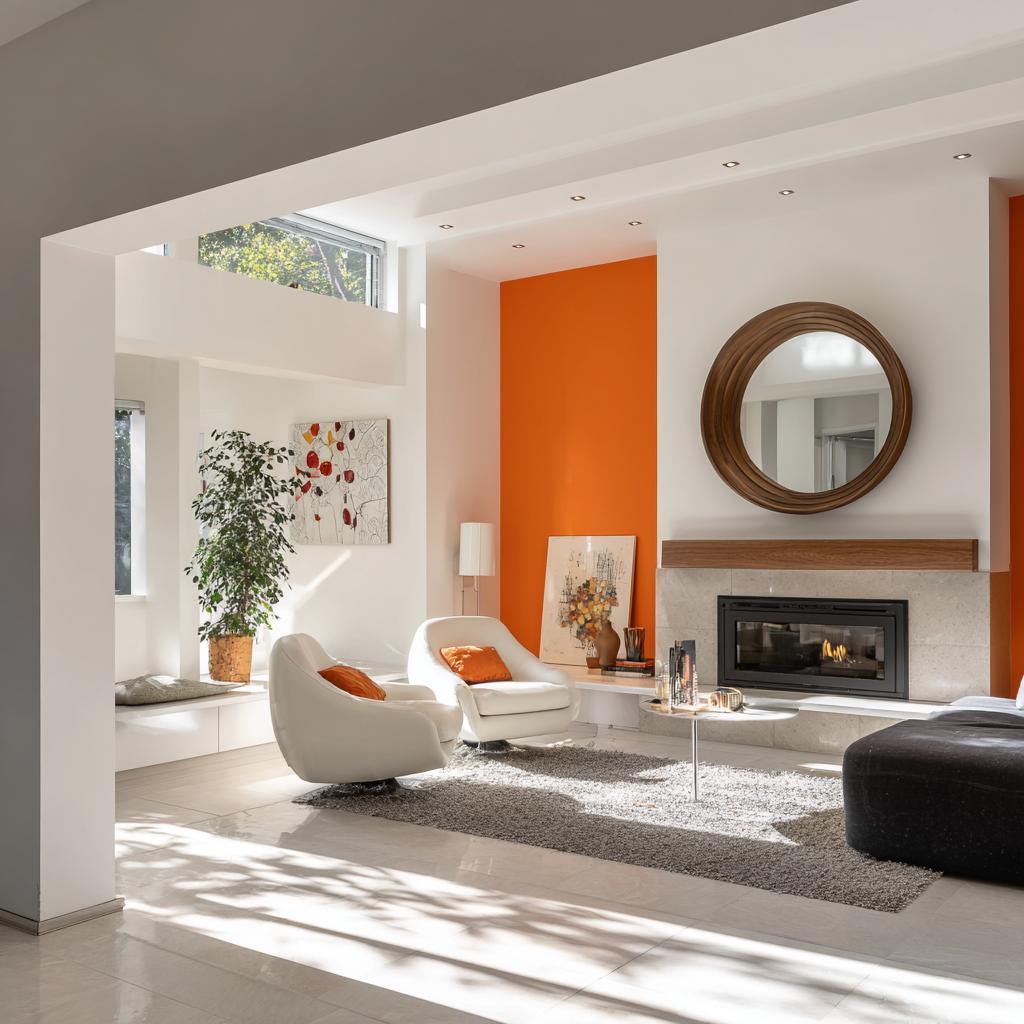
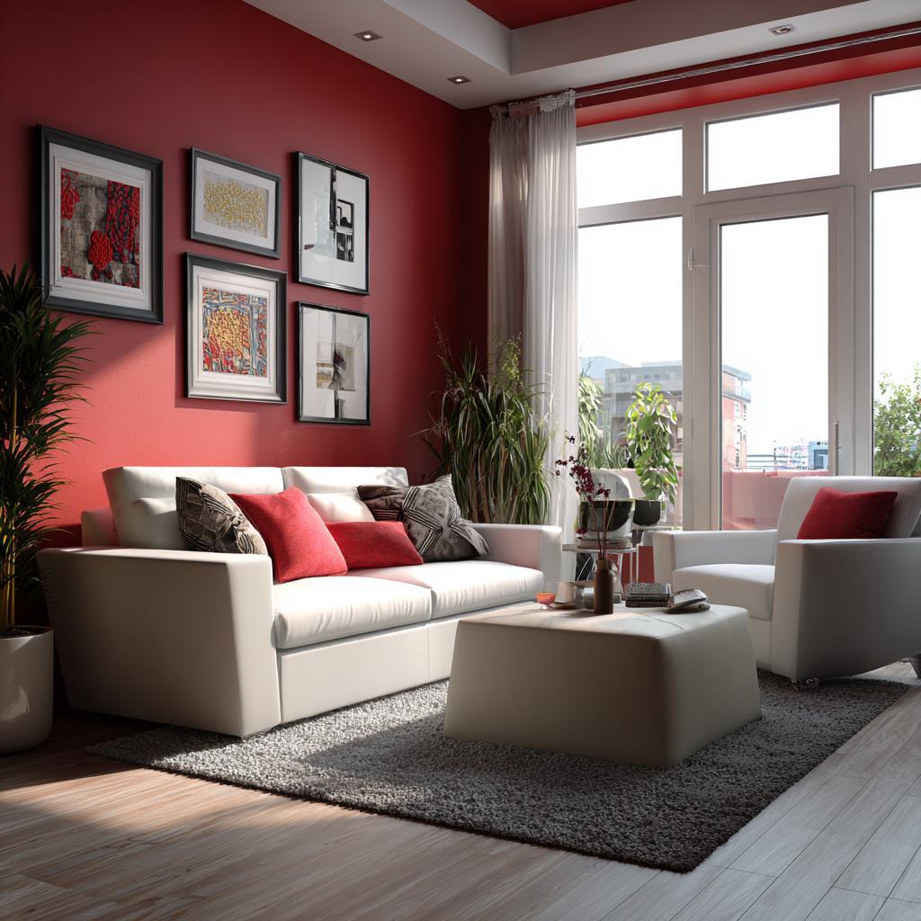
Elegant hall interior colour combination with red accent walls, white furniture
Natural light remains one of the most important factors when choosing interior room colour combinations. The same shade can feel warm and inviting in daylight and completely different under artificial light.
Testing paint samples at different times of day is essential. Morning light, afternoon sun, and evening lighting all reveal different undertones. Warm lighting softens colours, and at the same time cool lighting sharpens them.
In 2026, homeowners are paying more attention to lighting plans alongside colour selection, ensuring the two work together rather than against each other.
Final Thoughts
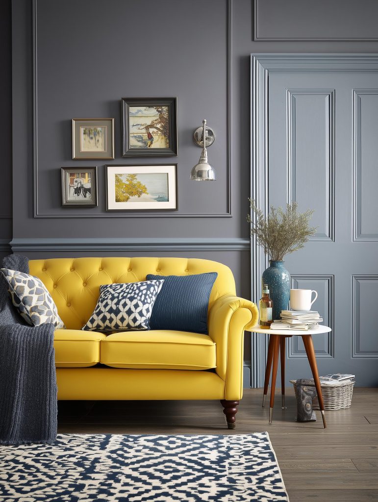
Hall interior colour combination with yellow sofa and grey walls
The home interior colour combinations of 2026 are not about bold statements or dramatic contrasts. They are about comfort, warmth, and spaces that feel emotionally balanced. Homes are becoming quieter, calmer places, and colour plays a big role in creating that sense of ease.
When chosen thoughtfully, the right colour combination does more than transform your walls. It changes how your home feels every single day. And when you are ready to bring these ideas together in a way that truly suits your space, HomeLane is there to help you design a home that feels just right.
Frequently Asked Questions
1. What are the latest home interior colour trends for 2026?
Warm neutrals, muted greens, soft blues, and earthy tones paired with gentle contrasts are leading home interior colour combinations.
2. Can I mix warm and cool colours in the same room?
Yes. Let one temperature dominate and use the other as an accent for balance.
3. What is the 60-30-10 rule in interior design?
It is a guideline where 60% of a room is the dominant colour, 30% is the secondary colour, and 10% percent is an accent. Think, for instance, 60% of beige, 30% of brown and 10% of red.
4. Are accent walls still in style for 2026?
Yes, but they are more subtle, often using deeper tones from the same colour family rather than high contrast shades.
5. How important is natural light when choosing interior house painting colour combinations?
Very important! Natural light affects how colours appear, so testing shades in your actual space is absolutely essential.


 EXPLORE MORE