Will that bright red rug really look good in your bedroom, or will it overshadow the rest of the décor? Is there enough room in your new kitchen to accommodate that spacious side-by-side refrigerator that you’ve always had your eye on? What is the ideal height to hang your prized artwork so that it gets noticed?
There are a bunch of common mistakes that most people make when designing their interiors, so read on to avoid making them!
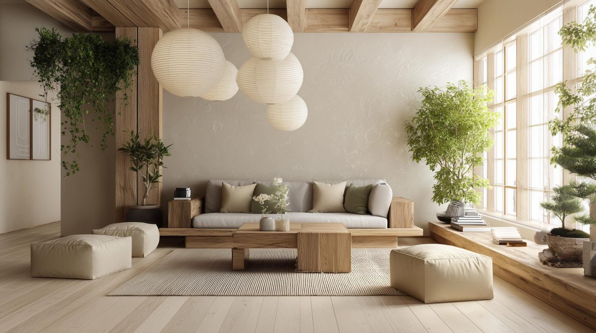
Your Layout Is The Key to a Perfect Home
While planning the layout of your interiors, you have to keep two things on your mind.
1. Plan Ventilation and Space
Space planning is the most important when it comes to designing the ideal layout. Plan the circulation pathways inside rooms to be clutter-free, and leave at least 3 feet clearance for easy movement.
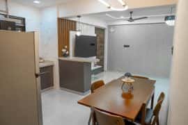
Especially in smaller spaces like kitchens, your movement points should be well laid out. For instance, a refrigerator that opens out with the door blocking the entrance to the room is a bad idea.
Kitchen cabinet doors should not open out into each other. Map out the expected circulation diagram, and position furniture and accessories to avoid collisions and congestion.
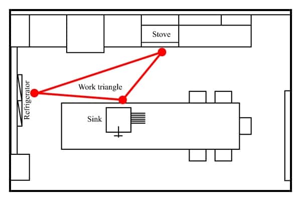
2. Follow Kitchen Triangle
In the kitchen, a triangle arrangement between the cooker, sink, and fridge offers the best workflow. These three points should be within easy reach of each other. This is called a ‘work triangle’ and is one of the basics of a good kitchen layout design— take a look at the self-explanatory diagram below:

Maintain Balance And Scale
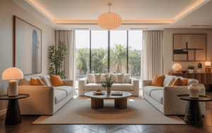
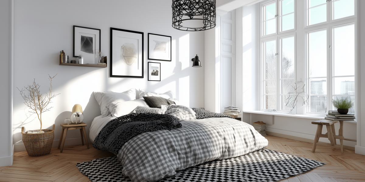
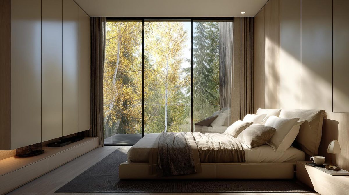
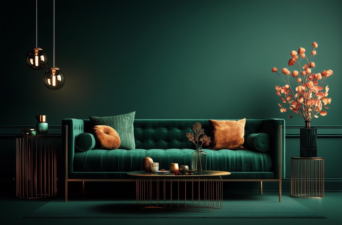
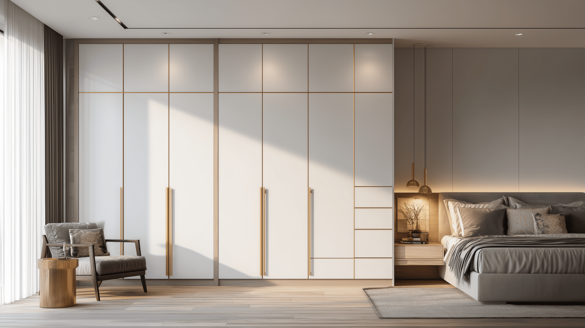
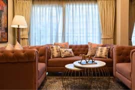
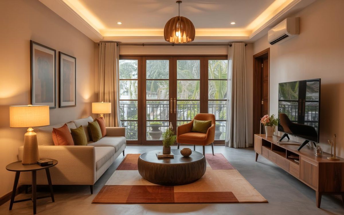
Most people do not relate the scale of the room to the furniture they put in. An oversized sofa in a small living room would eat up space in the room, making it look crowded. A king-sized bed in a tiny bedroom will leave the room looking cramped. Talented interior designers usually have a great sense of scale and are able to combine shapes and heights in the right proportion to achieve a harmonic balance.
Rule of thumb? A high ceiling calls for imposing furniture like a four-poster bed. Low furniture and floor seating is perfect for rooms that have a low ceiling. Wardrobes that are floor-to-ceiling tend to make a low ceiling look even lower.

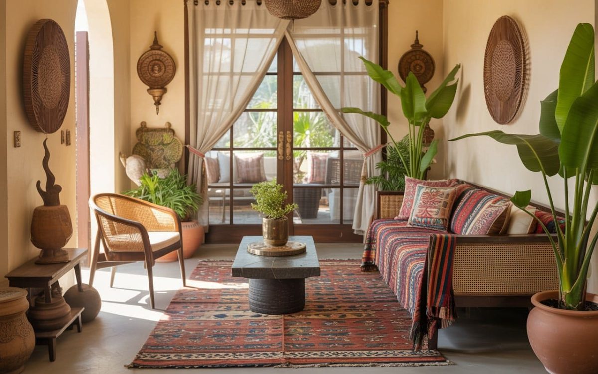
Coordinate Elements Like Colours and Textures
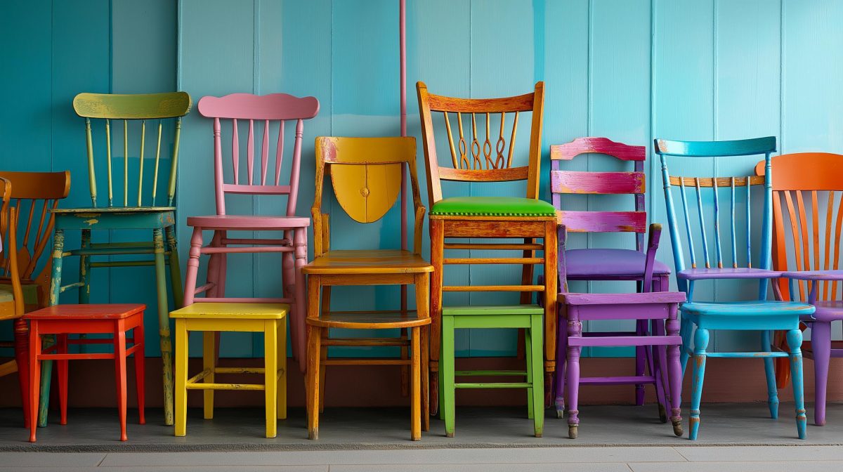
While the use of colour is very subjective and likes or dislikes differ from person to person, there are some interiors that are obviously a disaster because of the overuse of colours or repetitive patterns! For example, take a look at this room where orange has been overused to such an extent that the room is uncomfortably stimulating.

As you can see, colours have the capability of creating strong moods. Oranges and reds are very warm, while greens and blues have a cooling effect.
- Purples and blacks can be quite disturbing when overused in interiors.
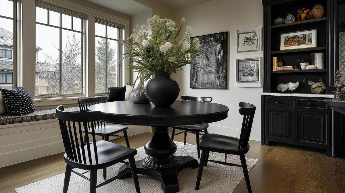
- On the other hand, when coordinated well, common threads in colour and texture can help to pull your design theme together.
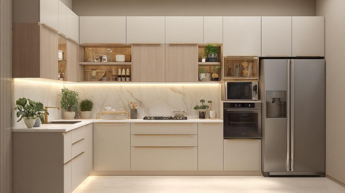
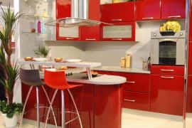
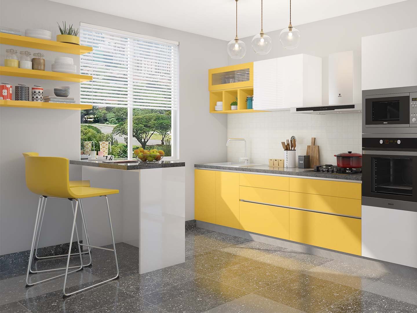
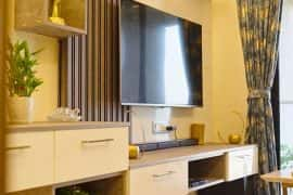
- In a kitchen, the use of two contrasting colours in the lower and upper cabinets works well to set the note for your space.
- Repeating elements with similar shades in the tiles or countertops will accentuate the theme. This kitchen is a great example of the two-tone theme.

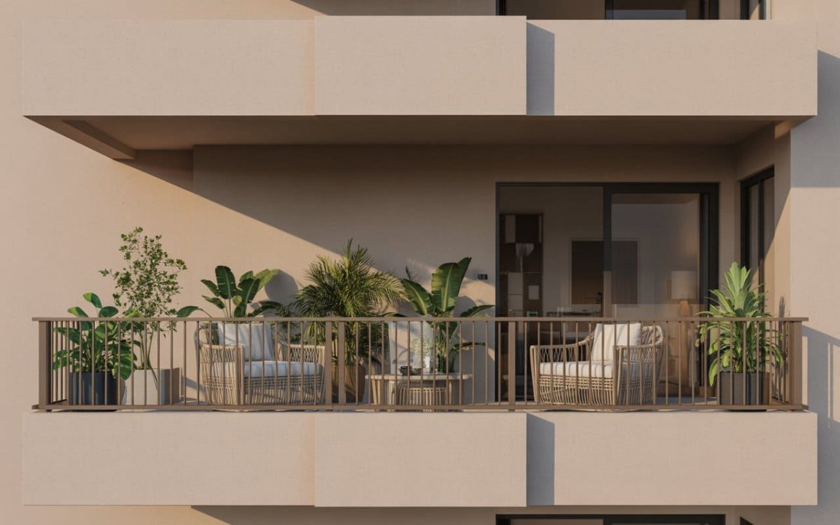
Then again, you must see what works best for your space. Sometimes a mishmash of eye-popping colours, like colourful scatter cushions on a neutral coloured sofa, works unexpectedly well and can add a lot of liveliness to an interior which would otherwise be dull and monotonous! The same colours can be picked out in accessories or wall paintings to tie them together within the room.
Learn To Give Away!
We all have hand-me-downs, precious pieces of furniture that have sentimental value, and thus find getting rid of it unbearable. However, when doing up your home you must be practical as well. If an old bulky piece of furniture does not fit well with the rest of your new interior, do consider giving it away. If you cannot bring yourself to do that, then think of resizing it or redesigning it in such a way that it goes well with your interior!

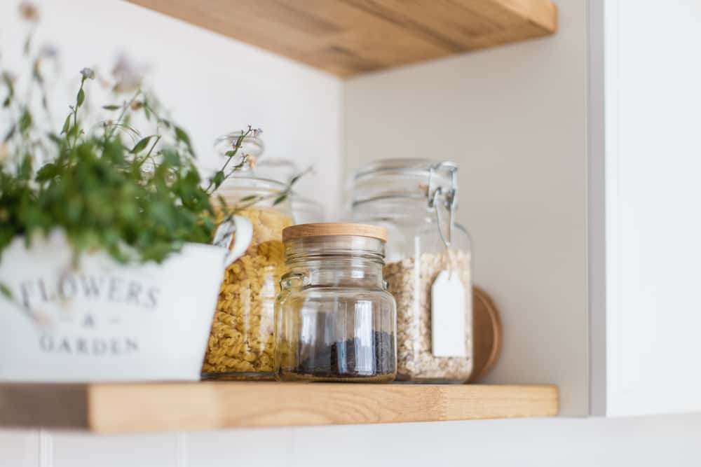
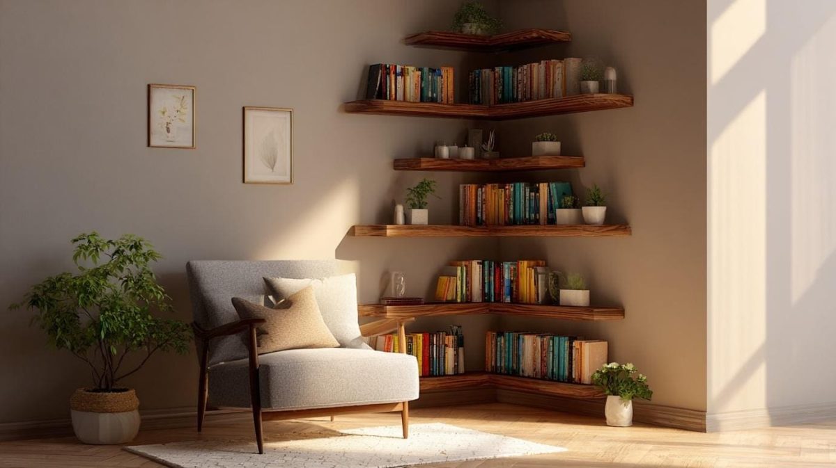
Corner Storage Must Be Carefully Planned
In a kitchen, the corner units below the countertop can be designed using innovative corner accessories that serve to make full use of available space. These units are cleverly designed to increase the accessibility of blind corners below the countertop. The stored items swivel out when opened so that you do not have to bend and reach inside the cabinet.
Careful thought needs to be given to the corresponding corner in the overhead cabinets, though. Quite often the overhead corner space has dead storage which cannot be accessed easily. Open shelves, or shelves with a double-hinged shutter that opens up completely, will solve these issues.

Open Shelves In Corner
Similarly, in an L-shaped wardrobe which has hanging space in the corner, the square space in the corner ends up being an awkward, hard to access area if it is improperly designed. Sliding shutters will make this corner more accessible.
These are a few of the most common mistakes that people make when planning their new home interior! To sum up, good home interiors have a sense of rhythm, harmony, balance, and proportion. If something feels wrong about your interior, you should try making a few changes to make your design elements work the way you want them to. Hiring a professional interior designer would be the easiest way to get the dream home that you have always wanted!


 EXPLORE MORE