Balcony Colour Mistakes That Make Your Space Smaller and Hotter in 2026
By Bivin Peter- April 11, 2026
Summary:
In 2026, a balcony is no longer just a utility area; it is a vital “breathing zone” for the modern Indian home. However, common Balcony colour mistakes such as using heat-absorbing dark tones or interior-grade paint can turn this retreat into a scorching, high-maintenance chore. From ignoring the building’s exterior harmony to clashing with your greenery, these errors affect both aesthetics and energy efficiency. By mastering the 60-30-10 rule and selecting a weather-resistant balcony colour combination, you can create a space that remains cool, vibrant, and visually spacious even in the harshest tropical climates. (90 words)
Best For:
Urban apartment dwellers and homeowners looking to transform small outdoor ledges into premium, climate-resilient retreats that enhance both mental well-being and property value.
Expert Tip:
Before finalizing your balcony paint colour, check the Light Reflectance Value (LRV) on the paint swatches. For Indian balconies facing South or West, HomeLane designers recommend a palette with an LRV of 60 or higher. This ensures your walls reflect enough sunlight to keep the surface cool to the touch and prevent “heat island” effects in your adjacent bedroom.
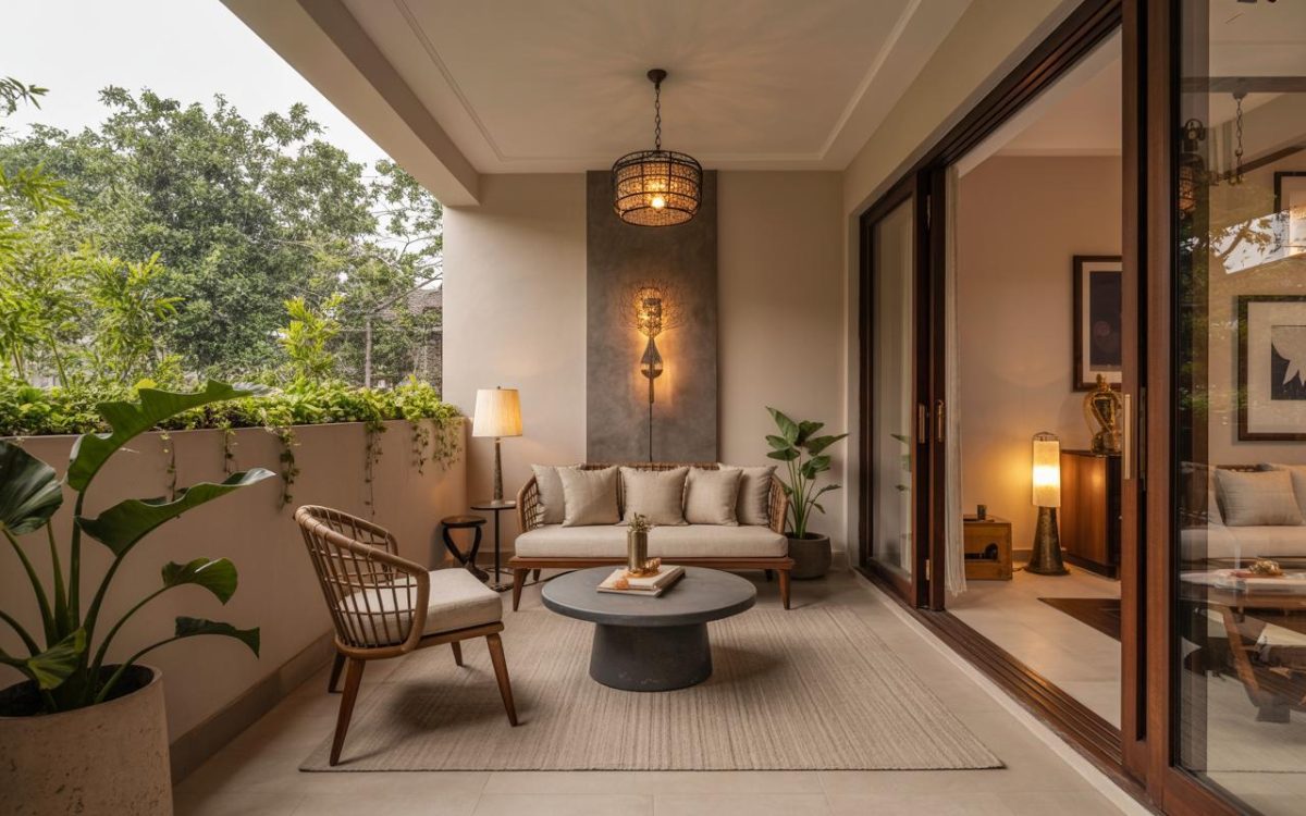
Create a serene retreat with this warm balcony colour combination.
Imagine stepping out on a breezy Sunday morning, coffee in hand, ready to soak in the serenity of your private outdoor oasis. But instead of feeling a sense of calm, you are greeted by a jarring wall shade that clashes with your plants, or a floor that feels scorching hot under your bare feet. In the world of modern Indian interior design, the balcony has transitioned from a mere utility area for drying laundry to a soulful extension of the living room. However, after five decades of designing homes across India, it is clear that many homeowners stumble at the very last hurdle: the palette.
Balcony colour mistakes are more than just aesthetic oversights; they can affect the temperature of your home, the longevity of your furniture, and even your daily mood. Whether you are living in a compact Mumbai apartment or a sprawling Bengaluru villa, the colours you choose for your outdoor space must withstand the harsh tropical sun and the relentless monsoon. Understanding how to navigate these choices is the difference between a balcony that feels like a resort and one that feels like a design afterthought.
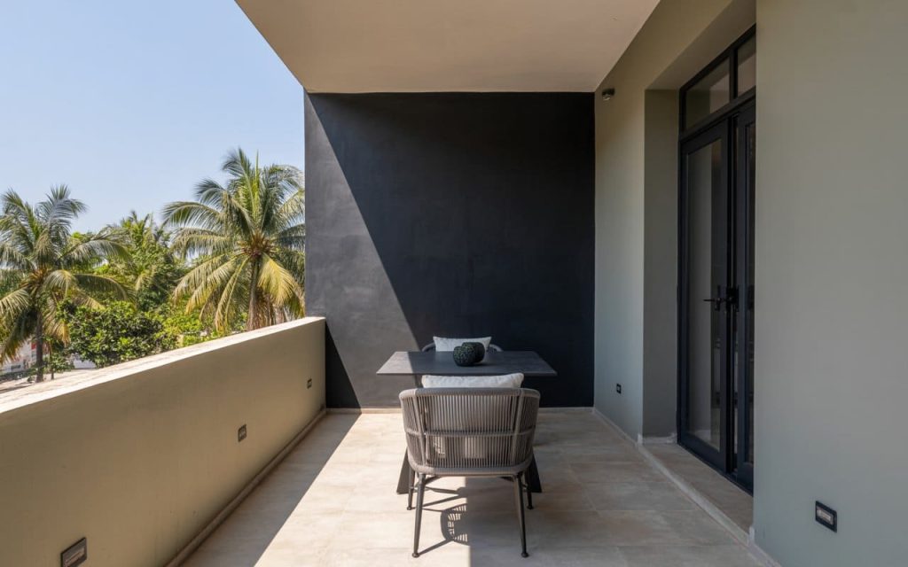
Choosing Overly Dark or Absorbing Colours
Elevate your outdoor area with this chic balcony colour design.
One of the most frequent Balcony colour mistakes observed in Indian homes is the use of deep, dark shades on walls that receive direct sunlight. While a charcoal grey or a deep chocolate brown might look sophisticated in a magazine, these colours have a low Light Reflectance Value (LRV). In a climate where temperatures often soar above 40°C, dark walls absorb up to 90% of solar heat, acting like a radiator that pumps warmth back into your home interiors.
This heat absorption not only makes the balcony uncomfortable during the day but also increases your air conditioning bills. If the goal is a moody aesthetic, it is better to use dark tones as accents rather than a primary balcony paint colour. Opting for lighter shades like ash grey or sandy beige as a base can keep the surface temperature significantly lower while still providing a modern backdrop.
As we consider the heat, we must also look outward to ensure the balcony does not feel isolated from the rest of the architecture.
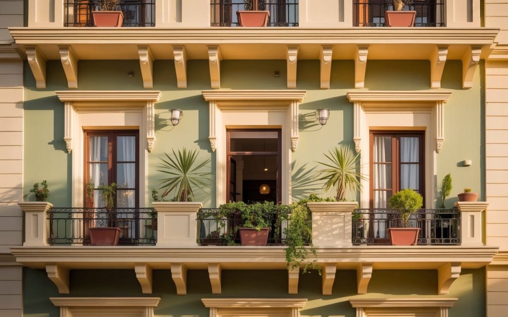
Ignoring the Overall Building Exterior
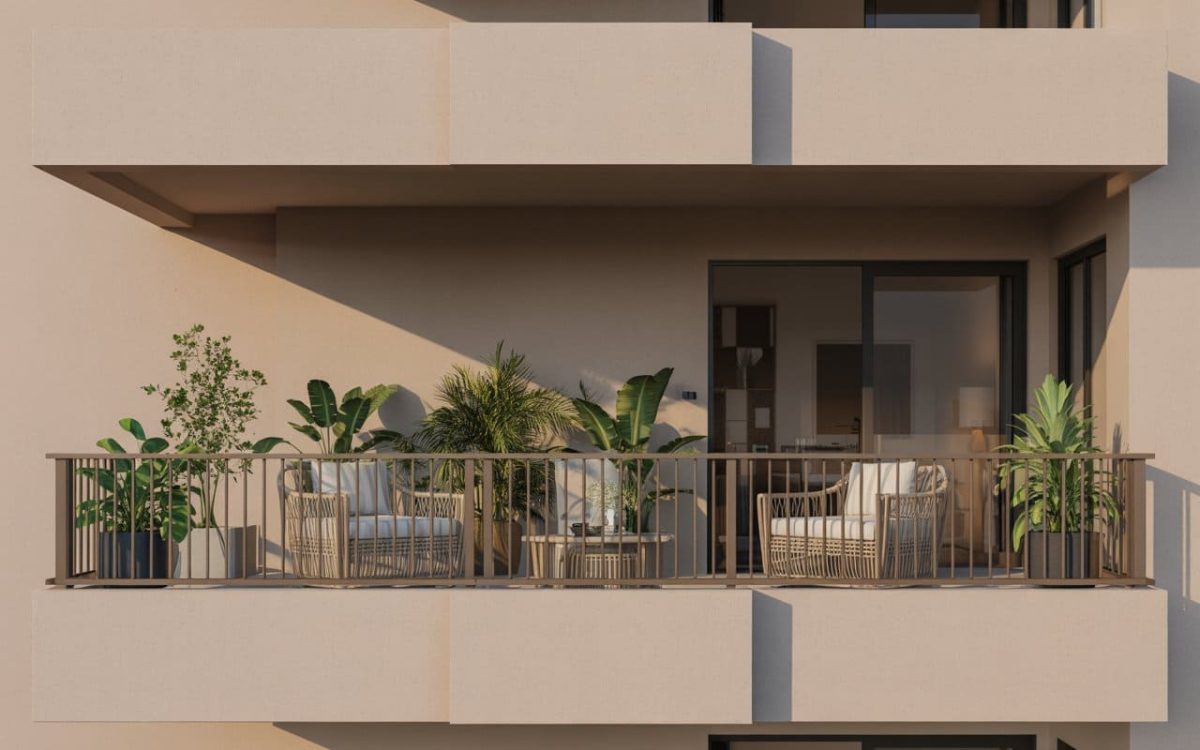
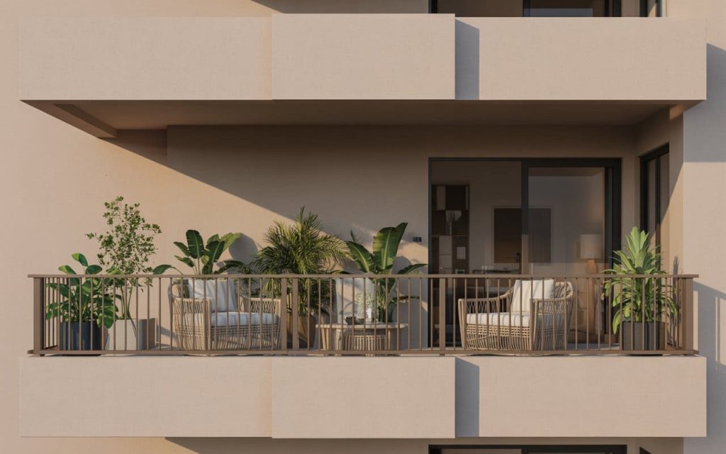
Boost your curb appeal with a sophisticated front balcony colour.
A balcony does not exist in a vacuum; it is a visible part of the building’s facade. A common Balcony colour mistake is choosing a vibrant indian balcony colour that looks great from the inside but sticks out like a sore thumb from the street. If the building exterior is a classic cream or terracotta, painting your balcony a bright teal can disrupt the visual harmony of the entire structure.
The most successful balcony colour design takes cues from the “parent” building. This does not mean it must be identical, but it should belong to the same colour family. For instance, if the apartment block is off-white, a front balcony colour in a muted sage green or a soft taupe provides a sophisticated contrast without looking disconnected. This sense of cohesion is what elevates a home’s curb appeal from average to extraordinary.
Choosing the right hue is only half the battle; the “type” of paint is what ensures that hue stays beautiful through the seasons.
Using Too Many Clashing Colours
Discover fresh balcony colour ideas to transform your small nook.
The “More is More” approach rarely works in small outdoor spaces. A common Balcony colour mistake is trying to incorporate a different colour for the walls, another for the balcony grill colour, and yet another for the furniture and pots. This creates visual clutter that makes a small space feel even more cramped and restless.
The gold standard for a professional balcony colour combination is the 60-30-10 rule:
60% Dominant Colour: Usually the main wall or the largest surface area.
30% Secondary Colour: Used for the flooring or a large piece of furniture.
10% Accent Colour: Reserved for the balcony grill colour, cushions, or a few statement planters.
By sticking to a disciplined palette, you allow the eye to rest, making the balcony feel like a curated retreat rather than a storage closet for mismatched ideas.
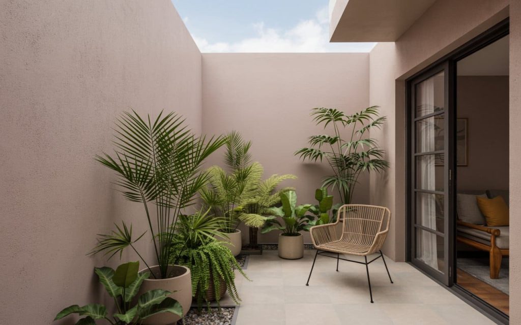
Overlooking the View and Greenery
Select a durable balcony paint colour that resists fading in sun.
The primary purpose of a balcony is to connect with nature. A common Balcony colour mistake is choosing a wall colour that competes with your plants. For example, a bright forest green wall might seem like a good idea for a “green home,” but it actually makes your beautiful potted palms disappear into the background.
To make your greenery pop, use contrasting balcony colour ideas. Neutral backdrops like off-white, light grey, or even a soft terracotta provide the perfect “canvas” for the vibrant greens of your plants. This allows the natural elements to be the hero of the space while the architecture provides a supportive, elegant frame.
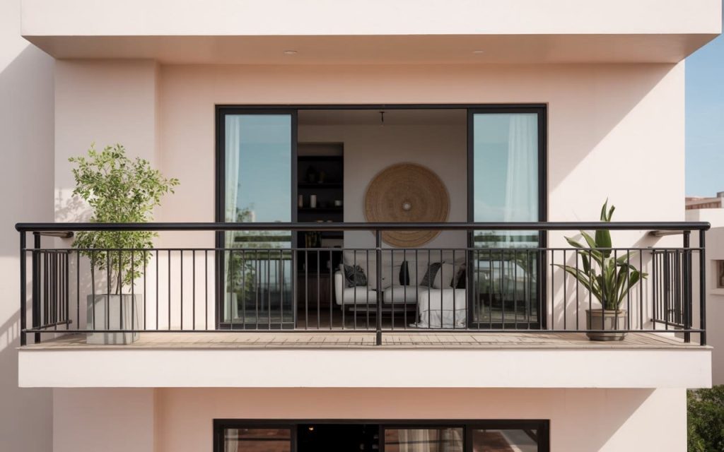
Choosing the right balcony grill colour defines your home style.
A balcony is your personal slice of the sky, a place where the chaos of the city fades into the background. Avoiding common Balcony colour mistakes is about more than just picking “pretty” shades; it is about understanding how light, heat, and material science work together to create comfort. By choosing a thoughtful balcony colour combination and respecting the surrounding environment, you can transform even the smallest ledge into a masterpiece of modern design.
At HomeLane, we believe that every corner of your home, from the heart of the kitchen to the edge of the balcony, should be a reflection of your identity. Our experts specialise in crafting functional, beautiful balconies that are functional and beautiful.
FAQs
1. What is the best colour for a small balcony?
For small balconies, light and airy shades like off-white, soft grey, or pale pastels are the best. These colours reflect light and create an illusion of openness, making the space feel less cramped. Pair them with a slim-profile balcony grill colour like black or charcoal for a modern touch.
2. How do I choose a balcony colour that matches my home?
The best approach is to select a balcony colour design that belongs to the same colour family as your building’s exterior. Use the building’s primary shade as your base and introduce personality through a complementary secondary balcony paint colour or through colourful decor and plants.
3. Can dark colours make a balcony hotter?
Yes, dark colours have a low Light Reflectance Value (LRV) and absorb more solar radiation. In the Indian climate, dark-coloured walls can significantly increase the temperature of the balcony and the adjacent rooms, leading to higher cooling costs.
4. What type of paint is best for balcony walls?
Exterior acrylic emulsions are the best for balcony walls. They are specifically formulated to be weather-resistant, UV-protected, and anti-fungal. Look for paints with “dust-guard” or “weather-shield” properties to ensure your Indian balcony colour stays fresh for years.
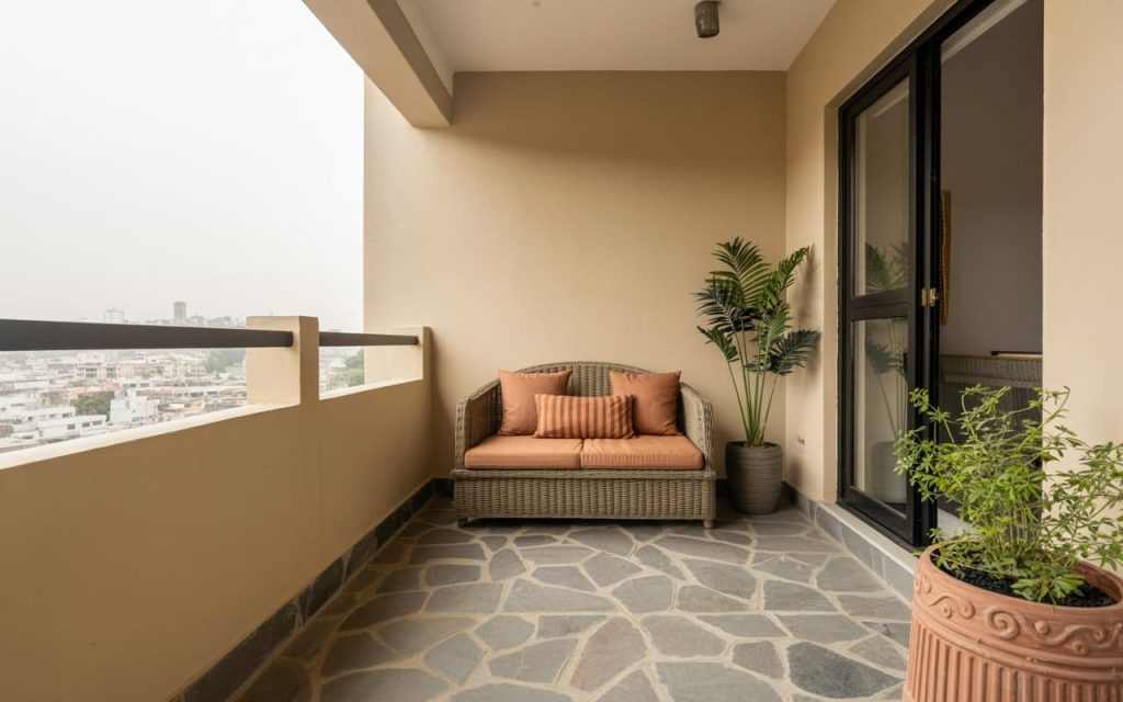
Alt text: Neutral balcony colour combination with beige walls and stylish wicker patio chairs.
Alt text: Modern balcony colour design featuring a bold black accent wall and grey seating area.
Alt text: Classic front balcony colour in sage green with cream architectural moldings and plants.
Alt text: Inspiring balcony colour ideas featuring warm peach walls and rustic stone floor tiling.
Alt text: Soft dusty rose balcony paint colour provides a calm backdrop for lush green plants.
Alt text: Modern balcony grill colour in matte black paired with light pink exterior walls.


 EXPLORE MORE