Windows do a lot more than let light in. They frame your views, influence how bright your rooms feel, and quietly shape the personality of your home, inside and out. Yet, when it comes to choosing window colours, many homeowners ignore it completely.
The right window colour can lift your interiors, improve curb appeal, and tie your overall design together. And the wrong choice can feel oddly disconnected, even if everything else looks great!
Choosing the right window colour combination is not about trends alone. It is about understanding your space, your light, and the story you want your home to tell.
Factors to Consider When Choosing Window Colours
Before picking shades, take a moment to look at the bigger picture.
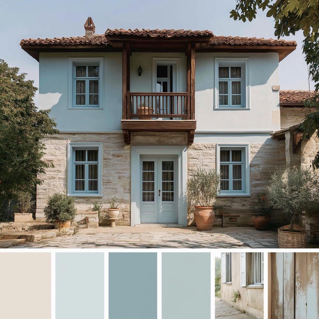
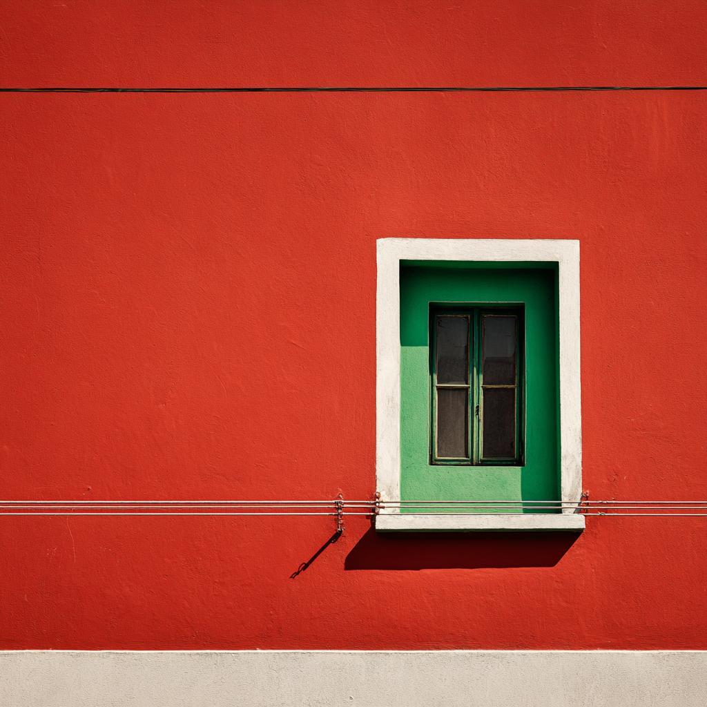
- Start with the architecture of your home. Is it modern, or does it lean old-fashioned? Modern homes suit cleaner, more neutral tones, while traditional homes can handle warmer or deeper window colour combinations.
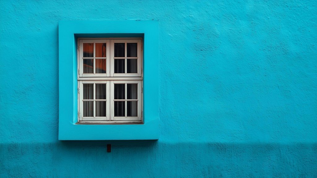
- Light, too, plays a defining role. Darker window frames can look dramatic but may absorb light, while lighter colours help to make the most of the brightness there is.
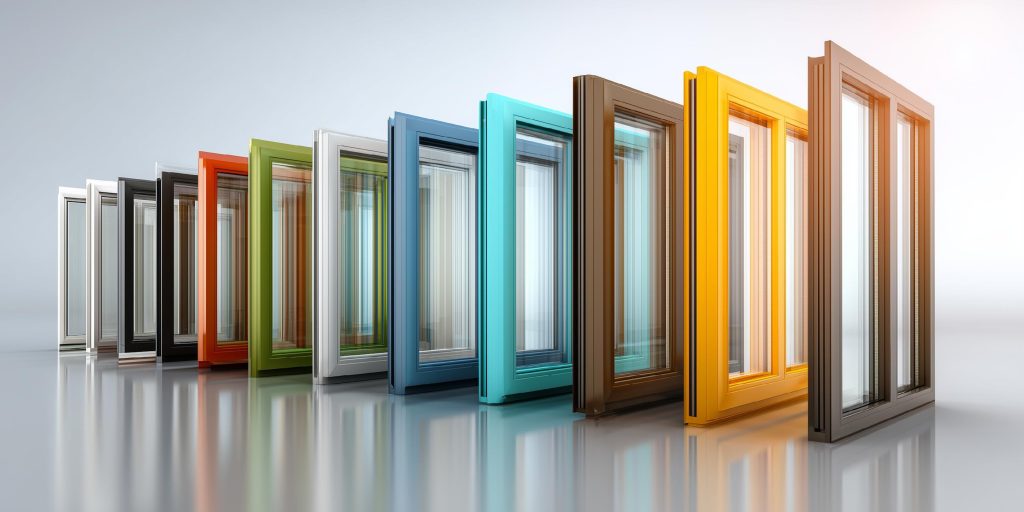
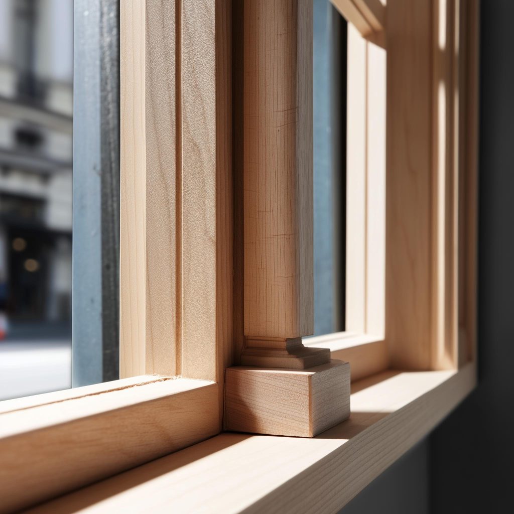
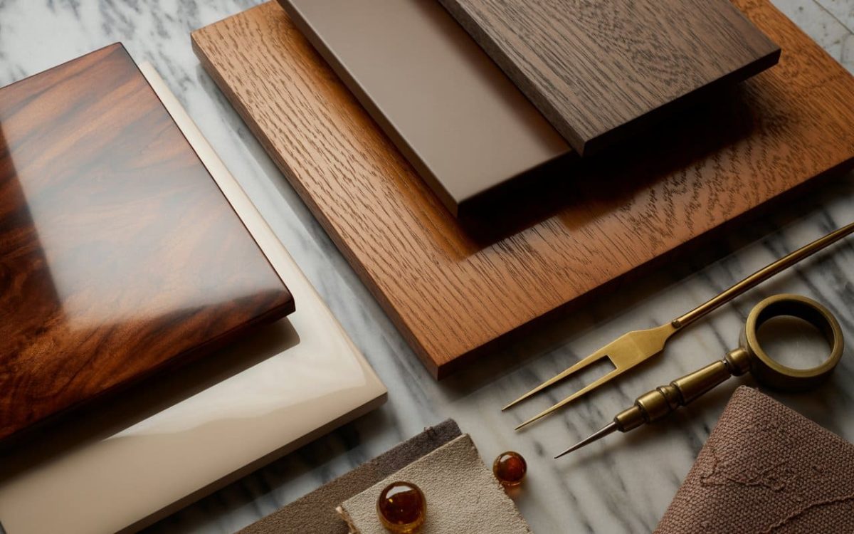
- Material matters too. Wooden frames, aluminium, and UPVC all interact differently with colour and texture.
- Also think about maintenance. Some colours show dust or wear more easily, especially in cities or coastal areas.
- Lastly, consider how permanent the choice feels. Window colours tend to stay for years, so it is worth choosing something that will age well.
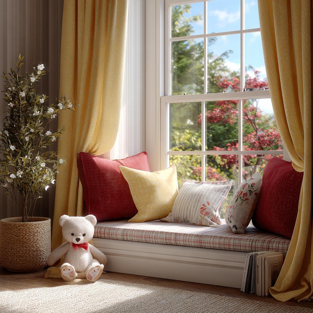
Interior Window Colour Combinations
Inside your home, window colours should complement the palette chosen for the interior (the walls, floors, and furniture) rather than compete with them.
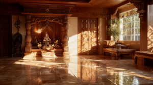
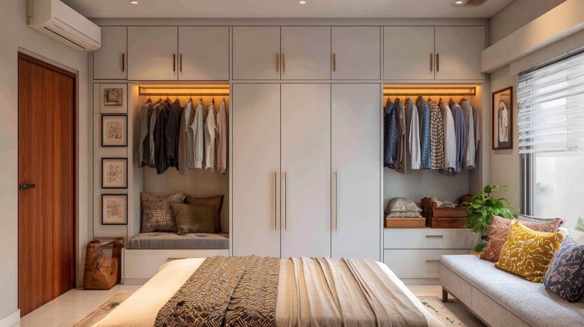
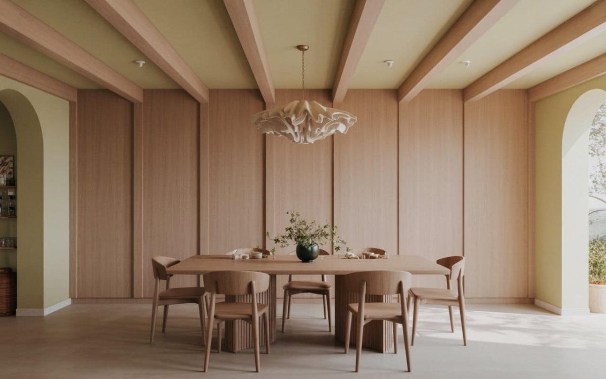
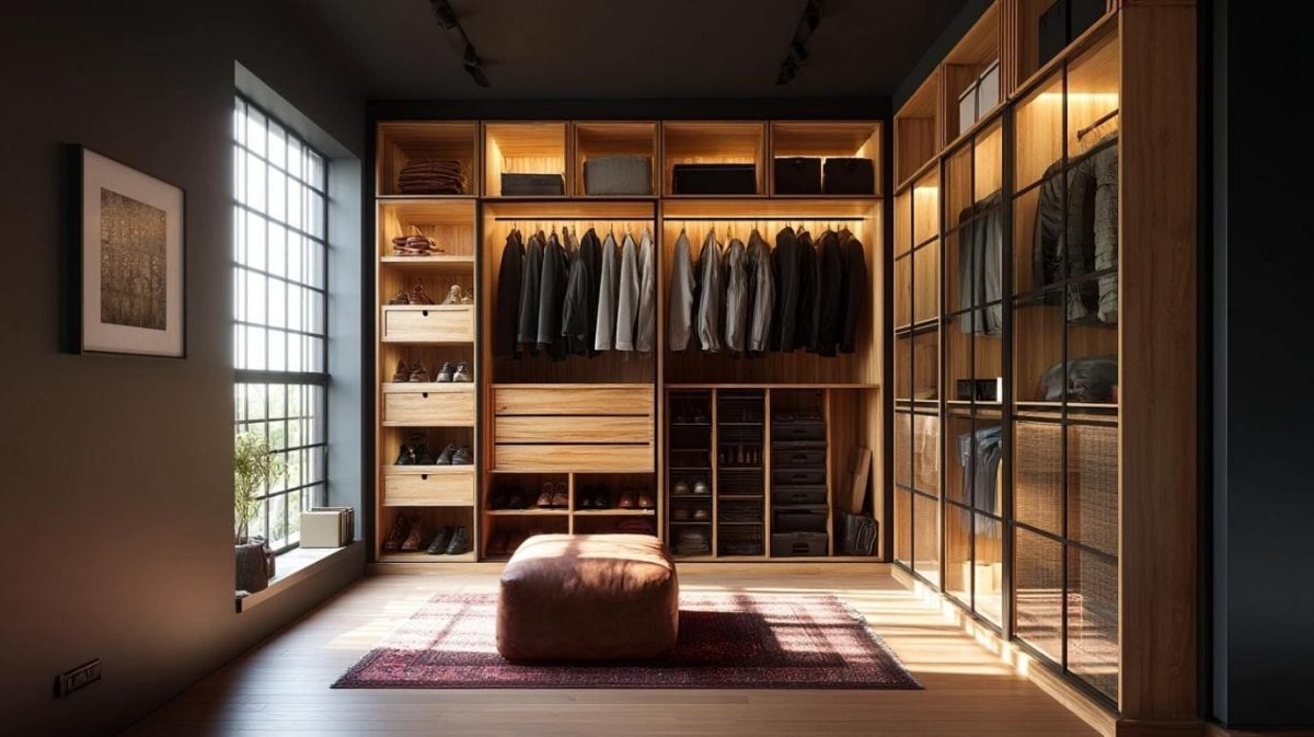
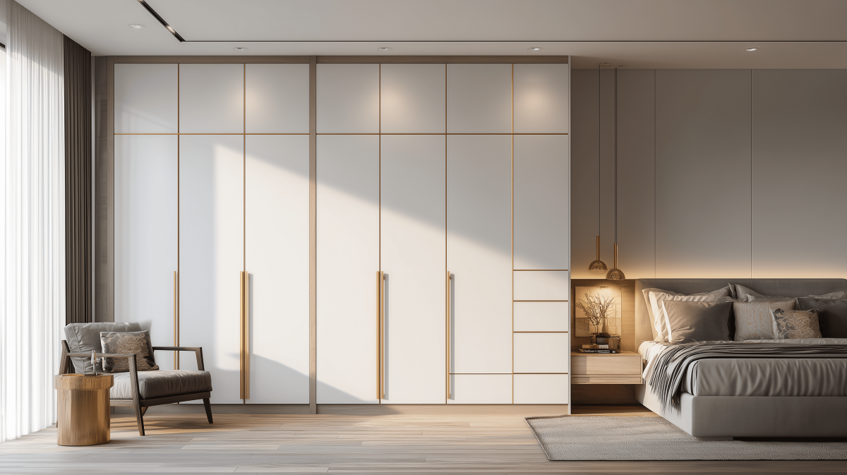
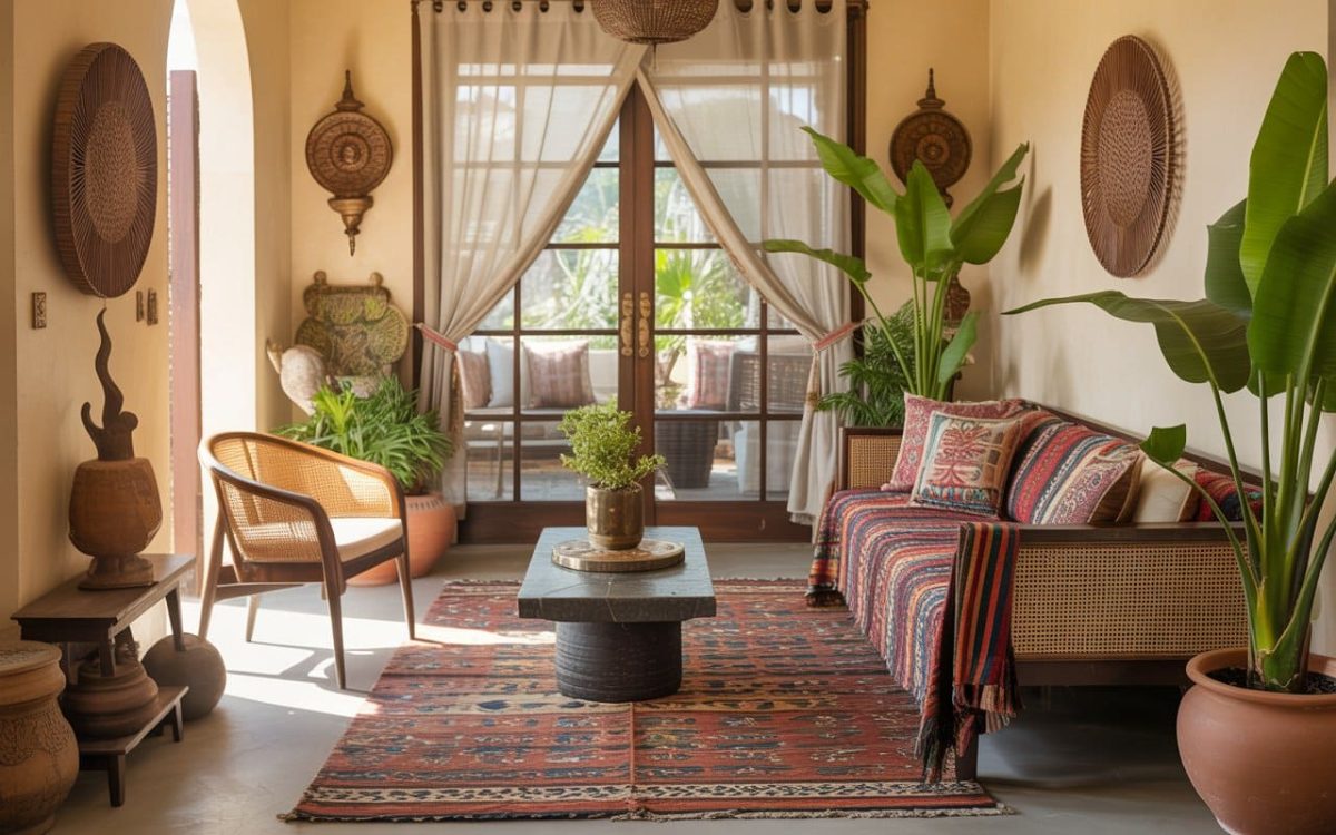
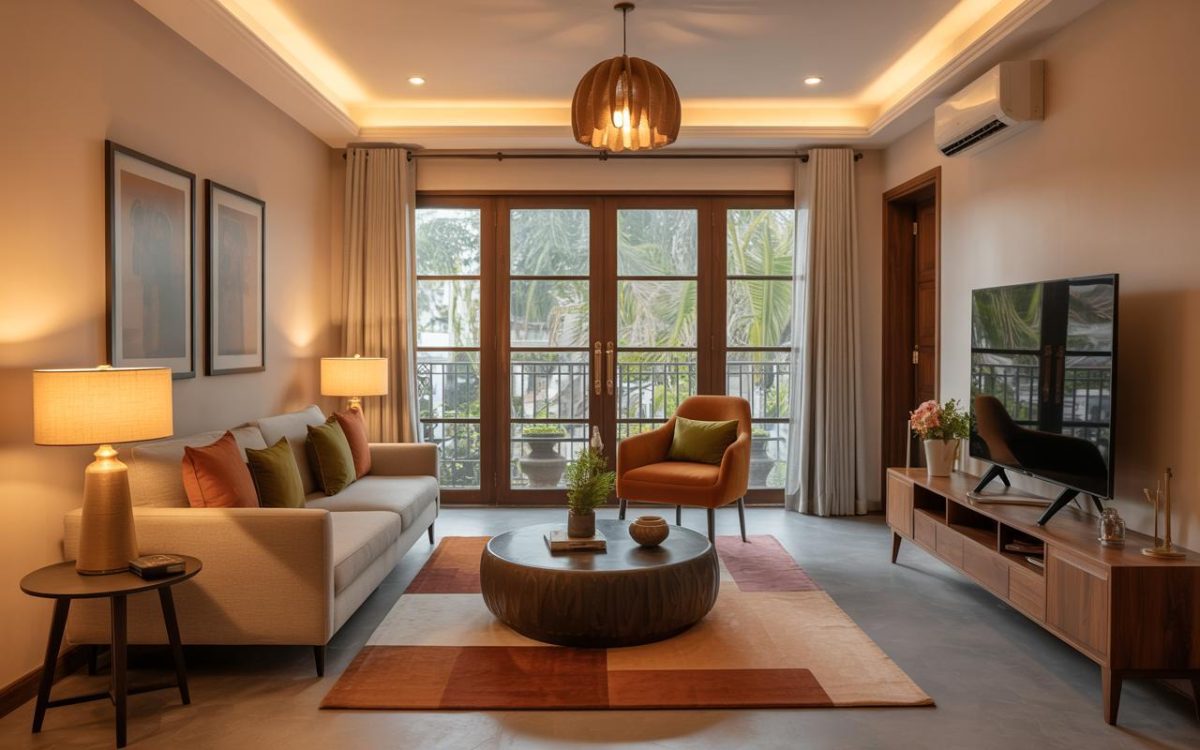
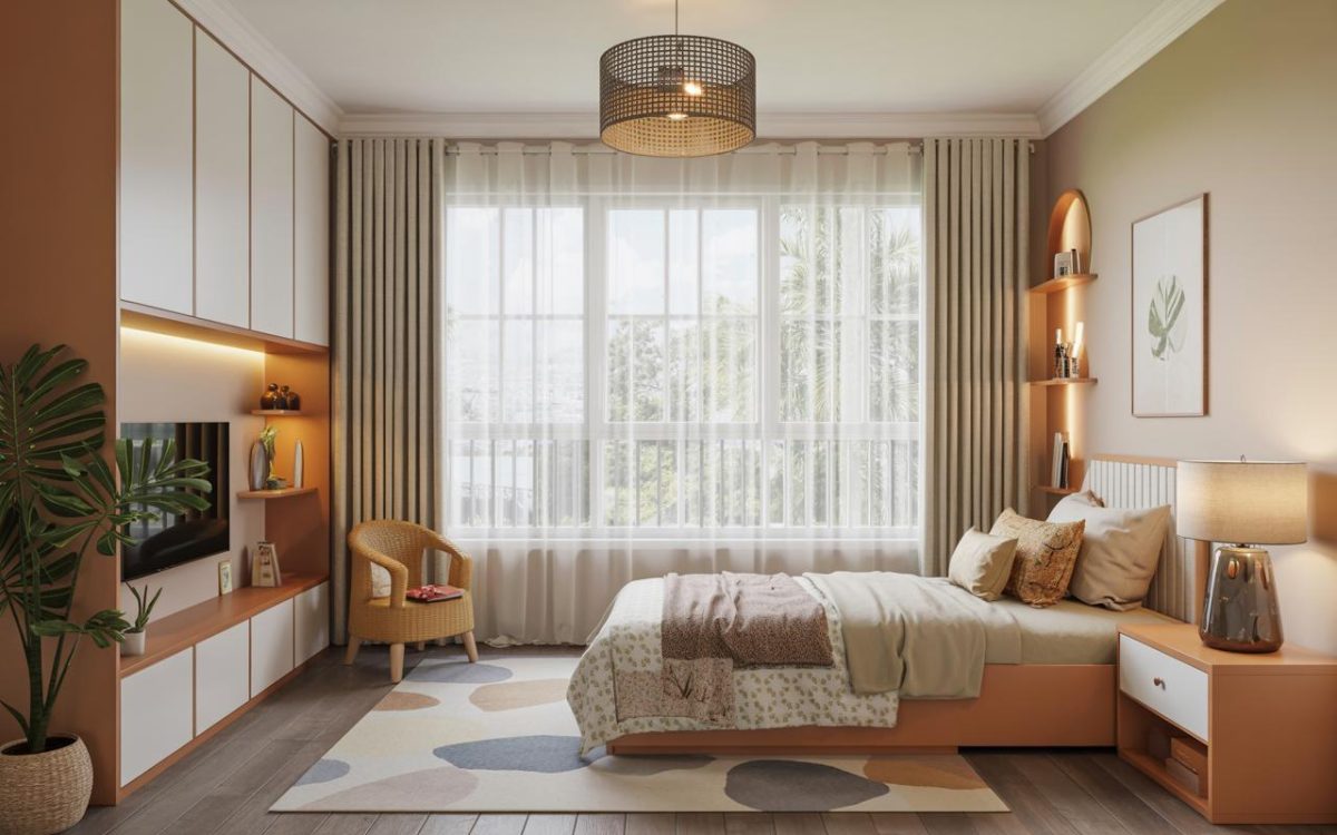
Neutral interiors pair beautifully with soft greys, whites, or beige window frames. In homes that lean warm, a wooden window colour combination adds depth and comfort without overwhelming the space.
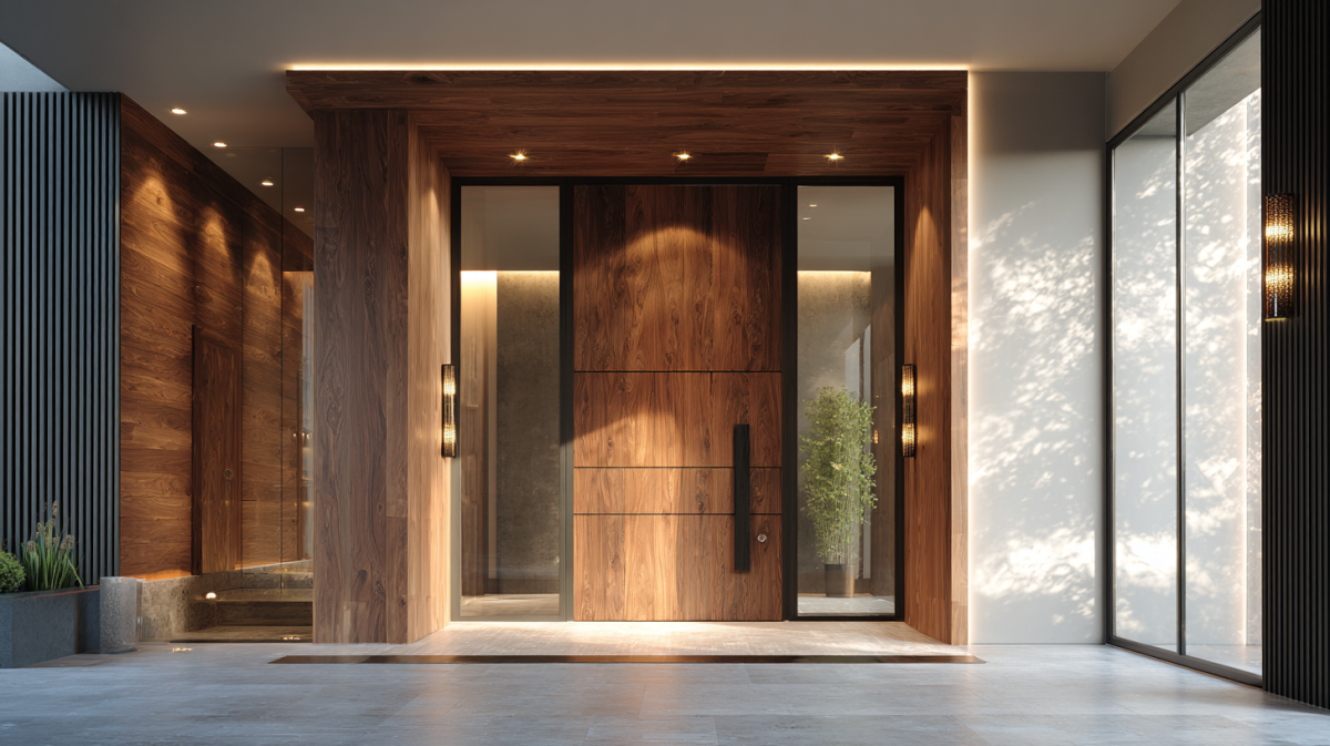
If your interiors have darker furniture or accent walls, lighter window frames help balance the room visually. For a more cohesive look, many homeowners also coordinate trims using a door and window colour combination that feels intentional and unified.
Window grills deserve attention too. A thoughtful window grill colour combination can add character, especially in homes where grills are visually prominent.
Tips for Coordinating Window Colours with Your Home
The easiest way to coordinate window colours is to treat them as part of a palette rather than a standalone element.
Look at your flooring, wall colours, and major furniture pieces. Window frames should either echo these tones, or offer gentle contrast.
In Indian homes, climate and dust play a starring role, which is why window colour combinations in India often lean towards practical neutrals that hide wear better than stark whites.
Exterior and interior colours do not have to match exactly, but they should feel related. Your house window colour combination must ensure the home looks cohesive from the street as well as from inside.
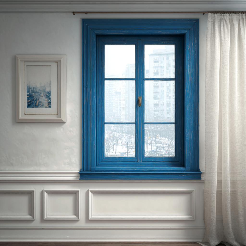
The choice of glass matters, too! A barely-there window glass colour combination can filter the light, add some privacy, or dial up the overall aesthetic without darkening the room too much.
Window Colour Trends
Current window colour trends focus on balance rather than bold statements.
Soft greys, warm whites, and muted earth tones are popular for their versatility. Black and charcoal frames continue to appeal in modern homes, especially when paired with lighter walls.
Natural wood finishes are making a comeback, particularly in interiors that favour warmth and texture.
Another growing trend is subtle contrast. Instead of matching everything, homeowners are choosing the best colour combinations for windows that gently stand out while still blending with the rest of the home.
Mistakes to Avoid
One common mistake is choosing window colours in isolation. What looks good on a sample may not work once installed across multiple rooms.
Another issue is ignoring natural light. Dark frames in low-light spaces can make rooms feel dull.
Overmatching is also something to watch out for, as it tends to end up looking boring! When everything is the same colour, the space can feel flat rather than cohesive.
Lastly, avoid chasing trends without considering longevity. Window colours should still feel right years down the line.
Making Window Colours Work for You!
Window colours may seem like a small detail, but they have a lasting impact on how your home looks and feels. The right combination enhances light, complements your interiors, and boosts curb appeal without trying too hard.
At HomeLane, design decisions are always made with the full picture in mind. If you are choosing a palette for a new home or a renovation, our designers can help you find window colour combinations that work beautifully with your interiors, your lifestyle, and your long-term plans.
So come visit us, and let’s get talking!
FAQs
1. What is the most popular window frame colour?
White and soft grey remain the most popular choices because they work across styles and reflect light well. They also make it easier to update your interiors later without worrying about colour clashes.
2. Should interior and exterior window colours match?
They do not have to match exactly, but they should complement each other for a cohesive look. Many homes use a neutral exterior shade and a warmer or darker colour indoors for flexibility.
3. How do I choose a window colour combination that boosts curb appeal?
Look at your exterior walls, roof, and landscaping, and choose a window colour that adds contrast without clashing. Stepping back to view your home from the street can help you see what truly stands out.
4. Are coloured window frames more expensive than white?
Coloured frames can cost slightly more depending on material and finish, but the difference is often minimal. In many cases, the added visual impact is well worth the small increase in cost.
5. How do I choose a window colour combination that complements my brick house?
Neutral tones, deep greys, and muted greens pair well with brick and highlight its natural texture. It helps to consider the undertones in the brick before finalising your window colour.
6. What’s the best window colour combination for maximising natural light?
Light colours like white, cream, or pale grey help bounce light into the room and keep interiors bright. Pairing them with sheer curtains or minimal window treatments enhances the effect further.


 EXPLORE MORE