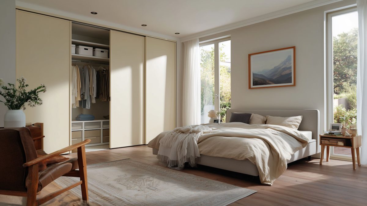
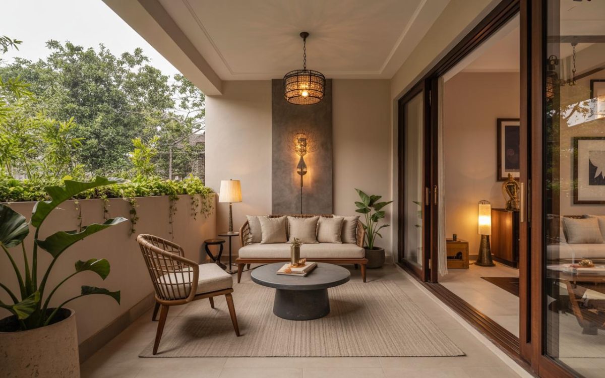
When we think of home, the words that come to mind are safety, comfort, and cosy. These words can be synonymous with pastel colours. Warm, bright, breathable, and homely – pastel colours bring lightness and positive energy to homes, making them a great choice for your 2 BHK house design.
As minimalist living room interior design takes over the world, the best way to stand out is through pastels. Pastel room colours can rescue your home from the dull plunges of black and white.
While you can’t go wrong with a splash of pastels in every corner of your house, expert guidance can give your home a personality of its own.
We have a guide on how to set up your living room interiors with pastel colours. Our perfect design solutions can help you navigate the beautiful, soothing, and welcoming world of turquoise, baby blue, mimi pink, and corals.
Introduction to Pastel Colours
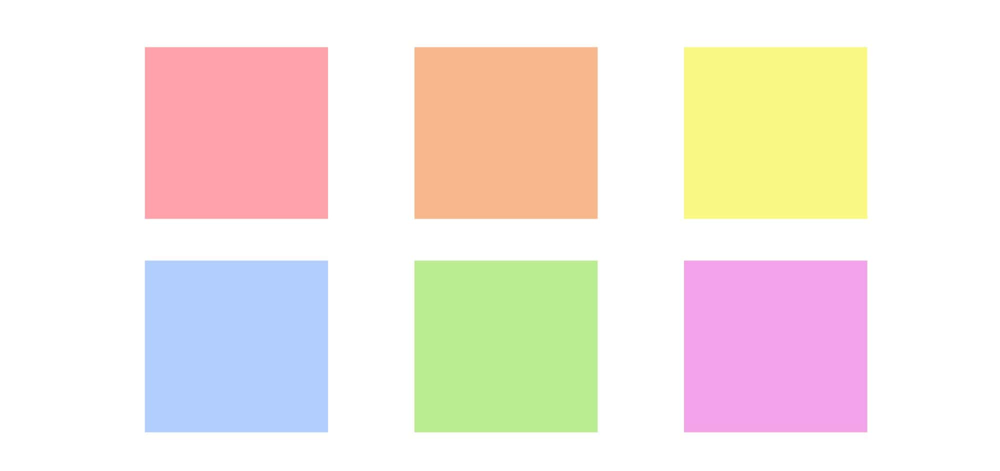
Pastels are made by infusing white with solid colours such as Yellow, Red, Blue and White. Traditionally, they are light colours, born from the primary colours’ high value and low saturation intersection. Indians are no strangers to pastels. The Indian vernacular has often referred to these interior pastel wall paint colours with the prefix ‘light’ (you know, light blue, light pink).
Here are the six main pastel colours:
How to incorporate pastel colours in your home
Visualizing a pastel colour room decor can be a challenge. The good news is you don’t have to face it all alone. Here’s our guide on incorporating pastels in your elegant living room interior design.
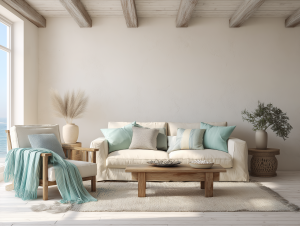
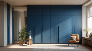
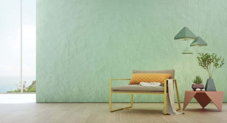
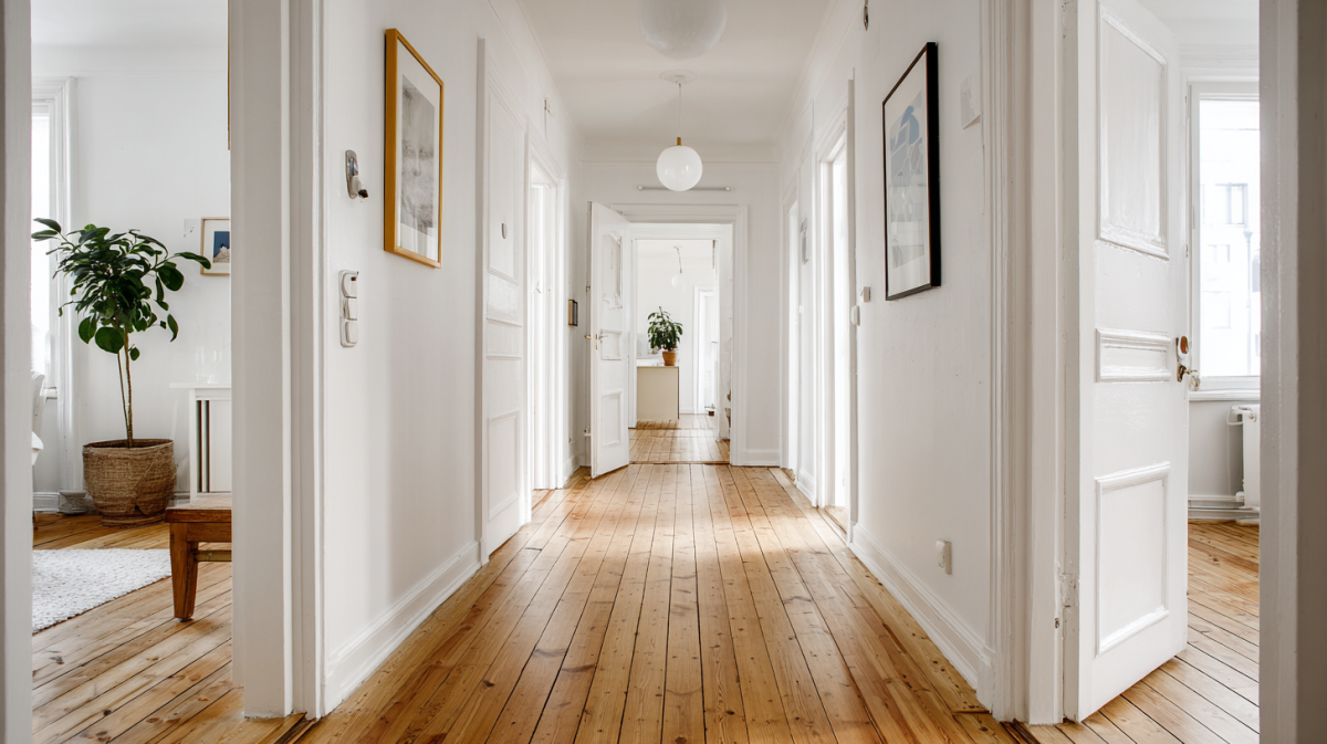
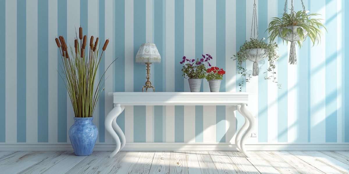
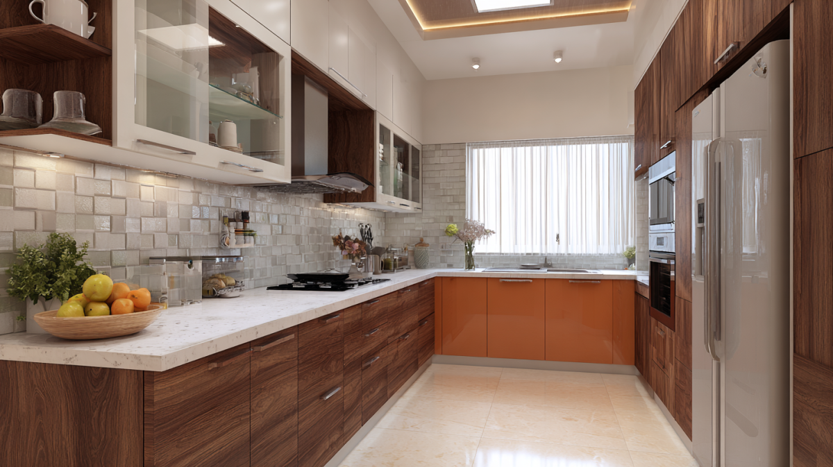
1. Walls
Go big or go home, right? We’d add that you should go big in your own home. Whether it’s a 1 bhk design or a 2 bhk design, there are many ways to bring pastel colour decor to life. Pick at least two or three complimentary pastel shades for the walls of your home. A bold contrast in the shade of white or darker hues in one of the walls wouldn’t hurt, of course.
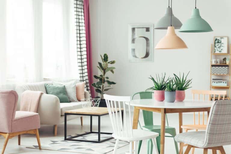
2. Layering and sequences
Wall hangings such as paintings, photo frames, and artefacts add to your rustic living room interior design. We recommend you pick and choose wall hangings and artefacts that complement the solid white colour on your walls and add to the colour story.
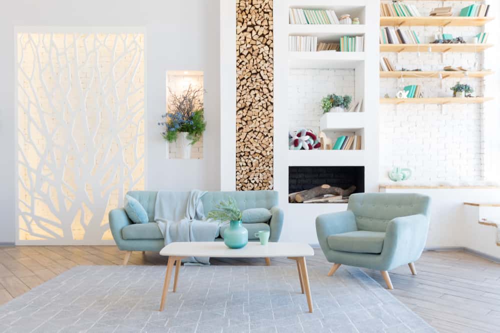
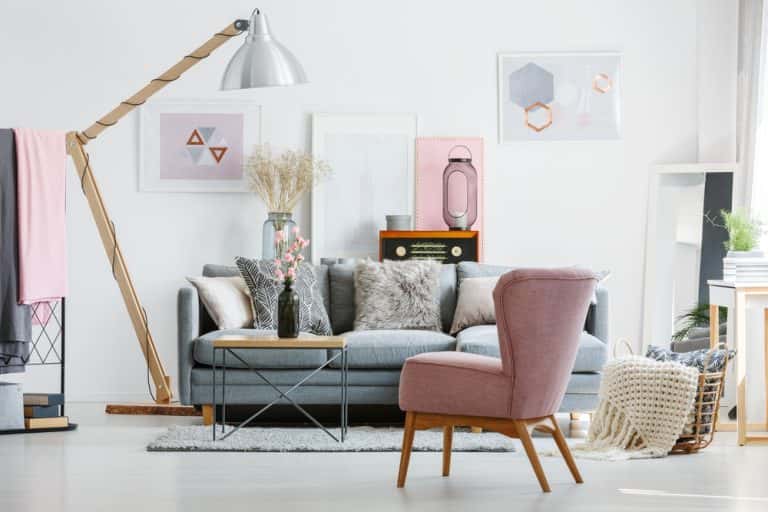
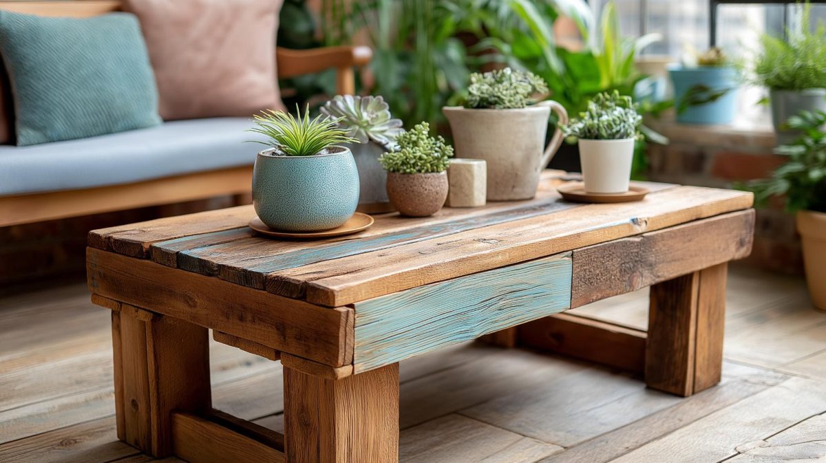
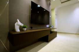
3. Furniture and figurines
When picking furniture, we understand that other priorities like size, comfort, and texture often outweigh the colour. But landing on that perfect pastel shade for your sofa, dining set, and additional sitting arrangements can be the biggest addition to your contemporary living room interior design.
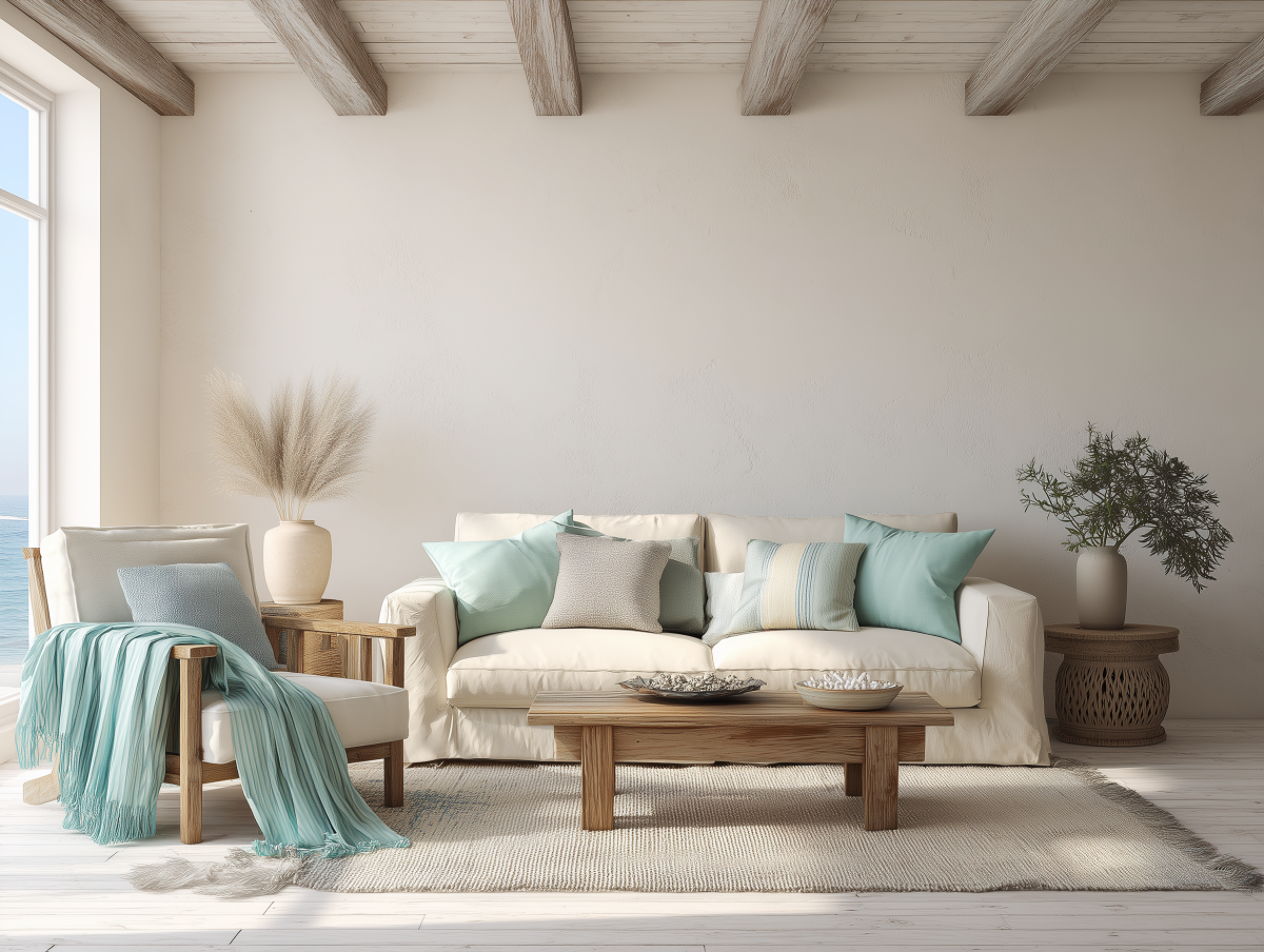
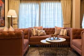
3. Layers and curtains
Balance is key when it comes to pastels in modern living room interior design. You can overdo it before the colour story turns bland. Here’s where curtains come in. You can add the perfect amount of pastels in certain rooms by picking an outstanding pastel shade as your curtains. Curtains get the heavy play of sun rays – which fills the entire room with warmth and playfulness.
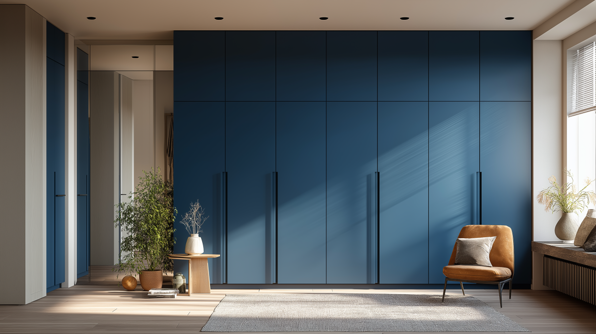
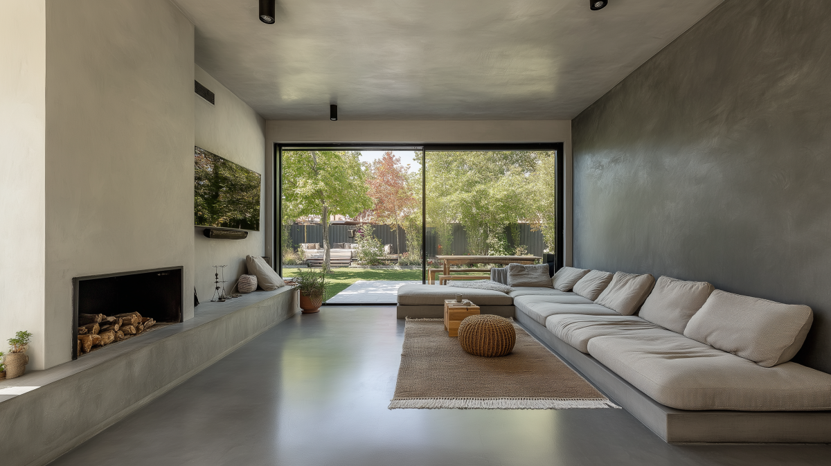
4. Ceilings and flooring
A subtle nod of pastel can come from your floor/ceiling. Nothing can complete the look of your house better than an outward pop of tangerine skyline or a turquoise doormat. It’s time to explore the world of living room false ceiling designs that can add an exuberant pop of colour to your home. The only line of caution is to have walls that complement the pastels and not go overtly against them. We’re taking hot pink walls and mimi pink skyline, not royal blue walls and tangerine skyline.
Conclusion
The days of eggshell white and grey are over! The pastel colour room design is back in style – and we can confirm they are here to stay. When designing your humble abode, it’s better to land on colours that soothe you – rather than bore or intimidate you. This is your cue to embrace the warmth and homeliness of pastels.
Feel free to use this guide and play with pastels like a pro. For more information, designing solutions, and expert advice, visit the HomeLane website.
FAQ
1. What is pastel interior design?
Pastel colour interior design incorporates a pastel colour palette in your home design and the use of pastels in wall paints, furniture, curtains, and miscellaneous wall hangings. Pastel colours, known for their neutrality and calmness, can be used as both bases of the design and the accessories for housing projects.
2. What colours go well with pastels?
Pastels go best with greys, whites, and neutral colour palettes such as nude, cream and beige. Pastels can also be paired with their base colours in Indian living room interior design. It is best to avoid pastels with high saturation colours such as royal blue or red. Pairing pastels with overtly bright colours washes them out.
3. Which shades are considered pastel colours?
Pastels, commonly known as “tints”, are subtle colour tones made by mixing white into solid shades of blue, red, green, and yellow. A pastel colour can be recognized by its paleness and white grading. With the infusion of white paint, pastels become softer and lighter versions of their original colours. Some popular pastel colours are soft pink, pale yellow, light turquoise, etc.


 EXPLORE MORE